Following along? Open the live page
Finmagine — free to explore • premium for full access • no app needed
Multimedia Learning Hub
Understand broad market health before picking individual stocks
What You Will Master
Market Breadth answers one question that price charts cannot: is the market rally (or decline) broad, or is it driven by just a handful of stocks? The Finmagine Breadth Dashboard gives you five complementary lenses on this — from today's snapshot chips to daily thrust data to sector-level internals to management sentiment breadth from concall transcripts.
What This Guide Covers:
- What market breadth measures — % of Nifty 500 stocks above a moving average
- The MA snapshot chips — 6 moving averages (10/20/40/50/100/200 DMA), green/amber/red zones
- The history chart — 6 toggle-able lines, period buttons, bull/bear zone shading
- Interpreting the zones — Bull Zone ≥70%, Bear Zone ≤30%, Divergence, MA Stacking
- Sector Breadth Grid — % above 50 DMA per sector today
- Management Tone Breadth — AI-extracted concall sentiment distribution
- Daily History Table — ADV/DEC, Up 4%/Down 4%, %above 10D/20D/40D MA, Nifty close
Video Walkthrough
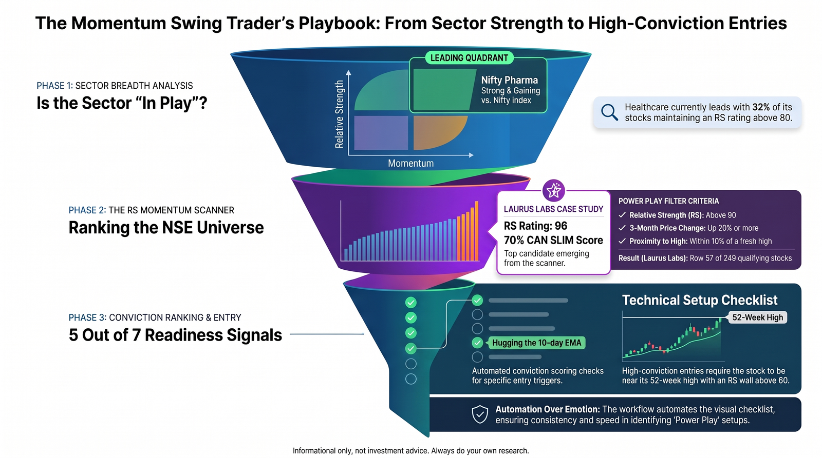
Breadth is step one of a real, end-to-end swing trading workflow — sorting sectors by relative strength, drilling into the strongest one, running the RS Momentum Scanner's PowerPlay filter, confirming rotation on the RRG, and landing on an automated Conviction Ranking checklist.
Want the illustrated framework behind it, phase by phase? See the Playbook tab.
The Momentum Swing Trader's Playbook
The video above follows a repeatable four-phase framework — from "is the sector even in play?" down to an automated entry-readiness score. Here's that same framework laid out step by step, illustrated with the same real example (Laurus Labs, Healthcare/Pharma) shown in the video.
Why Automate the Checklist?
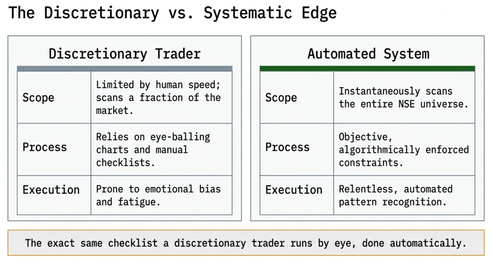
A discretionary trader can run this exact checklist by eye, chart by chart. The value of automating it isn't a new idea — it's speed and consistency at a scale no human can match:
The 4-Phase Filtration Engine
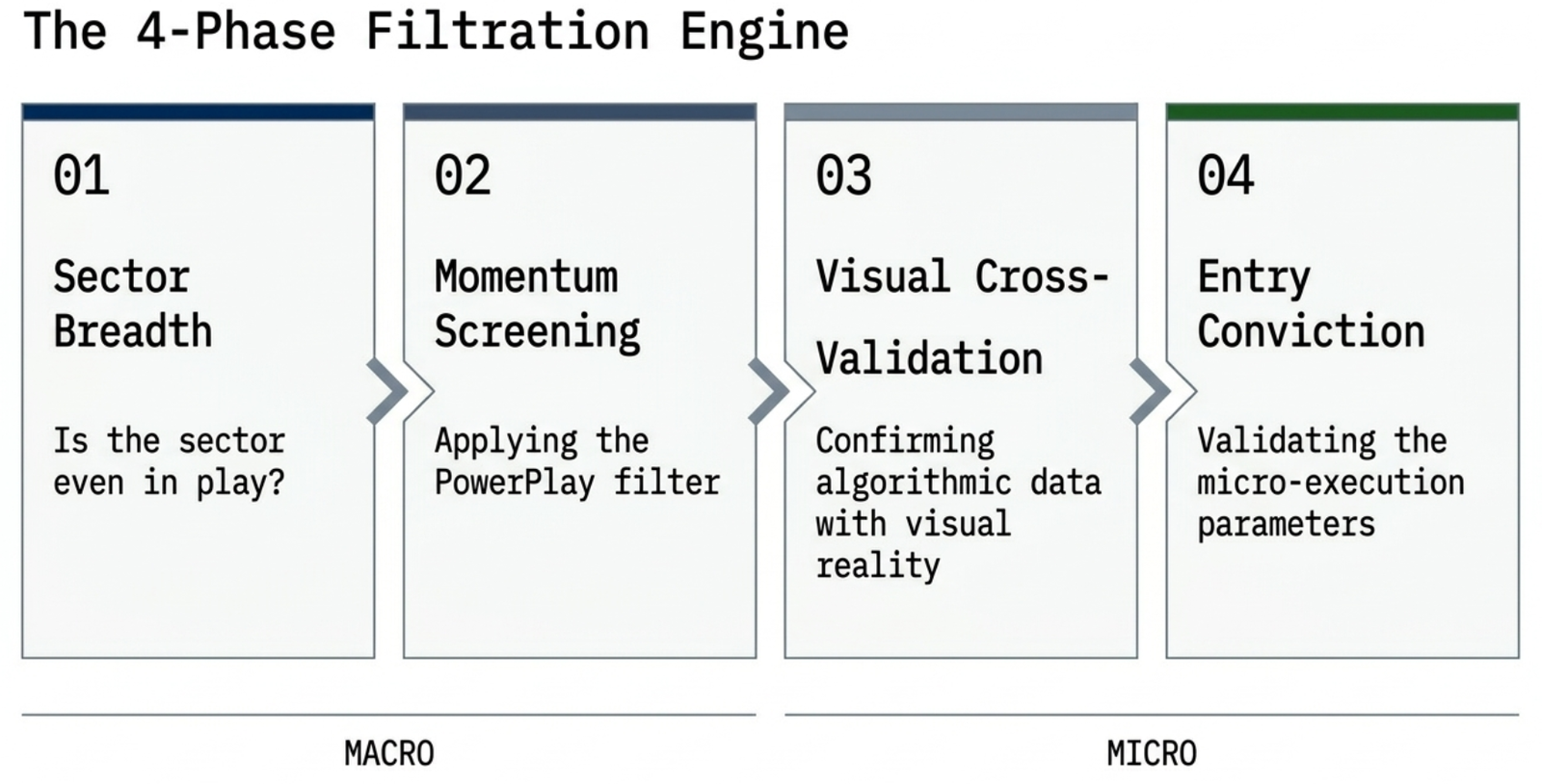
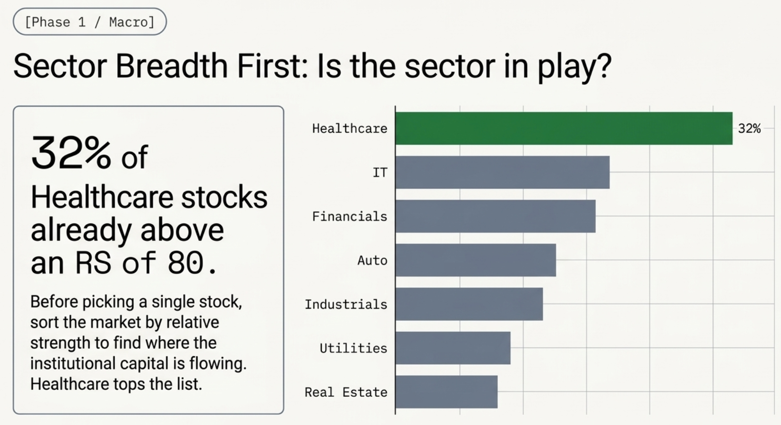
Phase 1 — Sector Breadth: Is the Sector Even in Play?
Before picking a single stock, sort the market by relative strength to find where institutional capital is flowing.
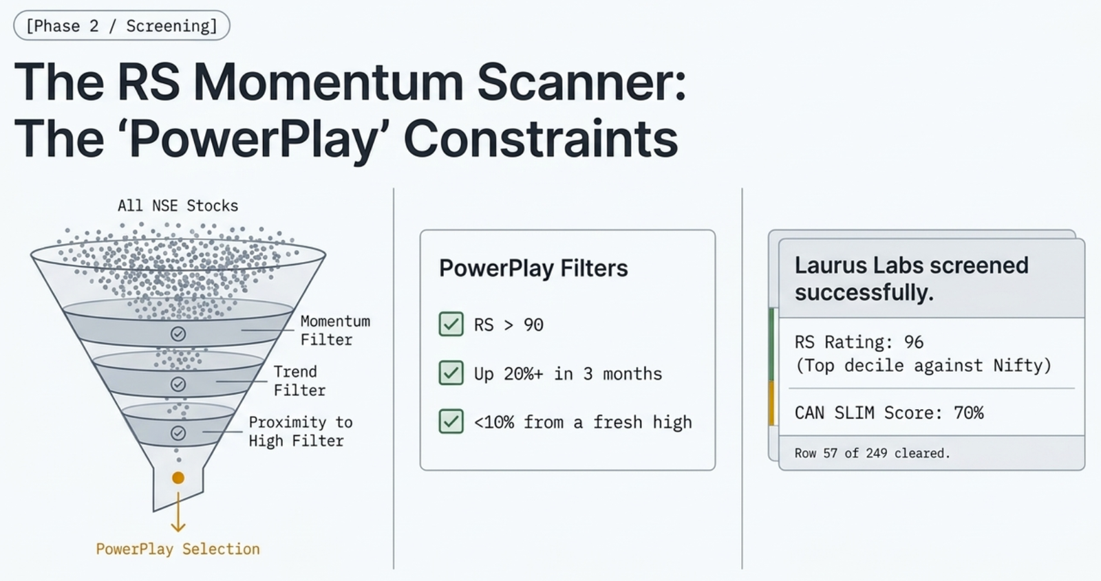
Phase 2 — The RS Momentum Scanner: Ranking the NSE Universe
The PowerPlay filter narrows the full NSE universe to stocks with real strength and momentum that haven't run too far from a fresh high.
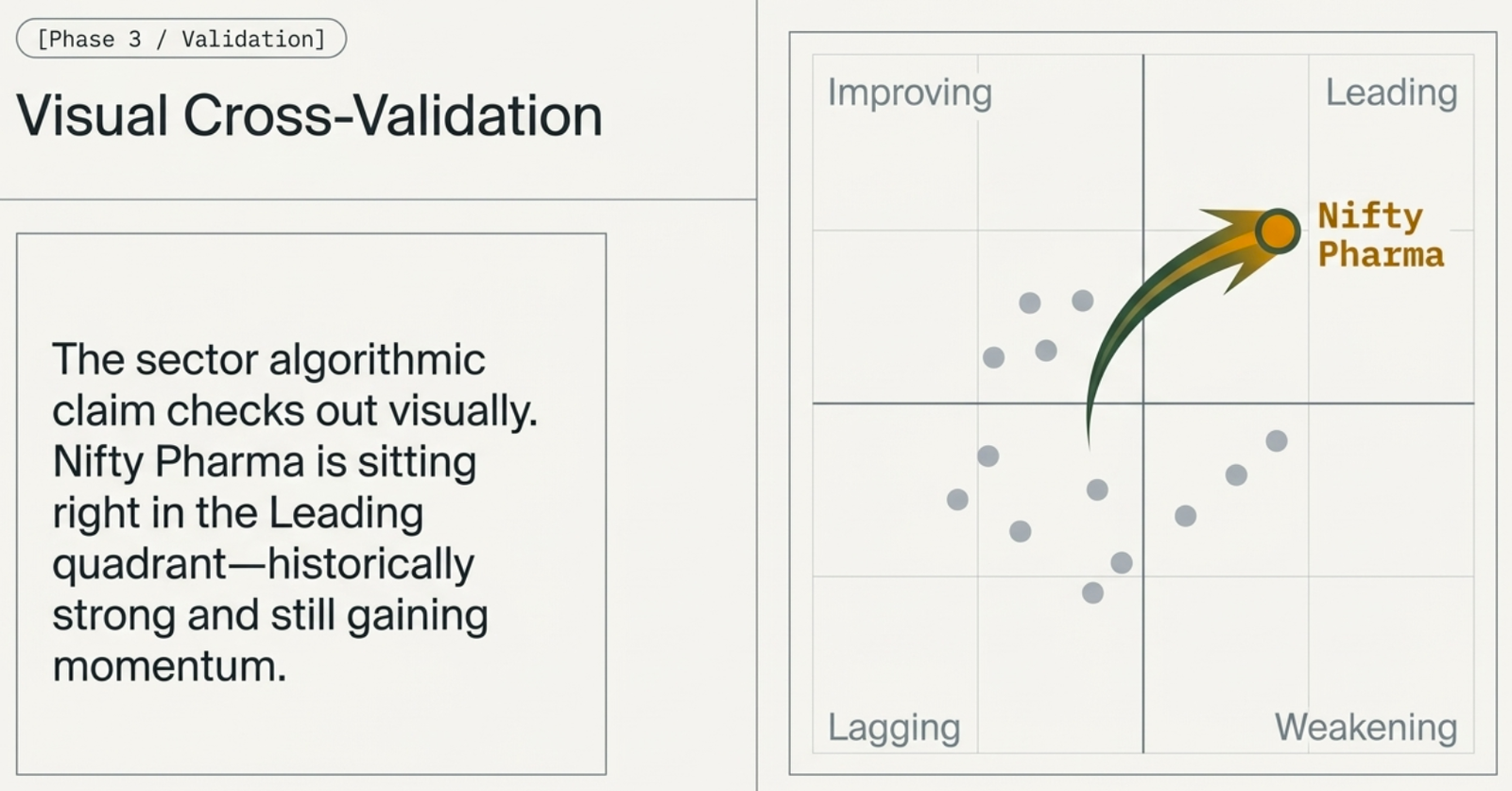
Phase 3 — Visual Cross-Validation
Before trusting the algorithmic read, confirm it visually on the Sector RRG.
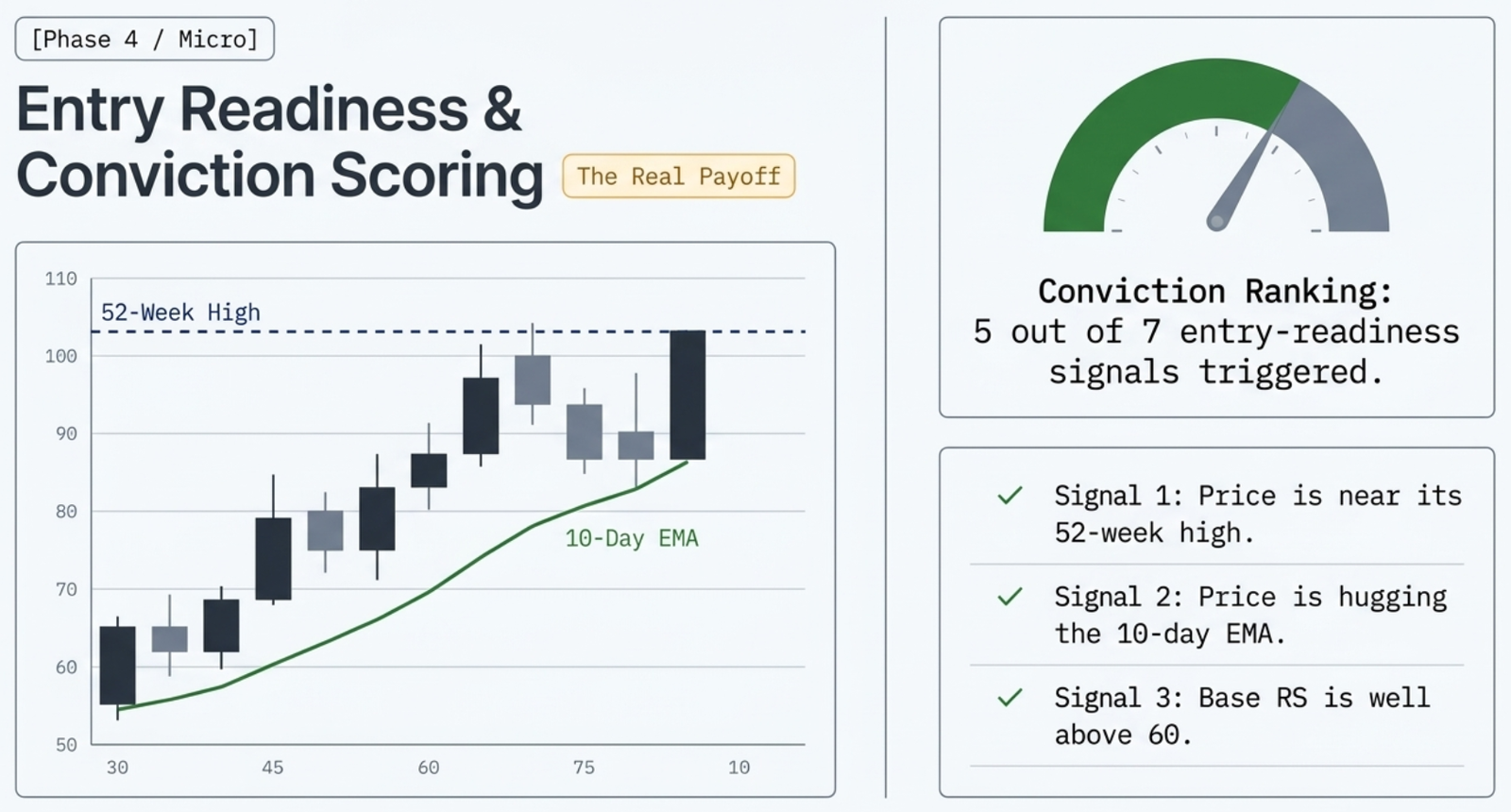
Phase 4 — Entry Readiness & Conviction Scoring: The Real Payoff
This is where the framework earns its keep — an automated score for whether a stock is actually ready to buy right now, not just on the radar.
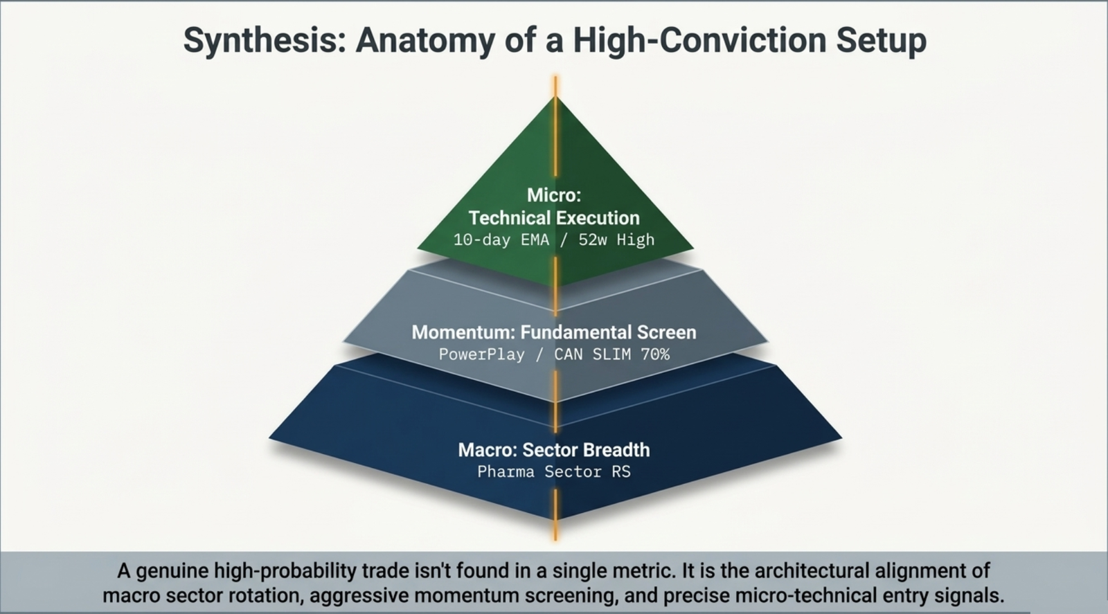
Putting It All Together
A genuine high-probability setup isn't found in any single metric — it's the alignment of all three layers.
What is Market Breadth?
The Nifty 50 index tells you what the 50 largest stocks are doing. Market Breadth tells you what the full Nifty 500 is doing. The two can diverge significantly — especially near market tops and bottoms.
The core question breadth answers: what percentage of stocks are participating in the current trend? Finmagine measures this by counting how many of the 500 stocks are trading above each key moving average — 10, 20, 40, 50, 100, and 200 DMA — and expressing that as a percentage.
The Finmagine breadth dashboard is a standalone page (distinct from the Breadth tab inside Markets). It covers the full Nifty 500 universe and combines five data sources: the MA snapshot, the history chart, sector internals, management sentiment breadth, and a full daily trading history table.
The MA Snapshot Chips
The six chips at the top of the page show today's breadth reading for each moving average period.
Above: an illustrative snapshot showing a market in short-term pullback (10/20 DMA breadth weak) within an otherwise healthy longer-term uptrend (200 DMA still bullish).
Each chip is colour-coded:
- Green (≥60%) — Bull Zone for that MA period. Majority of stocks are above this average.
- Amber (35–60%) — Neutral Zone. Market is mixed or in transition.
- Red (≤35%) — Bear Zone for that MA period. Majority of stocks are below this average.
The subtitle shows "X / 500 stocks" to give the raw count behind the percentage.
The History Chart
The line chart plots all six MA breadth readings over time. Each line is a separate colour:
- ■ 10 DMA — blue (most volatile, shortest term)
- ■ 20 DMA — green
- ■ 40 DMA — teal
- ■ 50 DMA — amber
- ■ 100 DMA — orange
- ■ 200 DMA — red (most stable, longest term)
Period Buttons
Choose how much history to display:
The 30D view shows the most recent session-to-session fluctuations. The 1Y view reveals regime changes — when breadth moved from a structural bull to a structural bear or vice versa.
MA Toggles
Each MA period has a checkbox. Uncheck the short-term lines (10, 20, 40 DMA) to see only the structural trend lines (50, 100, 200 DMA) without the noise. Or uncheck the long-term lines to focus purely on short-term momentum.
Bull and Bear Zone Shading
The chart has two lightly shaded horizontal bands:
- Green band (70–100%) — the Bull Zone. When a breadth line enters this band, that MA period's reading is healthy.
- Red band (0–30%) — the Bear Zone. When a breadth line falls into this band, broad selling has overtaken that timeframe.
Interpreting the Breadth Readings
Bull Zone — ≥70% above a moving average
When more than 70% of Nifty 500 stocks are above their 200 DMA, the market is in a broad structural uptrend. Most stocks are participating. Pullbacks in this environment tend to be shallow and short — they are buying opportunities rather than distribution tops.
Bear Zone — ≤30% above a moving average
Fewer than 30% above the 200 DMA indicates wide market weakness. Most stocks are below their long-term trend line. Defensive positioning, tighter stops, and higher cash levels are prudent until breadth recovers above 40–50%.
Divergence — the most important warning signal
Divergence occurs when the Nifty 50 index makes a new high but breadth (particularly 200 DMA breadth) is flat or falling. The index is being carried by a shrinking number of large-cap stocks while the broad market deteriorates underneath. Historically, breadth divergences precede meaningful corrections by days to weeks.
MA Stacking — the strongest bull signal
MA Stacking is when breadth values are ordered highest-to-lowest by MA period: 10 DMA > 20 DMA > 40 DMA > 50 DMA > 100 DMA > 200 DMA. Short-term participation is highest, long-term participation is lowest but still healthy. All timeframes are aligned. This is the environment where breakouts have the highest probability of follow-through.
Sector Breadth Grid
The grid shows how each sector within the Nifty 500 is doing on a single metric: what percentage of its stocks are above their 50 DMA today.
Sectors are sorted by % descending, so the strongest sectors are always at the top left. The same green/amber/red colour coding applies: ≥60% = green, 35–60% = amber, ≤35% = red.
Why use 50 DMA specifically for sectors? The 50 DMA is the most widely watched medium-term trend line. A sector where most stocks are above their 50 DMA has broad internal momentum — not just a few large-cap names pulling the sector index higher while smaller names lag.
Management Tone Breadth
This widget distributes management sentiment across hundreds of quarterly earnings concall transcripts, scored by Finmagine's AI system. Each company's most recent concall is classified into one of six tone categories:
| Tone | What it means | Signal |
|---|---|---|
| Confident Specific | Quantified, forward-looking language with specific targets or timelines | Most bullish |
| Confident Vague | Positive tone but without specific commitments ("good visibility ahead") | Positive |
| Cautious | Acknowledges challenges, hedges outlook, but not alarmed | Neutral / Watch |
| Mixed | Some segments confident, others cautious in the same concall | Neutral |
| Defensive | Primarily deflecting analyst questions, explaining misses, cutting guidance | Bearish |
| Evasive | Avoids answering direct questions about margins, orders, or guidance | Most bearish |
The Stacked Bar and Distribution Rows
The stacked bar at the top of the widget shows the proportion of each tone category across all analysed companies. Below it, each row shows the precise percentage and raw count for that tone category, with a mini bar for visual comparison.
QoQ Shift
The bottom row compares the current quarter's distribution to the previous quarter. Three aggregate groups are tracked: Confident (Confident Specific + Vague), Cautious (Cautious + Mixed), Defensive (Defensive + Evasive). An arrow and ±pp delta shows whether the aggregate mix has improved or deteriorated quarter-over-quarter.
Daily History Table
Switch to the Daily History tab to see the raw trading session data for the last 60 trading days (expandable with Load More). Each row is one trading session.
| Column | What it shows | How to read it |
|---|---|---|
| Date / Day | Trading session date and day of week | Mon–Fri; useful for spotting end-of-week patterns |
| Adv | Number of Nifty 500 stocks that advanced on the day | 300+ advancing = broad buying day |
| Dec | Number of Nifty 500 stocks that declined on the day | 300+ declining = broad selling day |
| Up 4% | Stocks that gained 4%+ in a single session | High count = institutional accumulation day (thrust) |
| Dn 4% | Stocks that fell 4%+ in a single session | High count = distribution day; 4+ distribution days in 5 weeks = caution |
| %>10D | % of Nifty 500 stocks above 10 DMA that day | Short-term breadth; drops fast in selloffs |
| %>20D | % above 20 DMA | Medium short-term breadth |
| %>40D | % above 40 DMA | Bridges short-term and medium-term |
| Nifty | Nifty 50 close that day | Index level for divergence comparison |
| Chg% | Nifty 50 daily % change | Compare to ADV/DEC for breadth confirmation or divergence |
How to Use Breadth in Your Workflow
Breadth is a context-setting tool, not a stock-picking tool. Use it to answer one question before every trade: is the overall environment supporting new positions right now?
Weekly check (5 minutes)
- Look at the six snapshot chips. Is the 200 DMA reading above 60%? If yes, the structural backdrop is fine. If below 40%, raise your caution level.
- Is there MA Stacking (short-term breadth > long-term breadth)? If yes, full-risk is appropriate. If not, consider partial position sizing.
- Scan the Sector Breadth Grid. Which sectors are green (≥60% above 50 DMA)? These are your hunting grounds. Avoid initiating new longs in red sectors unless you have a specific catalyst.
Before a new breakout entry (2 minutes)
- Check the 10 DMA breadth chip. Is it above 55%? If yes, short-term momentum is in your favour. Below 40% and falling — wait for stabilisation before chasing breakouts.
- Scan the Daily History table for the last 5 sessions. Are there more thrust days (Adv 300+, Up 4% count high) than distribution days? Breakouts in thrust environments hold better.
Connecting to the Rest of the Platform
- Identify broad market health on the Breadth Dashboard
- Identify leading sectors on the Sector RRG
- Cross-check sector internals using the Sector Breadth Grid (is the RRG-leading sector also broadly healthy, or just one or two stocks pulling it?)
- Drill into sub-sectors via the Markets Industry Groups tab
- Filter for stocks meeting your criteria on the Screener
Related Guides
- Sector RRG — 18 NSE sector rotation chart: RS-Ratio, RS-Momentum, four quadrants, clockwise rotation, as-of snapshots
- Markets Hub — the 12-tab Markets surface: breadth tab, heatmap, FII/DII, industry groups, industry stages, and more
- Industry Groups — sub-sector rankings with 52WH Distance and 4W/12W rank history
- Morning Brief — pre-session briefing desk with sector movers, FII/DII flows, and AI prompt synthesis
- RS Momentum Scanner — top Nifty 500 stocks ranked by RS Rating, with sector and MCap filters
Ready to Analyse Indian Stocks Like a Pro?
Finmagine gives you 30+ computed financial ratios, sector benchmarks, FII/DII flows, the Finmagine Score, and AI-powered analysis — all in one place.