
Following along? Install the extension first
Finmagine Financial Chart Builder — free • no account needed • Chrome, Edge, Brave
Multimedia Learning Hub
Master every ratio in the Calculated Ratios tab through video, audio, comprehensive overview, and interactive knowledge testing
What You Will Master
This is the definitive standalone tutorial for the Calculated Ratios tab. While other guides touch on this tab as part of a 5-tab overview, this guide goes ratio by ratio — formula, thresholds, what each rating actually means, and real Indian company examples. By the end you will never need to guess what a number is telling you.
The 11 Ratios Covered:
- Interest Coverage
- Debt to Equity (D/E)
- Debt to Assets (D/A)
- Current Ratio
- Quick Ratio
- EBITDA (absolute)
- EBITDA Margin
- Net Profit Margin
- Asset Turnover
- Fixed Asset Turnover
- Equity Multiplier
Plus: DuPont Analysis (ROE decomposition), the Banking Exception, a 6-step analysis workflow, and 48 flashcards.
High ROE Trap? How to Tell Real Compounders from Debt-Fueled Time Bombs
DuPont Analysis explained with real Indian company examples — Polycab, IndiGo, Adani Green, Bajaj Finserv.
Audio Deep Dive: The Analyst's Lab
A comprehensive two-host conversation covering all 11 ratios with real Indian company examples, the DuPont breakdown, the Banking Exception, and the 6-step workflow. ~25 minutes.
~25 minutes • All 11 ratios • Real Indian company examples • 6-step workflow walkthrough
Test Your Ratio Knowledge — 50 Flashcards
Click any card to reveal the answer. Use the search box to focus on a specific ratio or concept.
Why This Tab Is Different
Every financial website shows you ratios. Screener.in has them. Moneycontrol has them. So why does the Chart Builder bother computing its own?
Because pre-calculated ratios are trusting someone else's math. The Calculated Ratios tab goes back to the source — the raw Profit & Loss statement and Balance Sheet extracted directly from the Screener.in page you are reading — and derives these 11 ratios itself, in your browser, in real time.
This also means the tab works for any company on Screener.in, not just the 71 companies covered by Finmagine's paid research reports. Open a company page, click the extension, select Calculated Ratios, and the analysis runs instantly on whatever data Screener.in is showing.
How to Open the Tab — 3 Steps
- Go to any company page on Screener.in (e.g.,
screener.in/company/POLYCAB/consolidated/) or stockanalysis.com for US stocks - Click the Finmagine icon in your browser toolbar — the overlay panel appears on the right
- Select the "Calculated Ratios" tab — it is the third tab, after Charts and Quick Analysis
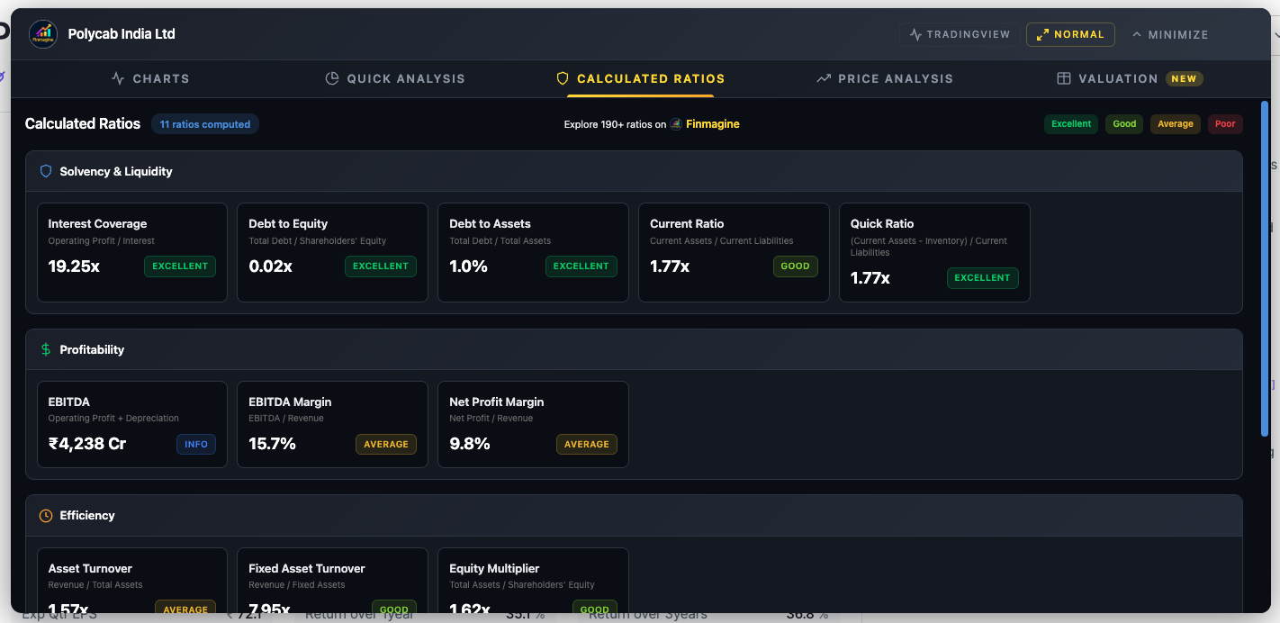
Polycab India — Calculated Ratios tab showing Solvency & Liquidity and Profitability sections. Note the tab bar (Charts | Quick Analysis | Calculated Ratios | Price Analysis | Valuation) and the rating legend (Excellent / Good / Average / Poor) in the top-right corner.
The Rating System — What the Colours Mean
Every ratio (except EBITDA absolute value) displays a colour-coded badge. Before diving into individual ratios, understand what these badges represent — and their single most important limitation.
These thresholds are generic, cross-sector defaults. They work well for manufacturing, consumer, and technology companies. They break completely for banks, NBFCs, and insurance companies — which will always show red on D/E, D/A, and Equity Multiplier because leverage is their raw material, not a risk indicator. We cover the Banking Exception in full at the end of this guide.
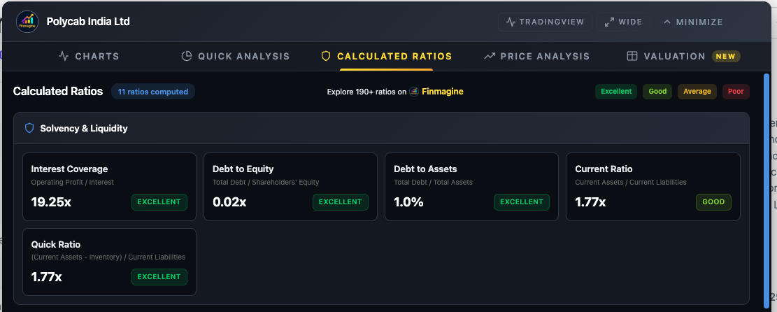
Polycab India — Solvency & Liquidity section. The four rating colours are visible: green (Excellent), lime (Good), yellow (Average), red (Poor). Polycab earns Excellent on 4 of 5 solvency ratios — a fortress balance sheet.
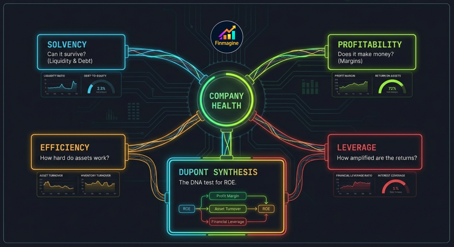
The 5 Categories at a Glance
The 11 ratios are organised into 5 analytical pillars. Each pillar answers a different question about the company — and together they build a complete financial X-ray.
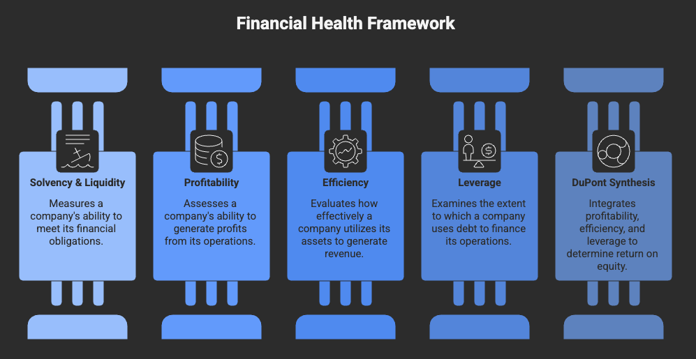
The five analytical pillars of the Calculated Ratios tab. Parts 1–4 below cover each pillar in depth. Part 5 shows how DuPont Synthesis ties them all together.
Solvency & Liquidity — Can It Survive?
These five ratios answer one question before any others: is this company financially stable enough to be worth analysing at all? A company with spectacular growth but a failing balance sheet is an accident waiting to happen. Check survival before you check performance.
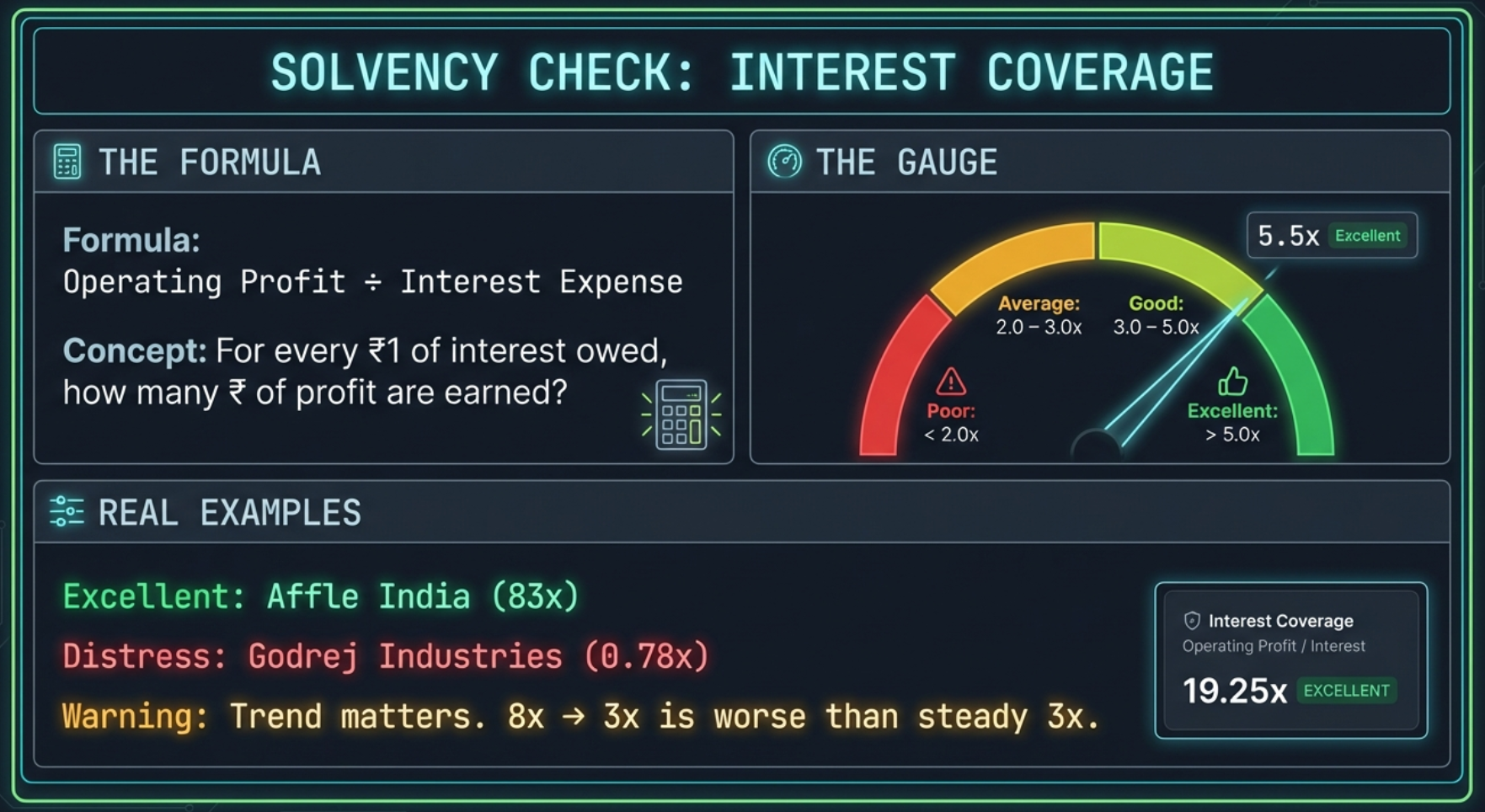
Ratio 1 of 11 — Interest Coverage
What It Measures
For every rupee of interest the company owes its lenders, how many rupees of operating profit does it generate? A ratio of 5.0x means the company earns five times what it needs to pay interest — comfortable headroom. A ratio of 0.78x means it cannot pay interest from operations at all.
What Each Rating Means in Practice
| Rating | Value | What It Means | What to Do |
|---|---|---|---|
| Excellent | ≥ 5.0x | Rock-solid. Even a 60–70% drop in operating profit would still cover interest payments. | No concern here. Move on to other ratios. |
| Good | 3.0–5.0x | Comfortable. Moderate downturns absorbed easily. | Healthy. Worth tracking trend across years. |
| Average | 2.0–3.0x | Tight but manageable. A bad quarter or an interest rate rise could put pressure on this. | Check trend: is it improving or declining? |
| Poor | < 2.0x | Danger zone. Below 1.0x = operating profit cannot cover interest at all — the company is burning reserves or borrowing to pay its debt service. | Investigate immediately. Is there a one-time event, or is this structural? |
Real Company Examples
Ratio 2 of 11 — Debt to Equity (D/E)
What It Measures
For every rupee shareholders have invested, how many rupees of debt sits on top? A D/E of 0x = debt-free (shareholders own 100% of the capital). A D/E of 4.0x = for every rupee of equity, there are four rupees of debt — the bank owns four times more of the capital structure than shareholders do.
What Each Rating Means in Practice
| Rating | D/E | What It Means | Implication |
|---|---|---|---|
| Excellent | ≤ 1.0x or 0 | Conservative, equity-funded growth. Shareholders own the majority of capital. | Resilient in downturns. Company can survive extended periods of poor performance. |
| Good | 1.0–1.5x | Moderate leverage. Using debt for growth but in a controlled manner. | Generally healthy for capital-intensive sectors like manufacturing. |
| Average | 1.5–2.5x | Elevated debt load. Manageable in good times; stressful during downturns. | Monitor closely, especially if Interest Coverage is also under pressure. |
| Poor | > 2.5x | Excessive leverage. Minor disruptions to cash flow can cascade into a debt crisis. | Dig into why. Is this a one-time capex build-out or a structural problem? |
Real Company Examples
Ratio 3 of 11 — Debt to Assets (D/A)
What It Measures
What fraction of the total asset base is funded by creditors? D/E can look alarming when equity is thin even if debt is small. D/A is steadier — it anchors debt to total assets, giving you a cleaner picture of capital structure regardless of equity size.
D/E vs D/A — When to Use Which
| D/E Ratio | D/A Ratio | |
|---|---|---|
| Best for | Comparing leverage across companies of similar profitability | Assessing overall capital structure and creditor exposure |
| Weakness | Can spike dramatically when equity is eroded by losses (not from new debt) | Does not show how leveraged shareholders are relative to their own investment |
| Use case | Checking if a company is taking on dangerous levels of debt vs. its equity base | Checking what percentage of the total asset pie creditors claim |
Use both together. They tell the same story from different angles. A company with D/E of 3.0x and D/A of 15% is in a very different position from one with D/E of 3.0x and D/A of 70%.

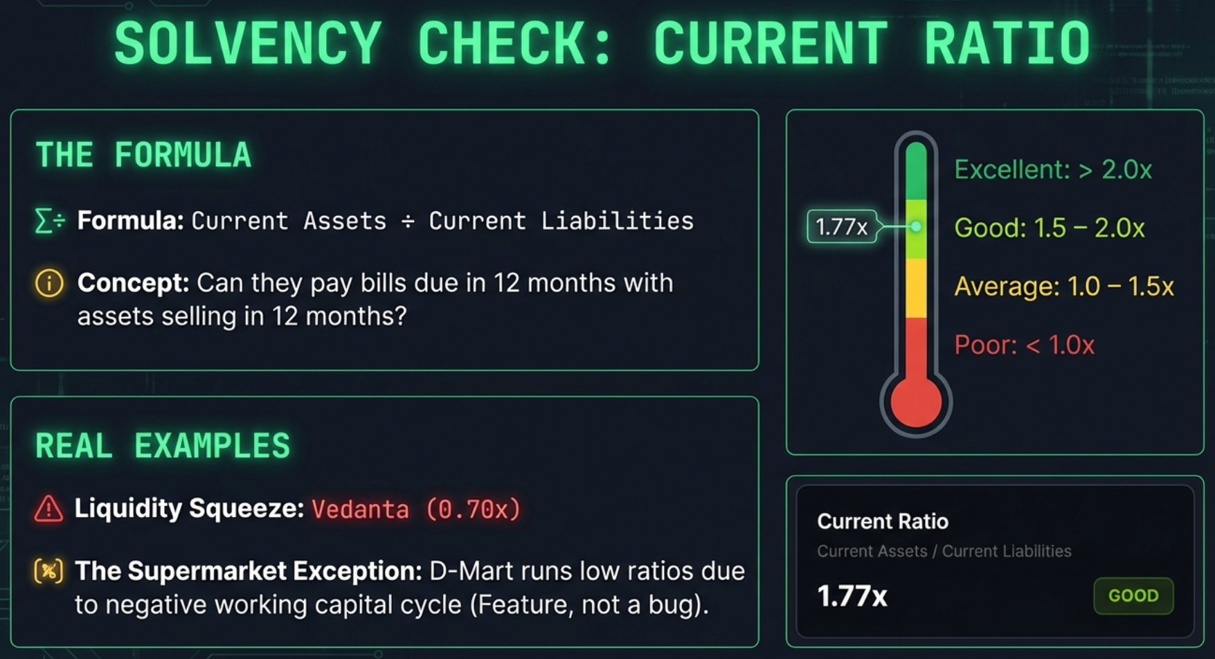
Ratio 4 of 11 — Current Ratio
What It Measures
Short-term survival: for every rupee the company owes in the next 12 months (suppliers, short-term loans, wages), how many rupees of assets can it convert to cash in the same timeframe? Current assets include cash, receivables, and inventory. Current liabilities include payables, short-term borrowings, and the current portion of long-term debt.
What Each Rating Means in Practice
| Rating | Value | Interpretation |
|---|---|---|
| Excellent | ≥ 2.0x | Strong liquidity buffer. Can meet all short-term obligations twice over, even with unexpected delays in receiving payments. |
| Good | 1.5–2.0x | Comfortable. Manageable with modest room for error. |
| Average | 1.0–1.5x | Thin buffer. Operational hiccups — a large customer paying late, a surprise expense — could create short-term cash pressure. |
| Poor | < 1.0x | Short-term liabilities exceed short-term assets. The company would struggle to meet obligations coming due without borrowing more or selling long-term assets. Vedanta at 0.70x is an example. |
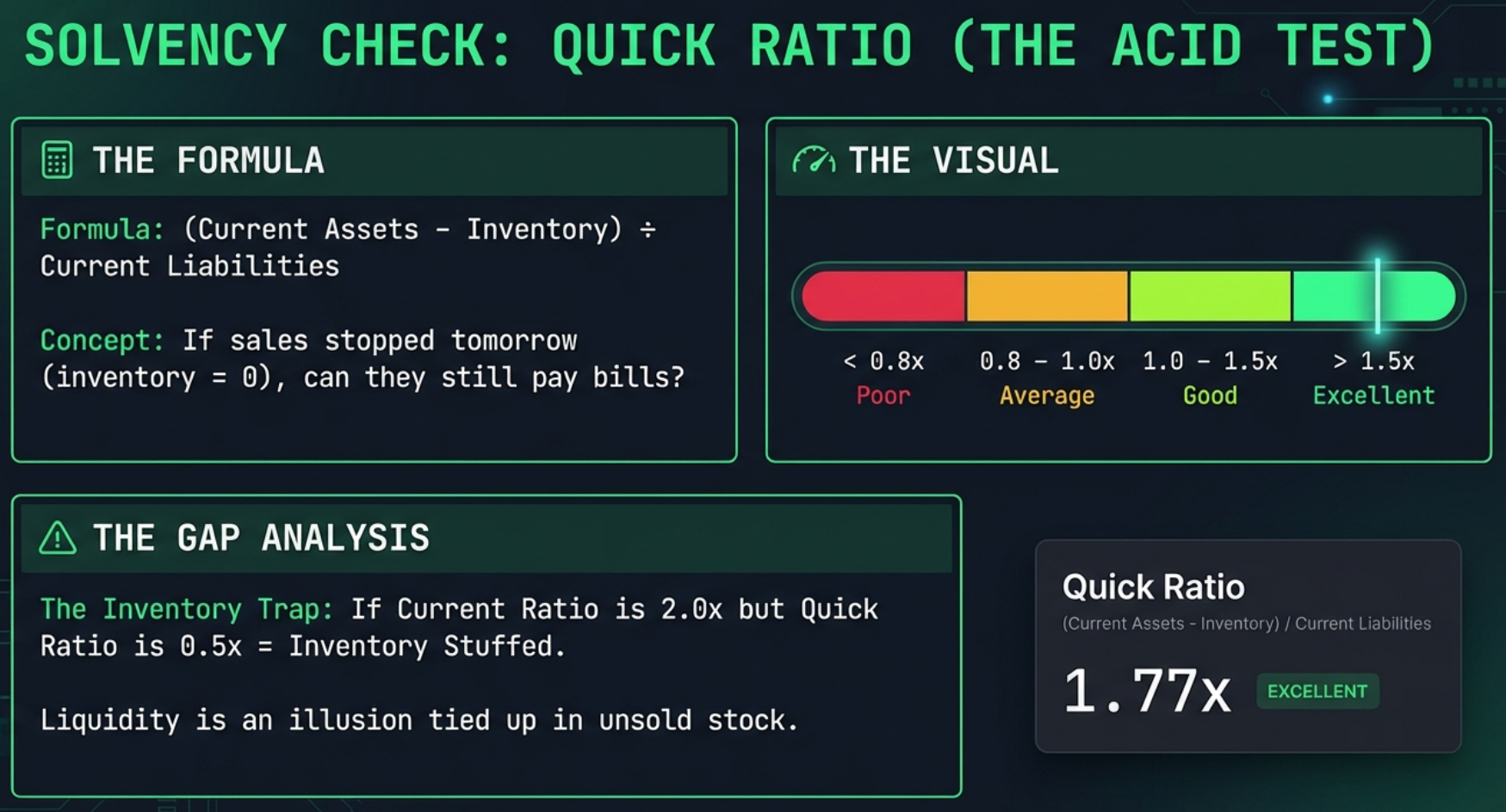
Ratio 5 of 11 — Quick Ratio (Acid Test)
What It Measures
The Quick Ratio asks a harder question than the Current Ratio: if sales stopped tomorrow and you could not sell a single unit of inventory, could you still meet all short-term obligations? It strips inventory from current assets because inventory takes time to convert to cash and may not be saleable at book value in a crisis.
Reading the Gap Between Current and Quick
The spread between Current Ratio and Quick Ratio reveals how much of the current asset base is tied up in inventory:
| Current Ratio | Quick Ratio | What the Gap Says |
|---|---|---|
| 2.0x | 1.9x | Almost no inventory — asset-light, services, or software business. Liquidity is genuine. |
| 2.0x | 0.8x | Large inventory buffer. Liquidity looks good on paper but depends heavily on being able to sell stock. Check inventory ageing. |
| 1.2x | 0.5x | Dangerously inventory-heavy for its short-term obligations. A demand slowdown could trigger a cash crisis. |
Reading the Solvency 5 Together
No single solvency ratio gives you the full picture. Look at them as a system:
| Scenario | What It Often Means |
|---|---|
| Low D/E + High Interest Coverage + High Current & Quick | Financial fortress. This company can withstand a multi-year downturn. Think Affle, TCS, HDFC AMC. |
| High D/E + Low Interest Coverage + Low Current | Triple red flag. Debt is high, it cannot easily service it from operations, and short-term obligations exceed short-term assets. Near-distress. |
| High D/E + High Interest Coverage + Adequate Current | Deliberate leverage play. The debt is large but the business generates enough to service it comfortably. Infrastructure, real estate development. |
| Low D/E + Low Interest Coverage | Unusual — perhaps interest expense is minimal but operating profit is collapsing. Check the P&L for a deteriorating core business. |
Profitability — Where Does the Money Go?
Survival established, we now ask: is this a genuinely profitable business, or does it generate revenue without retaining meaningful earnings? The three profitability metrics tell the story of money as it flows down the income statement.
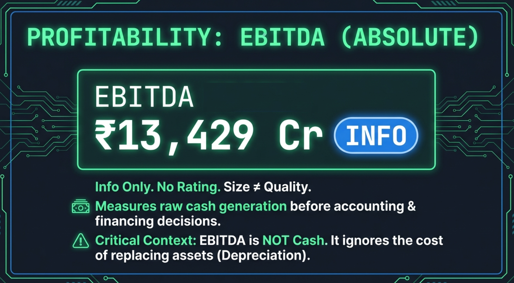
Ratio 6 of 11 — EBITDA (Absolute Value)
No rating badge. EBITDA is displayed as an absolute number (in Crores for India) tagged "Info" — it tells you the scale of operating cash generation before financing costs and non-cash charges. It is not rated because an absolute value cannot be compared across companies of different sizes.
Why EBITDA Exists as a Metric
EBITDA strips out interest (financing decisions), taxes (jurisdiction effects), and depreciation (accounting policy choices) to show you the raw cash-generating power of the core business. Analysts use it to compare operating profitability across companies with different debt levels and depreciation policies.
The Critical Warning

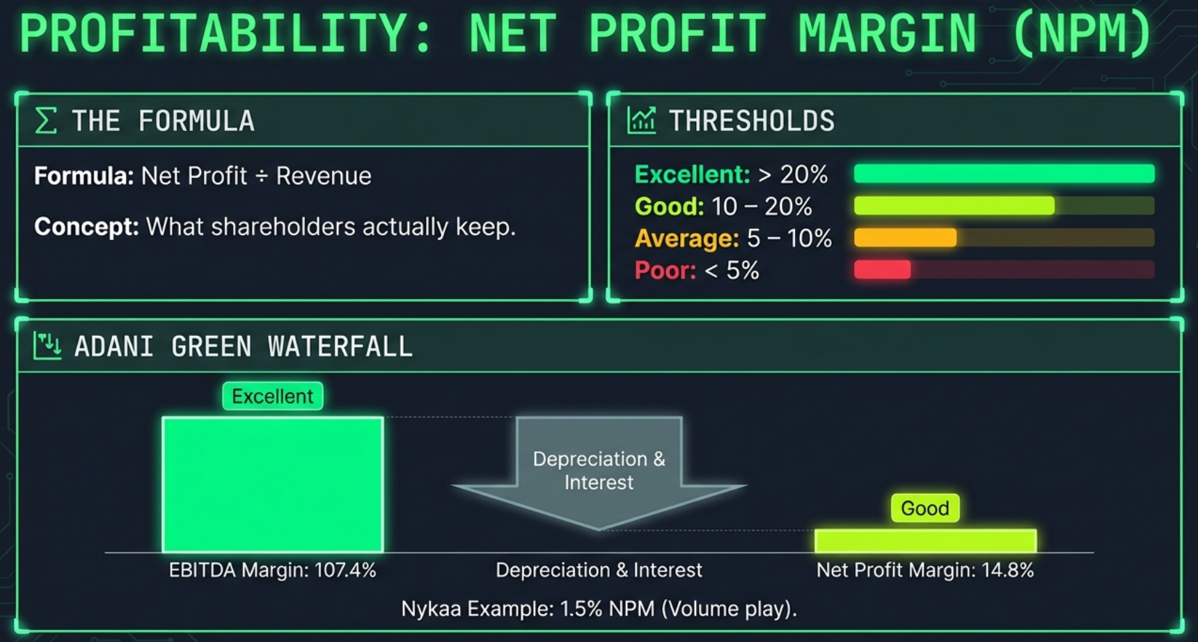
Adani Green Energy — EBITDA Margin of 107.4% (Excellent) collapses to Net Profit Margin of 14.8% (Good) after depreciation and interest charges. The 93-percentage-point gap is the cost of leveraged infrastructure. Note also D/E 4.52x and D/A 70% — both rated Poor — in the solvency section above.
Ratio 7 of 11 — EBITDA Margin
What It Measures
Of every rupee of revenue, how many paise reach operating profit before depreciation and financing costs? EBITDA Margin is the cleanest measure of operating efficiency — it shows pricing power and cost discipline without contamination from capital structure decisions.
Sector Benchmarks That Matter
| Sector | Typical EBITDA Margin Range | Why It Varies |
|---|---|---|
| Software / IT Services | 25–40% | Low capital intensity, high value-added per employee |
| Pharmaceuticals | 20–35% | R&D amortisation excluded; manufacturing scale matters |
| Consumer FMCG | 15–25% | Brand premiums; moderate distribution costs |
| Cables / Industrials | 10–18% | Material cost-heavy; limited pricing power |
| Retail / E-Commerce | 3–12% | Volume-driven, thin per-unit margins |
| Airlines | 10–20% | Aircraft costs excluded; fuel cost volatility |
| Infrastructure / Utilities | 50–80%+ | Revenue is clean; depreciation and interest are enormous (excluded from EBITDA) |

Ratio 8 of 11 — Net Profit Margin
What It Measures
After paying interest to lenders, taxes to the government, and depreciation charges, what percentage of revenue do shareholders actually get to keep? This is the final, honest number — what remains after everyone else has been paid.
The Profitability Waterfall
Watch the journey from EBITDA Margin to Net Profit Margin — the gap tells you where money is leaking:
Interest: cost of debt
Taxes: government's share
Real Company Examples
Efficiency — How Hard Do the Assets Work?
Efficiency ratios answer: given the assets deployed, how much revenue is being squeezed out of them? Two companies with the same profit margin can have radically different return profiles based purely on how efficiently they use their assets.
Ratio 9 of 11 — Asset Turnover
What It Measures
For every rupee of assets on the balance sheet, how many rupees of annual revenue does the business generate? High asset turnover means the business model extracts high revenue from a relatively lean asset base. Low asset turnover is often structurally normal for capital-heavy industries.
The Two Business Models
There is no single correct Asset Turnover — it depends entirely on the business model. Think of two ways to build a profitable restaurant:
Cross-Company Comparison
| Company | Asset Turnover | Business Model | Rating |
|---|---|---|---|
| Nykaa | 2.18x | High-velocity retail | Good |
| Polycab | 1.57x | Efficient manufacturer | Average |
| Adani Enterprises | 0.43x | Diversified conglomerate | Poor |
| Adani Green | 0.10x | Capital-intensive infrastructure | Poor |
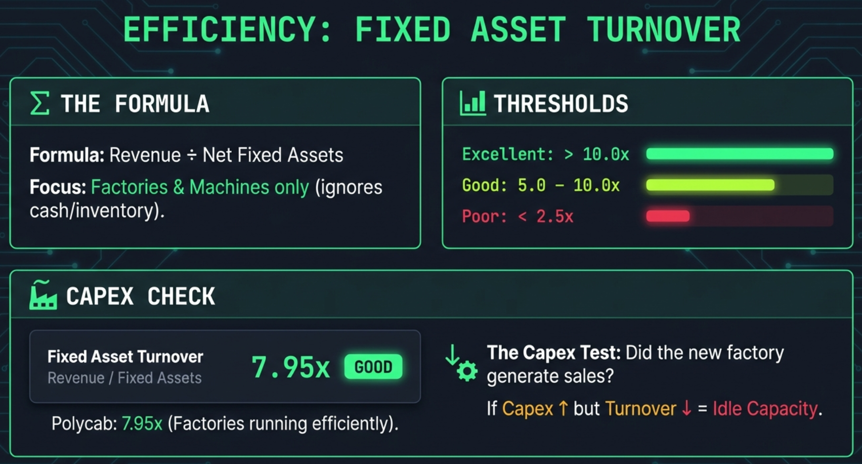
Ratio 10 of 11 — Fixed Asset Turnover
What It Measures
While Total Asset Turnover includes everything on the balance sheet — cash, receivables, inventory, investments — Fixed Asset Turnover narrows the lens to just the productive physical base: land, buildings, plant, and machinery. It asks specifically: how hard are the factories and equipment working?
When Fixed Asset Turnover is Most Valuable
This ratio is most informative for manufacturers, industrials, and asset-heavy businesses. It answers questions like:
- Is a new factory (capex spent two years ago) now generating revenue efficiently?
- Are older assets being sweated harder as they depreciate, or is revenue growth not keeping up with the asset base?
- Is a company sitting on large idle fixed assets relative to its revenue (capacity underutilisation)?
Leverage — The Amplifier
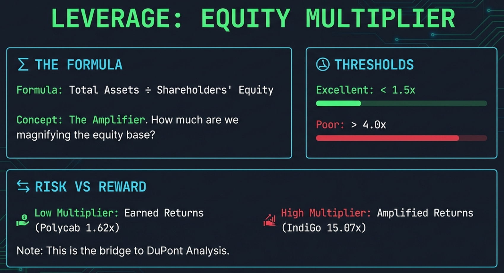
Ratio 11 of 11 — Equity Multiplier
What It Measures
For every rupee of shareholder equity, how many rupees of total assets does the company control? An Equity Multiplier of 1.0x = zero debt (assets exactly equal equity, everything is equity-funded). An Equity Multiplier of 15x = IndiGo Airlines — for every rupee of shareholder equity, there are 15 rupees of total assets, with 14 rupees funded by debt, leases, and payables.
Why the Equity Multiplier Is the Crucial Third Lens in DuPont
Alone, the Equity Multiplier just restates D/E from a different angle. Its power comes in combination with Net Profit Margin and Asset Turnover in DuPont Analysis — see Part 5. A company can achieve a high ROE through genuine operational excellence or by simply loading up on debt. The Equity Multiplier exposes which one it is.
DuPont Analysis — The DNA Test for ROE
This is the crown jewel of the Calculated Ratios tab — and the reason a single number like Return on Equity can be deeply deceptive without decomposition.
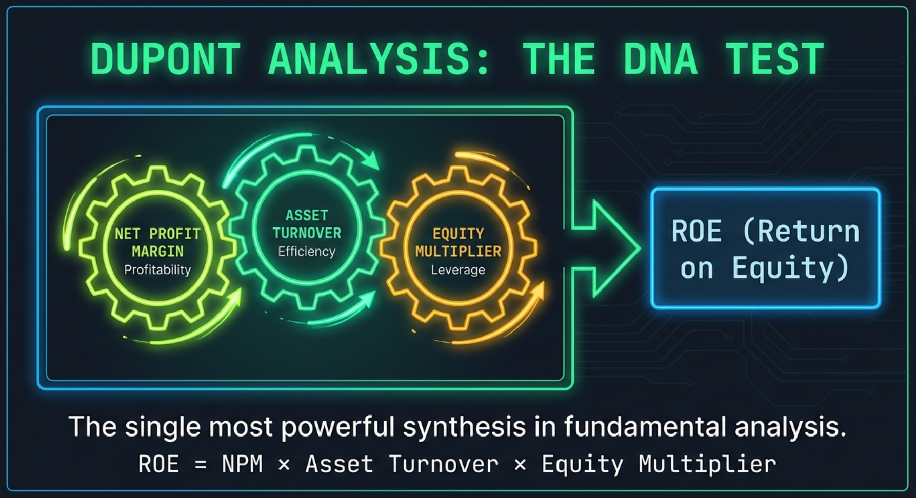
The Formula
Each component has already been covered above — DuPont synthesises all three into one verdict on how a company earns its ROE
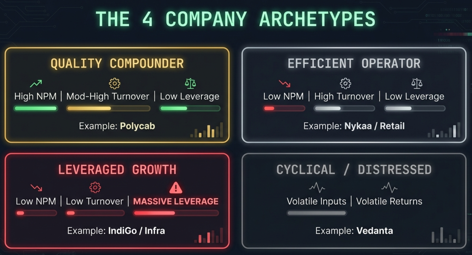
The Four Company Profiles
When you look at a company's DuPont breakdown, you are placing it into one of four fundamental profiles. Each profile has a completely different risk/quality character:
| Profile | Net Profit Margin | Asset Turnover | Equity Multiplier | Quality | Example |
|---|---|---|---|---|---|
| Quality Compounder | High | Moderate | Low (≤2x) | Highest | Polycab, Asian Paints |
| Efficient Operator | Low–Moderate | High | Low–Moderate | Good | Nykaa, D-Mart, retail |
| Leveraged Growth | Low | Low | High (>4x) | High Risk | IndiGo (15x multiplier) |
| Commodity/Cyclical | Variable | Moderate | Moderate–High | Cyclical | Vedanta, steel/mining |
Reading the DuPont Section in the Tab
The DuPont section appears at the bottom of the Calculated Ratios tab. It shows:
- The three components and their individual values with colour ratings
- The calculated ROE (NPM × AT × EM)
- A comparison against Screener.in's reported ROE — if the difference is under 2%, it shows "Matches (Verified)". Larger differences are flagged as "Slight difference" and usually reflect timing or averaging choices
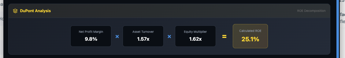
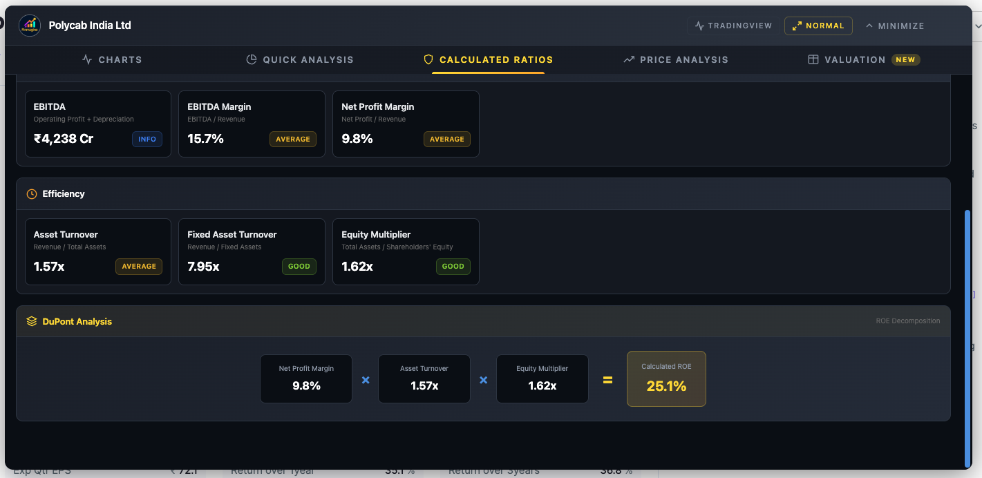
Polycab India — DuPont decomposition: 9.8% × 1.57x × 1.62x = 25.1% ROE. All three drivers are modest and balanced — this is earned ROE, not leveraged ROE. The equity multiplier of 1.62x confirms the company is barely using debt to amplify returns.
Polycab — Quality Compounder
Low leverage (1.62x EM) · ROE earned through operations

IndiGo — Leveraged Growth
15.07x equity multiplier · 38% ROE manufactured by debt
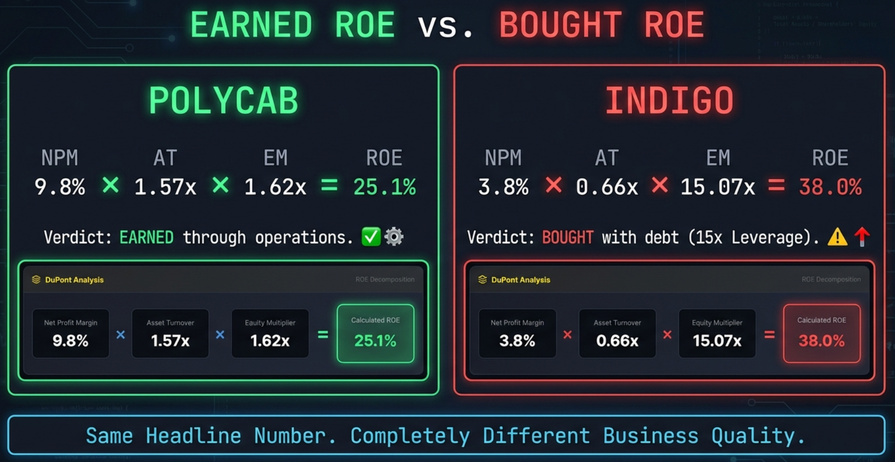
How to Use DuPont in Practice: Two-Step Analysis
Step 1: See a company with ROE above 20%. Do not celebrate. Open the DuPont section.
Step 2: Ask the diagnostic question:
Or did they buy it with debt?
- Earned ROE: High margin + reasonable turnover + low equity multiplier (≤2x). This ROE is resilient — it will compress in bad times but the company will not collapse.
- Bought ROE: Low margin + low turnover + high equity multiplier (>4x). This ROE is fragile — any margin compression gets amplified by the leverage, and a bad year can destroy shareholder value rapidly.
DuPont for Banks — Handle With Care
The Banking Exception — When All the Rules Break
Run Bajaj Finserv through the Calculated Ratios tab and you will see red everywhere: D/E of 5.13x (Poor), Asset Turnover of 0.21x (Poor), Equity Multiplier of 9.25x (Poor). Should you panic?
No. You are looking at a perfectly healthy financial services conglomerate through the wrong lens.
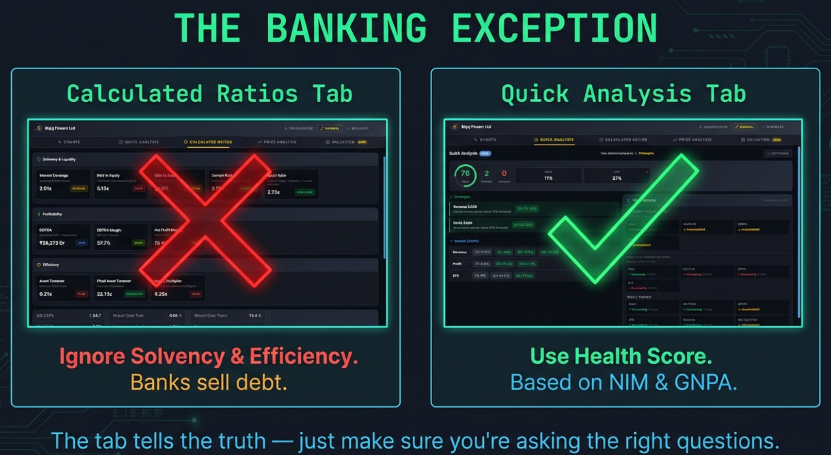
Wrong lens vs right lens — Calculated Ratios shows red everywhere for Bajaj Finserv; Quick Analysis gives an accurate Health Score of 76 (Good) using banking-appropriate metrics.
Why Banks Operate By Different Rules
Think about what a bank does. Its raw material is other people's money. When you deposit Rs.1 lakh in your savings account, that appears on the bank's balance sheet as a liability — the bank owes it back to you. The bank then lends that money to borrowers, which becomes its assets.
| Ratio | What It Shows on a Bank | What to Use Instead |
|---|---|---|
| D/E | Always very high — deposits inflate liabilities | Capital Adequacy Ratio (CAR) — shows if the bank holds enough capital against its risk-weighted assets |
| D/A | Always very high — same reason as D/E | Tier 1 Capital Ratio — core equity relative to risk-weighted assets |
| Interest Coverage | Meaningless — interest paid on deposits is a core operating cost, not a leverage risk indicator | Net Interest Margin (NIM) — spread between lending rate and deposit rate |
| Current Ratio | Misleading — bank liabilities (deposits) are "due on demand" but not all depositors withdraw simultaneously | Liquidity Coverage Ratio (LCR) — regulatory measure of short-term liquidity |
| Asset Turnover | Always very low — bank assets are loans (not fast-moving inventory) | Return on Assets (ROA) — net profit as a % of total assets; better measure for banks |
| Equity Multiplier | Always very high — same as D/E, deposits inflate liabilities | Return on Equity (ROE) directly; also NIM, GNPA ratio |

Calculated Ratios: red across solvency and leverage — structurally expected for an NBFC
Quick Analysis: same company scores Health Score 76 (Good) using the right NBFC lens
Same company, two tabs — Calculated Ratios shows structural red flags; Quick Analysis uses sector-appropriate metrics for an accurate read
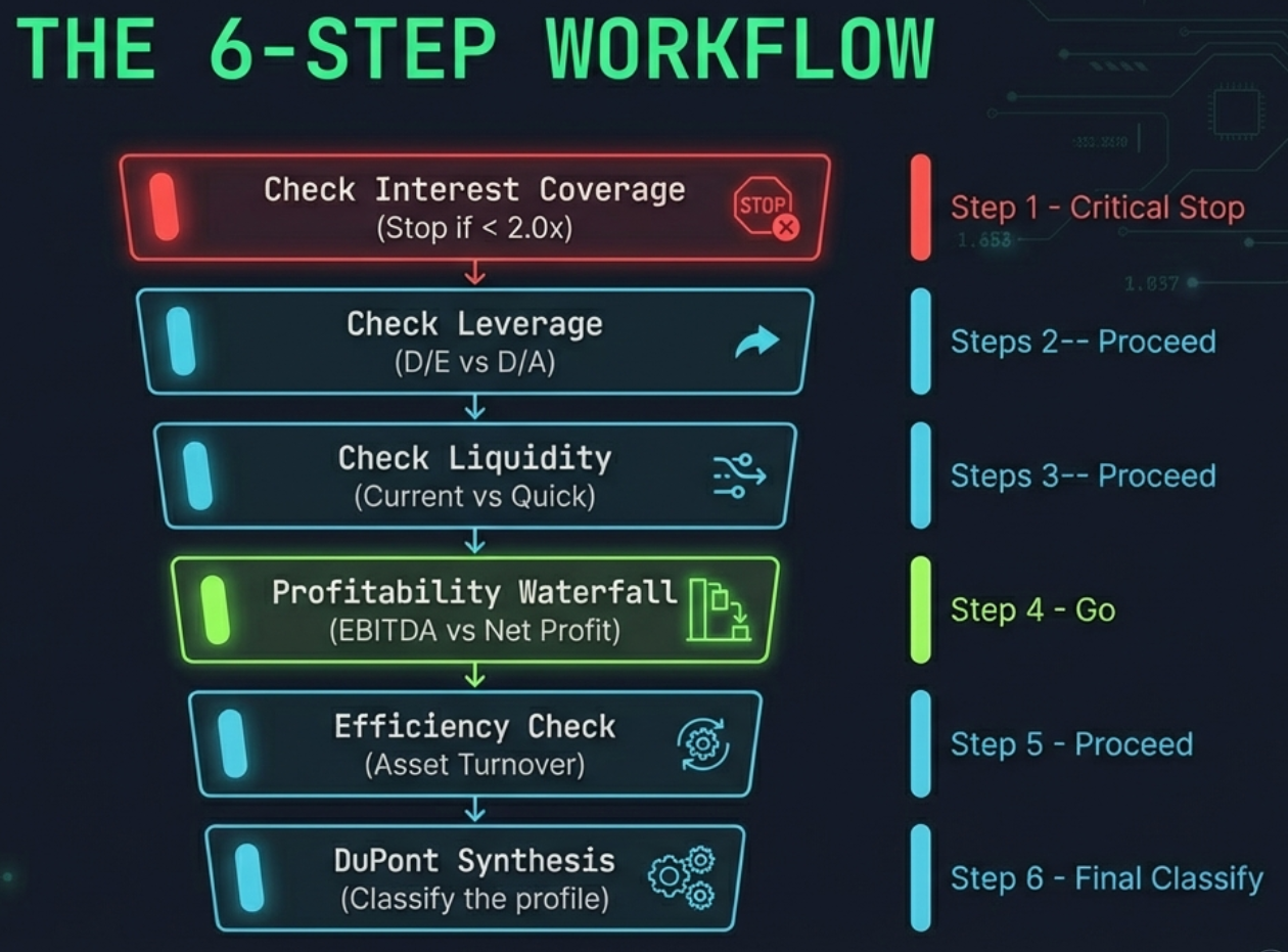
The 6-Step Analysis Workflow
Now that every ratio is explained, here is how to sequence them for maximum insight. Do not treat the Calculated Ratios tab as a random dashboard — there is a logical order that builds a complete picture.
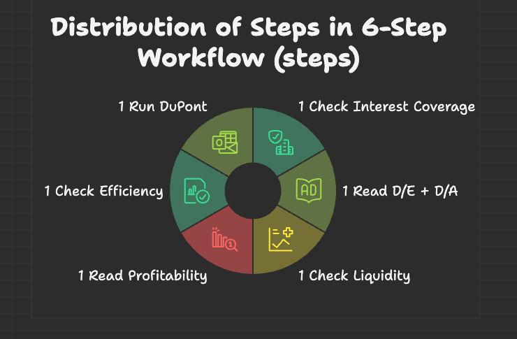
The 6-step workflow as a decision wheel — each segment represents one analytical gate. Work clockwise: survival first, returns last.
If Interest Coverage is below 2.0x (Poor), you need a very good reason to proceed with analysis. A financially distressed company is not an investment candidate — it is a distress situation that requires a completely different analytical framework.
High D/E with high D/A = genuinely over-leveraged. High D/E with low D/A = small equity base, not necessarily a lot of debt. This combination tells you whether leverage is a risk or a mirage created by thin equity.
Current Ratio below 1.0x is a short-term alarm. If Quick Ratio is significantly lower than Current Ratio, investigate inventory quality. The gap reveals whether short-term liquidity depends on shifting stock quickly.
Compare EBITDA Margin to Net Profit Margin. A large gap (above 15 percentage points) means the company is paying heavy interest and/or depreciation costs. This is expected for infrastructure; it is a warning for a consumer brand or technology company.
If Total AT is low but Fixed AT is reasonable, cash and investments are inflating the asset base (a good problem for cash-rich companies). If both are low, the asset base is genuinely underperforming — either capacity is sitting idle or the business model is inherently capital-heavy.
With all three components now understood in detail, the DuPont breakdown gives a verdict on ROE quality. Assign the company to one of the four profiles (Quality Compounder, Efficient Operator, Leveraged Growth, Cyclical). That classification determines the risk framework for everything else in your research.
Complete Threshold Reference
All 11 ratios with exact thresholds — extracted directly from the extension source code.
| Ratio | Formula | Excellent | Good | Average | Poor |
|---|---|---|---|---|---|
| Interest Coverage | Op. Profit / Interest | ≥ 5.0x | 3.0 – 5.0x | 2.0 – 3.0x | < 2.0x |
| Debt to Equity | Borrowings / Equity | ≤ 1.0x | 1.0 – 1.5x | 1.5 – 2.5x | > 2.5x |
| Debt to Assets | Borrowings / Total Assets | ≤ 20% | 20 – 40% | 40 – 60% | > 60% |
| Current Ratio | Current Assets / Current Liabilities | ≥ 2.0x | 1.5 – 2.0x | 1.0 – 1.5x | < 1.0x |
| Quick Ratio | (Current Assets − Inventory) / Current Liabilities | ≥ 1.5x | 1.0 – 1.5x | 0.8 – 1.0x | < 0.8x |
| EBITDA | Op. Profit + Depreciation | Info only — no rating (absolute value) | |||
| EBITDA Margin | EBITDA / Revenue × 100 | ≥ 40% | 25 – 40% | 15 – 25% | < 15% |
| Net Profit Margin | Net Profit / Revenue × 100 | ≥ 20% | 10 – 20% | 5 – 10% | < 5% |
| Asset Turnover | Revenue / Total Assets | ≥ 3.0x | 2.0 – 3.0x | 1.0 – 2.0x | < 1.0x |
| Fixed Asset Turnover | Revenue / Net Fixed Assets | ≥ 10.0x | 5.0 – 10.0x | 2.5 – 5.0x | < 2.5x |
| Equity Multiplier | Total Assets / Equity | ≤ 1.5x | 1.5 – 2.5x | 2.5 – 4.0x | > 4.0x |
Polycab India — the complete Calculated Ratios tab. Upper half: Solvency + Profitability. Lower half: Efficiency + Leverage + DuPont. Nearly every section green or lime — a textbook Quality Compounder profile.
Your Assignment — 5 Companies, 5 Profiles
Open each of these companies on Screener.in with the extension open and work through the 6-Step Workflow above. Each one demonstrates a different aspect of the framework.
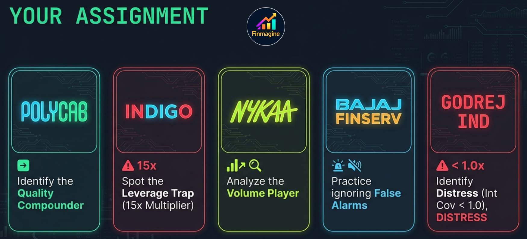
| Company | What to Look For | Learning Objective |
|---|---|---|
| Polycab India | D/E near zero, EBITDA Margin ~16%, NPM ~10%, Equity Multiplier ~1.6x | The ideal Quality Compounder profile — all ratios tell a consistent story of low-leverage, genuine operational returns |
| IndiGo (InterGlobe Aviation) | NPM 3–4%, Asset Turnover 0.6x, Equity Multiplier 14–16x, ROE 35–40% | Classic Leveraged Growth — see how DuPont shows the 38% ROE is manufactured almost entirely by the Equity Multiplier |
| Nykaa (FSN E-Commerce) | NPM 1–2%, Asset Turnover 2.0x+, Low D/E, Low Equity Multiplier | Efficient Operator — "Poor" NPM is not a red flag when turnover compensates. Practice not reacting to individual ratings out of context |
| Bajaj Finserv | D/E 5x+, Asset Turnover 0.2x, Equity Multiplier 9x+ — all "Poor" | The Banking Exception — see how a perfectly healthy NBFC conglomerate looks terrifying in this tab. Then open Quick Analysis to see its actual health score |
| Godrej Industries | Interest Coverage below 1.0x, high D/E | Financial distress markers — the Interest Coverage below 1.0x makes all other analysis secondary. Practice stopping the analysis early when Step 1 flashes red |
- What profile does the DuPont decomposition place this company in?
- Are there any ratios that surprise you relative to what you expected for this sector?
- If one metric looked concerning, did the others confirm the worry or provide context that explained it?
Get the free Chrome extension to follow along:
Install Finmagine Chart Builder →Free Chrome Extension
Ready to try this yourself?
Install the Finmagine Financial Chart Builder and transform any Screener.in, Google Finance, or stockanalysis.com page into interactive charts in one click.
Install from Chrome Web Store →No account required • Works on Chrome, Edge, Brave, Opera
Related Chart Builder Tutorials
DuPont deep-dive with real Indian company examples — concept-first approach to understanding what ROE really means.
How the health score is calculated — points mechanism, sector weights, bonus points table, and banking-specific metrics.
Covers Charts, Quick Analysis, Calculated Ratios, Price Analysis, and Valuation — with 74 flashcards and sector benchmarks.