Following along? Open the live page
Finmagine — free to explore • premium for full access • no app needed
After reading this guide you will be able to:
- Read the Valuation Zone bar and know what "Very Attractive" vs "Very Expensive" means in price terms
- Understand why EV/EBITDA is "PRIMARY" for energy stocks while PE is "IMPORTANT"
- Interpret "Below Median / Near Median / Above Median" status tags and use them correctly
- Compare the stock's PE and P/B against Nifty 50 index levels
- Use the PEG Ratio to decide if the PE is justified by growth
- Decode the Reversed DCF — what growth is already baked into the price
- Run the Scenario Valuation and customise Bear/Base/Bull assumptions
Watch the full valuation deep dive, then listen to the podcast-style walkthrough of all seven lenses:
🎧 Audio Deep Dive — The Seven Lenses of Valuation
A podcast-style walkthrough of all seven valuation lenses — why a 48% PE discount can still mean Fairly Valued, how debt masks cheapness, and how Reversed DCF reveals what the market is really pricing in.
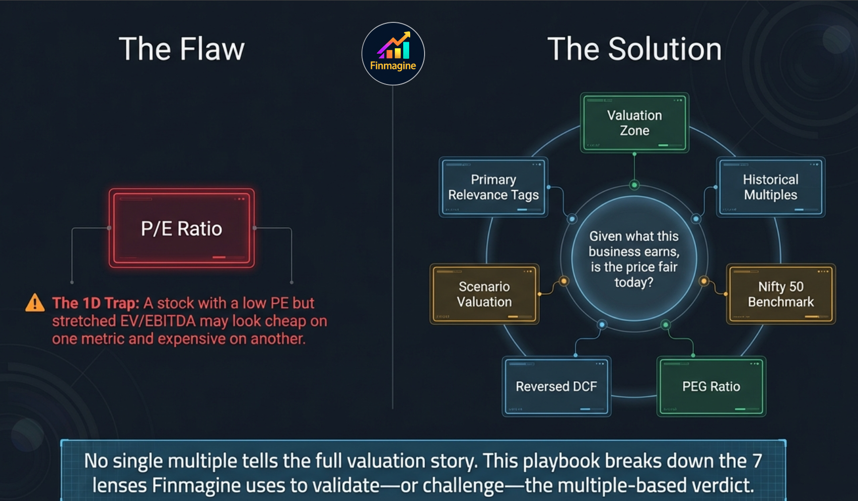
What Is the Valuation Sub-Tab?
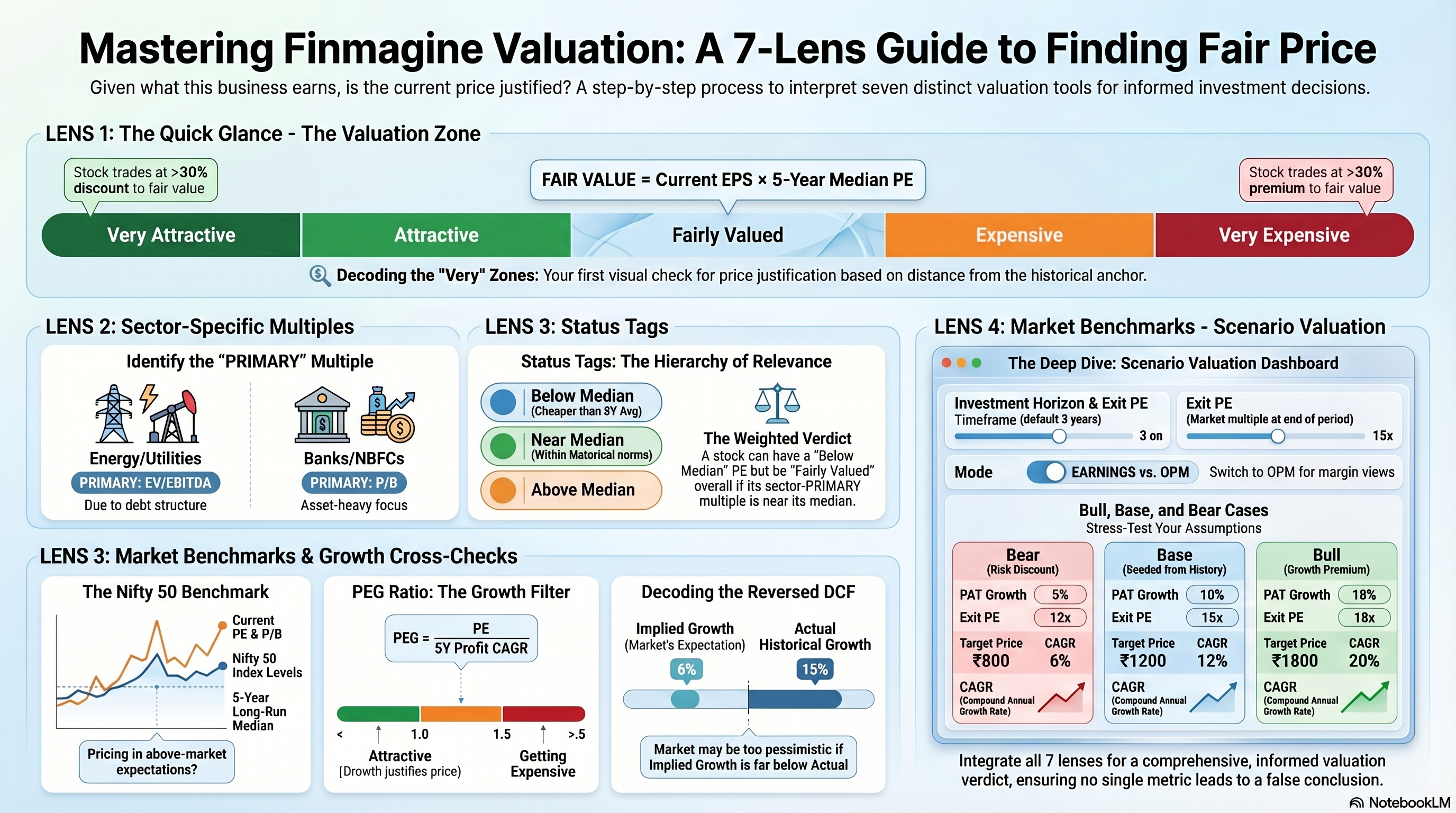
The Valuation sub-tab is the most comprehensive valuation analysis pane on Finmagine. It brings together seven distinct valuation lenses in a single view: a zone-based price range, four historical multiple cards, a Nifty 50 benchmark comparison, a PEG ratio, a Reversed DCF, and an interactive Scenario Valuation model.
Unlike the Quick Analysis score or the Price & Growth CAGR comparison, the Valuation sub-tab is built entirely around the question: given what this business earns, is the current price fair? It does not ask whether the business is good — that is the Scorecard's job. It asks whether the price you would pay today is justified.
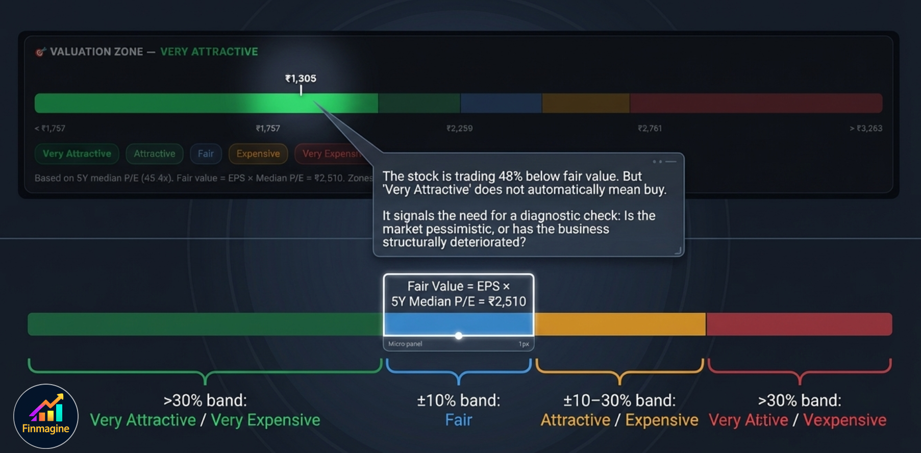
1. Valuation Zone
The Valuation Zone is a colour-coded price range bar that shows where the current stock price sits relative to its historically-justified fair value. It is the fastest way to answer: is this stock cheap or expensive vs. its own history?
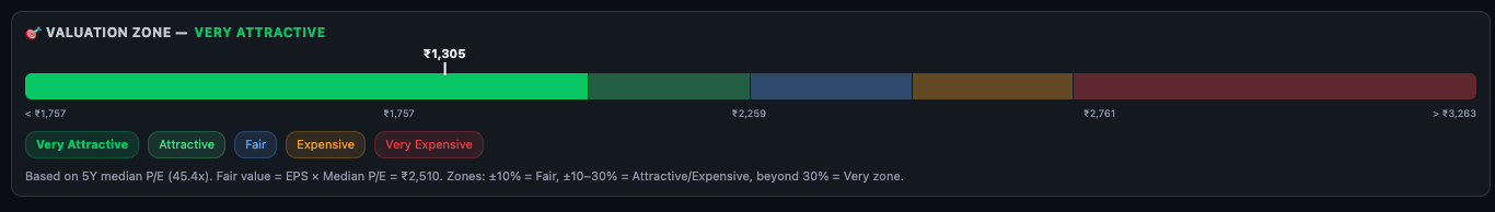
How the Zones Are Defined
Fair Value is calculated as: Current EPS × 5-Year Median PE. From that fair value, five zones are constructed:
The caption below the bar shows the methodology: "Based on 5Y median P/E (45.4x). Fair value = EPS × Median P/E = ₹2,510. Zones: ±10% = Fair, ±10–30% = Attractive/Expensive, beyond 30% = Very zone."
- The market is pessimistic about near-term earnings — which may or may not be justified.
- The business has genuinely deteriorated — making the historical median PE no longer applicable.
- The stock has a structural derating — sector or regulatory headwinds have permanently reduced the appropriate PE band.
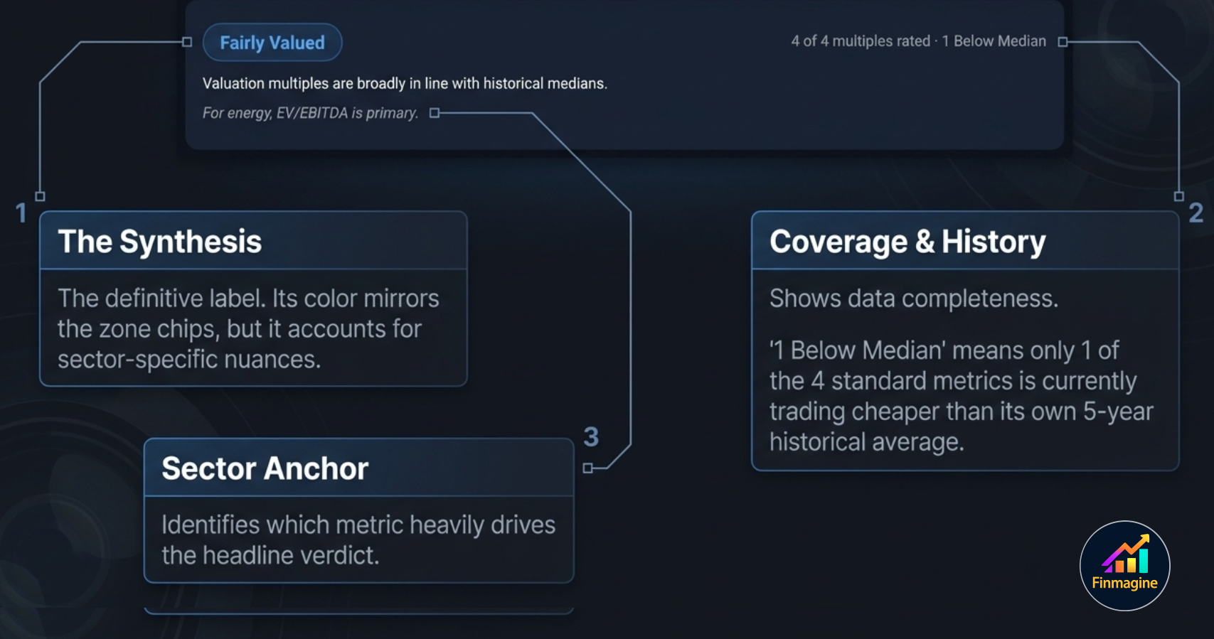
2. The Overall Verdict Card
Just below the Zone bar, a verdict card summarises the multi-multiple assessment in a single label:

The card contains three pieces of information:
- Verdict badge — e.g. Fairly Valued, Attractive, Very Attractive, Expensive, Very Expensive. The badge colour mirrors the Zone chip colours.
- Coverage count — "4 of 4 multiples rated · 1 Below Median". This tells you how many of the four standard multiples had enough data to be computed (PE requires positive earnings), and how many are currently trading below their 5Y historical median.
- Sector note — if a sector-specific primary multiple applies, it is called out here: e.g. "For energy, EV/EBITDA is primary." This tells you which multiple the verdict badge is most weighted toward.
3. Individual Multiple Cards
Below the verdict, four multiple cards appear — one for each valuation metric. Each card shows the same layout: name, relevance tags, Current value, % vs Median, and Median value.
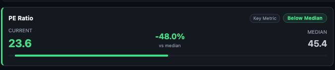
PE Ratio
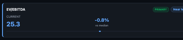
EV/EBITDA
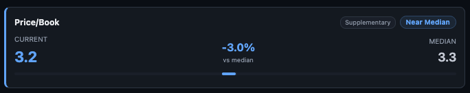
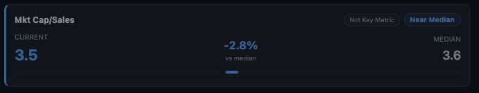
Price/Book and Mkt Cap/Sales
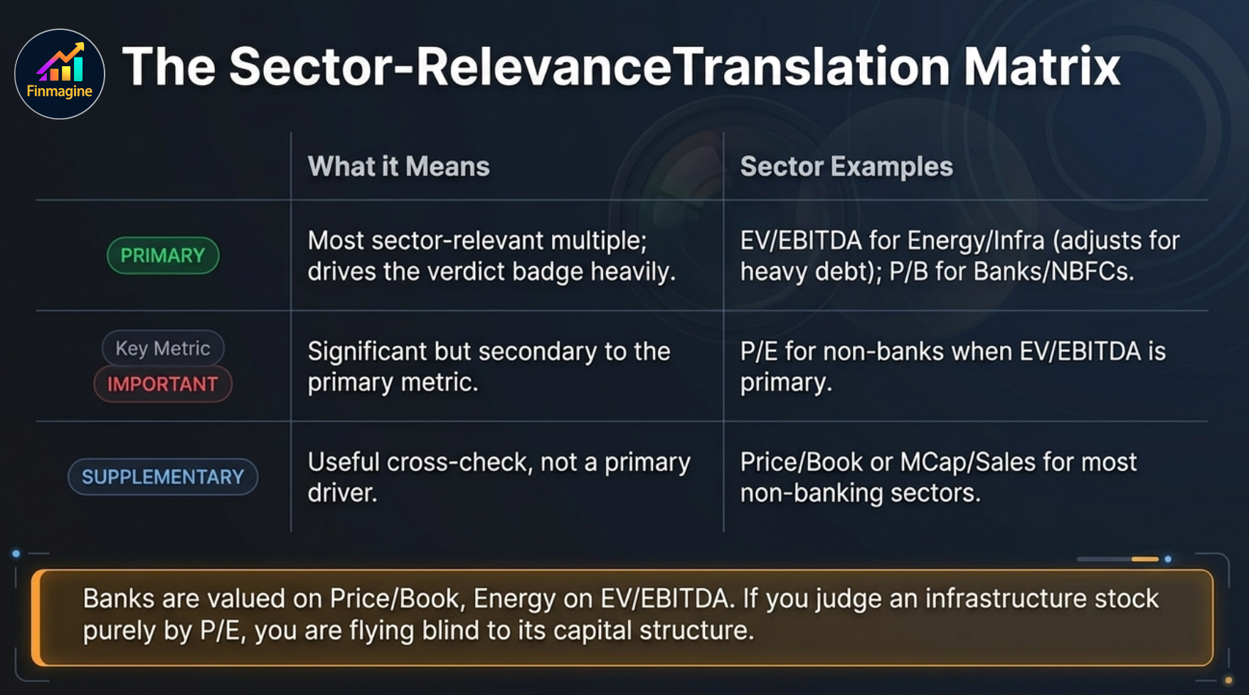
Relevance Tags — What They Mean
Each multiple card has one or two tags on the top right that tell you how important this multiple is for this specific company's sector:
| Tag | Meaning | When You See It |
|---|---|---|
| PRIMARY | Most sector-relevant multiple — drives the verdict badge most heavily | EV/EBITDA for energy/utilities/infra; P/B for banks/NBFCs; PE for most other sectors |
| IMPORTANT | Significant but secondary to the PRIMARY multiple | PE when EV/EBITDA is primary; P/B for profitable non-banks |
| SUPPLEMENTARY | Useful as a cross-check but not a primary driver | P/B and MCap/Sales for most non-banking sectors |
| Not Key Metric | Least relevant for this sector — shown for completeness only | MCap/Sales for sectors where margins are the key driver (not revenue scale) |
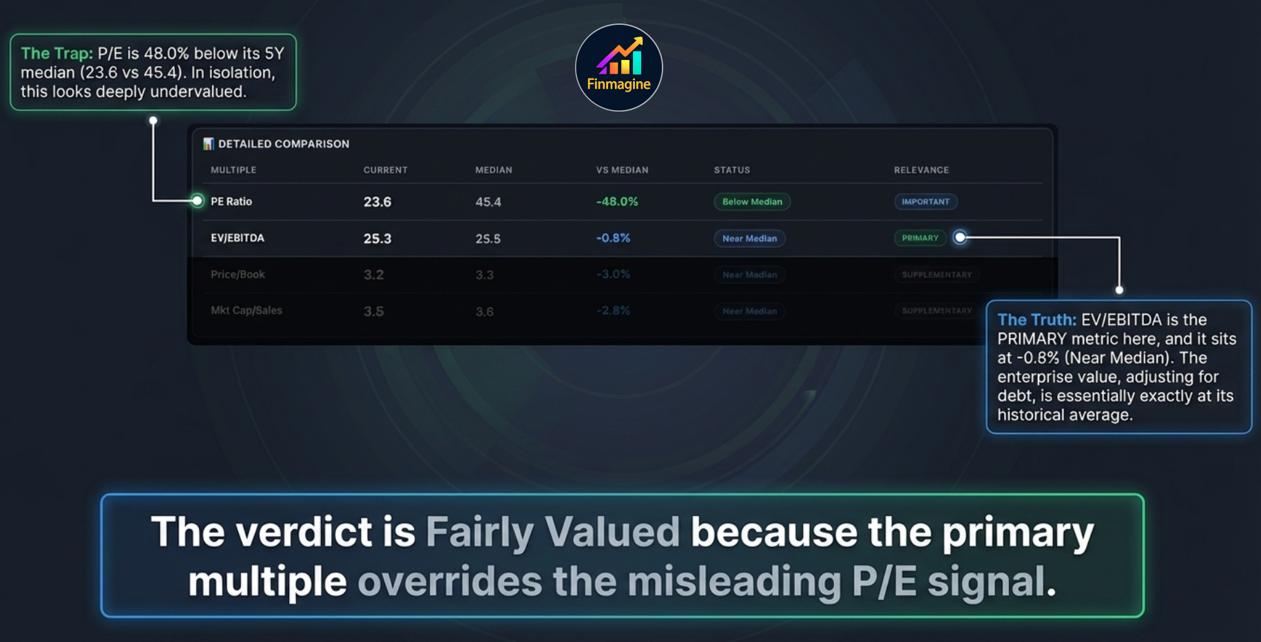
4. Detailed Comparison Table
The Detailed Comparison table shows all four multiples in a single row format with their Current, Median, VS Median (%), Status, and Relevance columns side by side — the most readable format for quickly comparing all multiples simultaneously.
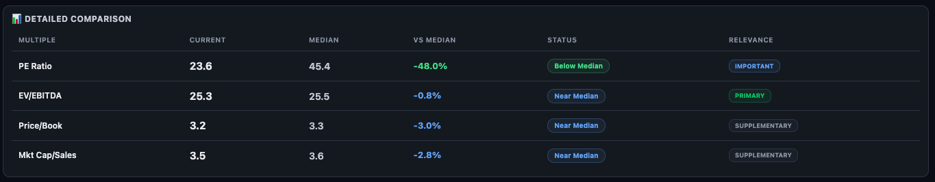
The Status column uses three labels:
- Below Median — current multiple is below 5Y historical median. Generally a positive valuation signal.
- Near Median — within a small band around the 5Y median. Fairly valued on this metric.
- Above Median — current multiple is above 5Y historical median. The market is applying a premium relative to history.
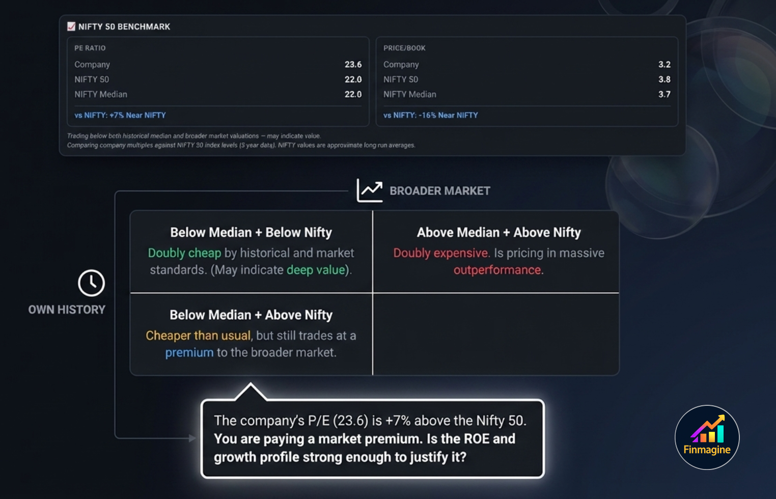
5. Nifty 50 Benchmark
The Nifty 50 Benchmark section adds a market-relative dimension to the analysis. Rather than comparing the stock only against its own history, it compares PE and P/B against the Nifty 50 index's current levels and long-run median.
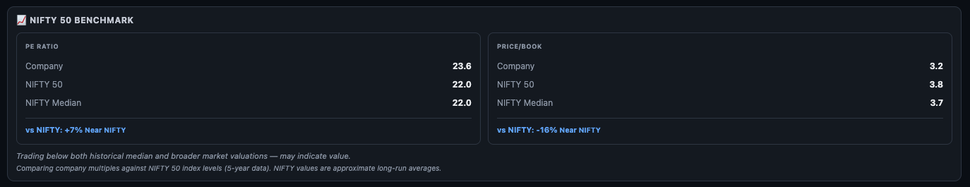
Each panel shows:
- Company — the current multiple for this specific stock
- NIFTY 50 — the current Nifty 50 index PE or P/B
- NIFTY Median — the long-run (5-year) median for the Nifty 50 on that multiple
- vs NIFTY — the percentage difference between the company multiple and the current Nifty 50 level, with a descriptive label
The narrative text below the two panels synthesises the comparison: "Trading below both historical median and broader market valuations — may indicate value." Read this as a starting observation, not a recommendation.
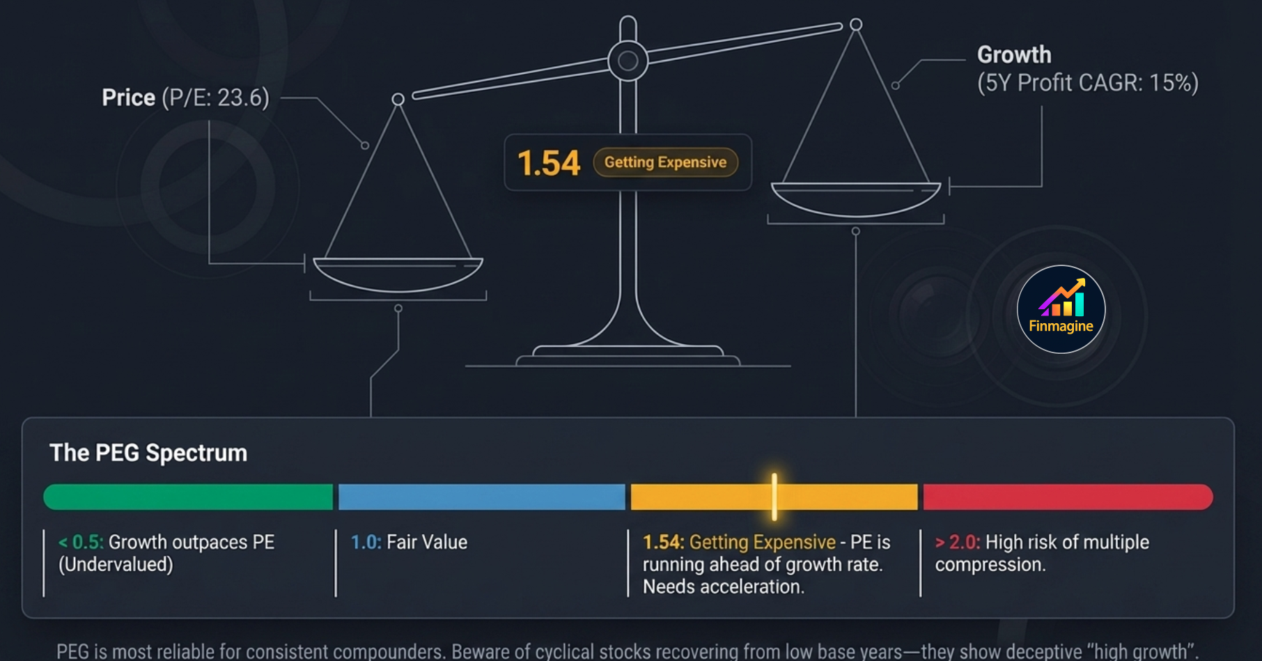
6. PEG Ratio
The PEG (Price/Earnings to Growth) ratio adds a growth dimension to the PE. A high PE can be justified if the company is growing fast; a low PE may still be expensive if growth is minimal. PEG normalises for this.
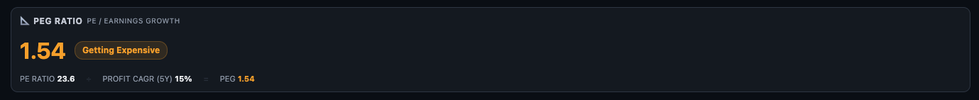
Formula: PEG = Current PE ÷ 5Y Profit CAGR (%)
| PEG Range | Label | Interpretation |
|---|---|---|
| Below 0.5 | Very Attractive | Growth significantly outpaces the PE — potentially deeply undervalued on a growth-adjusted basis |
| 0.5 – 1.0 | Attractive | Growth justifies (and exceeds) the PE premium — good value for a growth investor |
| 1.0 – 1.5 | Fairly Valued | PE is broadly in line with growth — a fair price for the growth delivered |
| 1.5 – 2.0 | Getting Expensive | PE is running ahead of the growth rate — needs growth acceleration to sustain the multiple |
| Above 2.0 | Expensive | PE significantly overstates the growth justification — high risk of multiple compression |
7. Reversed DCF
The Reversed DCF flips the standard DCF model. Instead of computing a target price from an assumed growth rate, it answers: "What growth rate is the current market price already pricing in?"

The statement reads: "At ₹1,305, market pricing in 6.1% annual PAT growth over 5 yrs (12% discount, exit PE 23.6x) · 5Y actual: 15.3% (below history)"
Three inputs drive the Reversed DCF:
- Current price — what the market is paying today
- Discount rate — 12% (approximate cost of equity for Indian markets)
- Exit PE — the assumed PE at the end of the 5-year period (uses current PE)
8. Scenario Valuation
The Scenario Valuation is a forward-looking model that shows 3-year target prices across three scenarios — Bull, Base, and Bear. It is the most interactive section in the entire Valuation sub-tab.
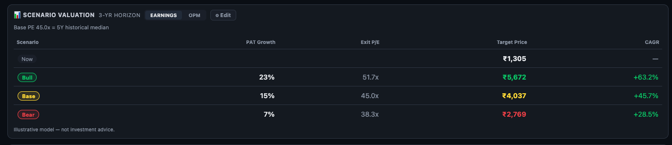
Default Scenarios
All three scenarios default to the 5Y historical median PE as the base (45.0x). Bull adds a PE premium (51.7x = +15%); Bear applies a discount (38.3x = −15%). PAT growth assumptions are seeded from the historical 5Y CAGR — the Base matches history, Bull is above, Bear is below.
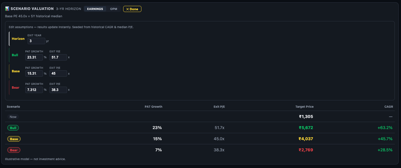
EARNINGS vs OPM Mode
The header shows two toggles — EARNINGS and OPM:
- EARNINGS mode — you input PAT Growth % and Exit PE directly for each scenario. Best when you have a view on bottom-line earnings growth.
- OPM mode — you input Revenue Growth and Operating Profit Margin % for each scenario. Finmagine computes projected PAT from those inputs. Best when you have a margin expansion or compression thesis.
OPM Mode — Margin-Based Scenarios
Switch to OPM mode when your thesis is about margins, not just earnings. For example: a company where raw material costs are falling (margin expansion thesis) or a company facing pricing pressure (margin compression risk). Enter your Revenue Growth assumption and target OPM % — Finmagine calculates PAT automatically and derives the 3-year target prices.
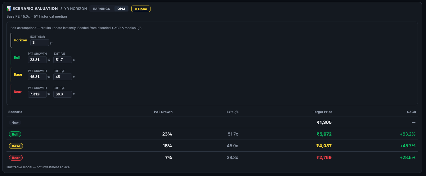
Edit Mode
Click the Edit button to open the editable inputs:
- Horizon — the number of years for the scenario (default 3, adjustable)
- Bull / Base / Bear PAT Growth % — your assumed annual PAT growth for each scenario
- Bull / Base / Bear Exit PE — the P/E multiple you assume the market will apply at the end of the horizon
Results update instantly. Click Done to lock the inputs and return to the clean table view.
9. Case Study — The Fairly Valued Paradox
This is one of the most common traps in retail investing: a stock trading at a 48% discount to its 5-year median PE looks like an obvious buy. The Valuation Zone bar is deep green. The Valuation Zone says "Very Attractive." Every instinct says this is cheap.
But the overall verdict badge says: Fairly Valued.
How is that possible? Walking through this specific example explains exactly why single-metric analysis fails — and why the seven-lens framework exists.

Lens 1 — The Zone Bar Creates a False Signal
The Valuation Zone uses Current EPS × 5Y Median PE to compute fair value. The five-year median PE for this company is 45.4x. At a current PE of 23.6x, the stock appears to be priced at exactly half its historical valuation. The Zone bar correctly shows this — it is doing its job. The problem is what the Zone bar cannot see: the company's debt load.
Lens 2 — EV/EBITDA Corrects for Debt
The verdict card adds the crucial context: this is an energy/infrastructure stock and EV/EBITDA is tagged PRIMARY. EV (Enterprise Value) = Market Cap + Net Debt. Unlike PE, which is calculated purely on equity, EV/EBITDA includes the company's entire debt burden. A company that looks cheap on PE because its equity is depressed may actually be fairly priced once you account for the full capital structure.
In this case, the EV/EBITDA sits at −0.8% vs its 5Y median — essentially exactly at its historical level. The "cheapness" on PE is entirely explained by the debt the market has already priced in. Judging the stock solely on its equity is like weighing a golden idol without accounting for the hidden iron anvil underneath.
Lens 3 — The Detailed Comparison Isolates the Outlier
The Detailed Comparison table shows all four multiples side by side. Three of four (EV/EBITDA, P/B, MCap/Sales) are Near Median. Only PE is an outlier — and it is the one metric that ignores debt entirely. This view makes the pattern instantly obvious: PE is the lone dissenting voice in a chorus of "fairly valued" signals.
Lens 4 — The Nifty 50 Check Reveals a Market-Relative Premium
Comparing internally (vs. its own history) says the stock is historically cheap. But comparing externally (vs. the broader market) reveals something counter-intuitive: the stock's current PE of 23.6x is higher than the Nifty 50 at 22.0x — a 7% premium over the index. A company with a depressed share price and high debt is commanding a market-relative premium. That premium needs a clear justification.
Lens 5 — PEG Confirms the PE is Not Cheap on a Growth-Adjusted Basis
PEG = PE ÷ 5Y Profit CAGR = 23.6 ÷ 15 = 1.54. At 1.54 the label is "Getting Expensive" — the PE is not justified by the growth rate. Even though 23.6x feels low in absolute terms, a company growing profits at 15% per year does not get a discount multiple — it gets a fair multiple. The PEG confirms that the PE is not genuinely cheap once you factor in what the company's growth rate actually warrants.
Lens 6 — Reversed DCF Reveals the Pessimism Premium
This is where the picture gets genuinely interesting. After five lenses that progressively deflated the "very cheap" narrative, the Reversed DCF delivers a key insight: the market is pricing in only 6.1% future growth against a 15.3% historical track record. The gap between what the market expects (6.1%) and what the company has historically delivered (15.3%) is large and measurable. That gap represents the market's pessimism — and it represents a margin of safety for any investor who believes the company will revert toward its historical growth rate.
The multi-lens system has now done something remarkable: it found the scenario where the stock is genuinely interesting. Not because it is cheap on PE — that was a debt-distorted illusion. But because the forward-looking price already assumes the company will grow at less than half its historical rate.
Lens 7 — Scenario Valuation Defines the Risk/Reward
The Scenario Valuation stress-tests the thesis: if the company grows PAT at only 7% (Bear) with a discounted exit PE of 38.3x, what is the 3-year return from ₹1,305? The answer: +28.5% CAGR. The Base case (15% growth, 45x PE) delivers +45.7%. The Bull case (23% growth, 51.7x PE) delivers +63.2%.
Even under the most pessimistic scenario modelled, the return is strongly positive. This is the analytical conclusion: the initial 48% PE discount was a misleading signal. The real opportunity lies in the deeply pessimistic growth assumption baked into the current price — and the asymmetric upside if that pessimism proves excessive.
Summary — Workflow for the Fairly Valued Paradox
How to Use the Valuation Sub-Tab
Step 1 Read the Valuation Zone first. Very Attractive or Attractive = below its historical fair value. Very Expensive = stretched. But check the sector note — if EV/EBITDA is primary, the PE-based zone may not be the right lead metric.
Step 2 Check the overall verdict badge and coverage. If only 2 of 4 multiples are rated (e.g. PE missing due to losses), the verdict is less reliable. "1 Below Median" vs. "3 Below Median" out of 4 tells a different story.
Step 3 Focus on the PRIMARY multiple. Ignore the "Not Key Metric" multiple for your core verdict. Look at the PRIMARY and IMPORTANT multiples — if both are near or below median, valuation looks reasonable; if both are above median, the stock is expensive.
Step 4 Cross-check with Nifty 50. A stock that is Below Median on its own history AND below the Nifty 50 multiple is doubly cheap by historical standards. A stock above its own median AND above Nifty 50 is doubly expensive.
Step 5 Run the Reversed DCF sanity check. If implied growth << actual historical growth, the price is pricing in pessimism — margin of safety exists. If implied growth > historical, the market is already pricing in acceleration — little margin of safety.
Step 6 Use Scenario Valuation for risk/reward framing. The Bear case gives you the downside. The Base case gives you the expected return if the business performs as it has historically. The Bull case gives you the upside. If the Bear case still shows a positive 3-year CAGR and the base case is compelling, the risk/reward looks attractive.
| What You See | What It Means | Next Step |
|---|---|---|
| PRIMARY multiple Below Median | Core valuation metric cheaper than usual for this company | Check Reversed DCF — is the market pricing in lower-than-historical growth? |
| PE very low but EV/EBITDA Near Median | Apparent cheapness on PE not confirmed by enterprise value metric — likely high debt | Check D/E ratio in Ratios tab and debt structure in Financials |
| PEG above 2.0 | Growth does not justify the PE — multiple compression risk | Check if recent 1Y CAGR is accelerating (could justify higher PEG) in Quick Analysis |
| Implied growth > actual historical growth in Reversed DCF | Market is pricing in acceleration beyond what the company has delivered | High-risk entry — only appropriate with a specific catalyst thesis |
| Bear scenario CAGR still positive | Even in the worst-case modelled scenario, 3-year return is positive | Attractive risk/reward — validate fundamentals with Quick Analysis score |
Ready to Analyse Indian Stocks Like a Pro?
Finmagine gives you 30+ computed financial ratios, sector benchmarks, FII/DII flows, the Finmagine Score, and AI-powered analysis — all in one place.