Following along? Open the live page
Finmagine — free to explore • premium for full access • no app needed
1. What Is the Peers Tab?
Every company exists inside a competitive universe. A 20% operating margin sounds impressive in isolation — but if every peer in your sector runs at 30%, the story changes. The Peers tab answers the question that fundamentals alone cannot: how does this company stack up inside its own sector?
The tab is organised into three sub-views:
- Charts — multi-metric radar positioning + Peer RS Rank table (sorted by RS Rating) + single-metric bar rankings
- All Ratios — full 31-ratio comparison table, colour-coded by quality tier
- Returns — price return comparison across all sector peers
The peer group is drawn from the company's industry sub-sector. TCS, for instance, sits in IT-Software (Information Technology) — a group of 20–23 companies. Finmagine computes all metrics from the same underlying dataset so comparisons are apples-to-apples.
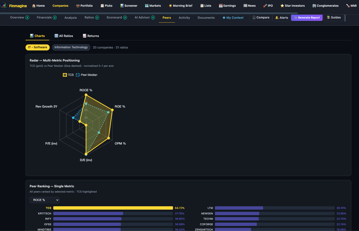
2. Charts View: The Radar Chart
The radar chart gives you a six-dimensional view of competitive positioning in a single glance. Your stock (yellow polygon) is overlaid on the Peer Median (blue polygon). The larger and more outward-reaching your yellow polygon, the stronger the multi-metric positioning.
The six radar metrics
- ROCE% — Return on Capital Employed. Are they generating strong returns on the money deployed in the business?
- ROC% — Return on Capital (tighter definition, excludes goodwill/intangibles in some contexts). Useful alongside ROCE for capital-light vs capital-heavy comparisons.
- OPM% — Operating Profit Margin. How efficiently does the company convert revenue to operating profit?
- D/E Ratio — Debt-to-Equity. Inverted axis — a low D/E plots further from the centre (better).
- Rev Growth 5Y — Revenue CAGR over five years. Is the company growing faster than its peers?
- P/E — Price-to-Earnings. Normalised against peers — a high P/E relative to sector suggests premium valuation.
Reading the radar shape
Look for two patterns:
- Yellow clearly outside blue on most spokes — the company leads its sector across the majority of dimensions. This is the profile of a sector quality leader.
- Yellow inside blue on one spoke, outside on others — the company has a specific weakness. A stock with strong ROCE and OPM but a small polygon on Rev Growth 5Y is a profitable but slow-growing business. Worth investigating why growth has lagged.
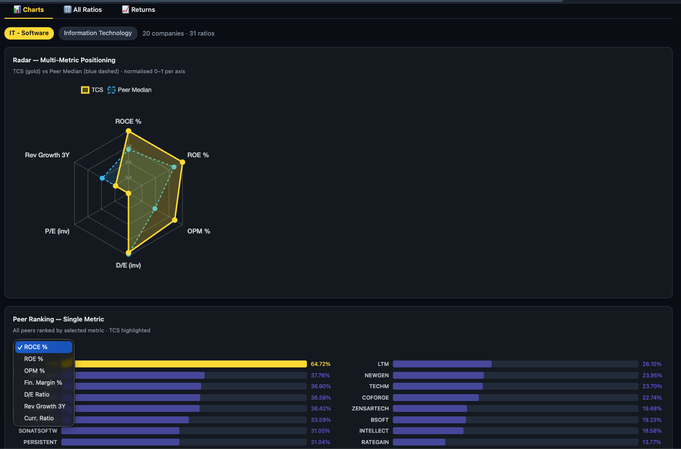
3. Single Metric Rankings
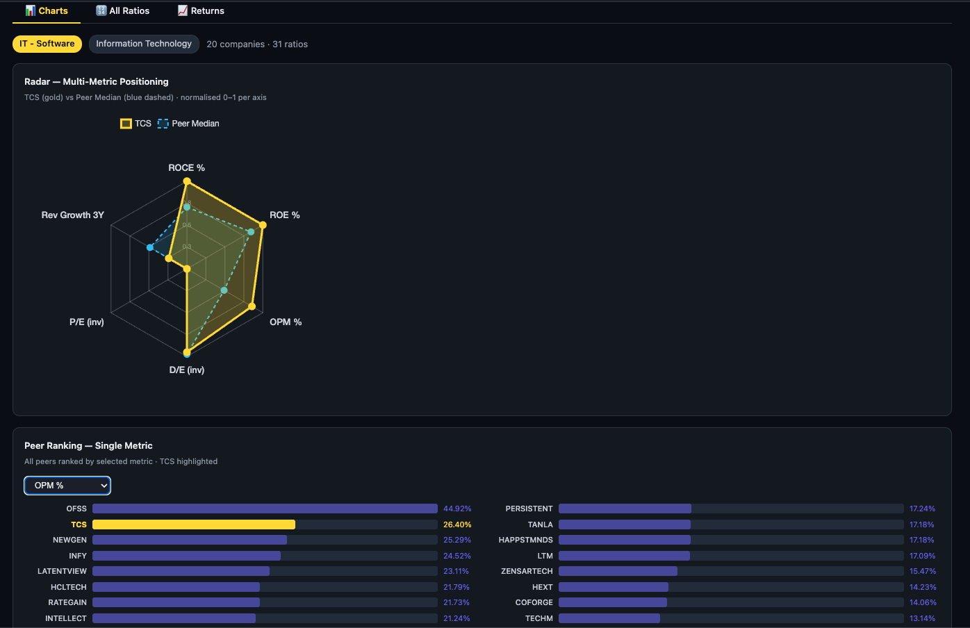
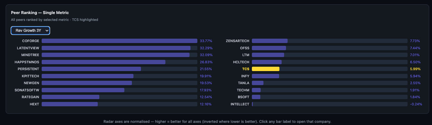
Below the radar chart, a dropdown lets you pick any single ratio and instantly see a full horizontal bar ranking of all peers. This is where contextual intelligence happens — you stop seeing a number in isolation and start seeing a rank.
How to use the ranking dropdown
- Select the metric you care about from the dropdown (e.g., OPM%, ROCE%, Rev Growth 3Y, D/E Ratio).
- Bars re-render immediately, sorted from highest to lowest.
- Your stock is highlighted in yellow — scan quickly to see whether it is in the top quartile, middle, or lagging.
- Click any bar label to open that company's full analysis page.
Which metric to rank by?
- ROCE% — quality screen: find capital-efficient operators in the sector
- OPM% — margin screen: identify who has pricing power or operational discipline
- Rev Growth 3Y — growth screen: find the fastest-scaling businesses
- D/E Ratio — safety screen: find who is deleveraging or already debt-free
- P/E — valuation screen: identify relative cheapness vs expensive peers
3b. Peer RS Rank — Relative Strength in Your Sector
Alongside the fundamental radar, the Peers tab now shows each peer's RS Rating — an IBD/O'Neil-style percentile score that ranks a stock's 12-month price performance against the entire Nifty 500 universe. This tells you not just what the business has earned, but what the market has chosen to reward.
How RS Rating is computed
Finmagine uses a four-quarter weighted formula identical to IBD's original approach. The most recent quarter carries double weight:
Q3 return = Price 3m ago / Price 6 months ago − 1
Q2 return = Price 6m ago / Price 9 months ago − 1
Q1 return = Price 9m ago / Price 12 months ago − 1
raw score = (2×Q4 + Q3 + Q2 + Q1) / 5
RS Rating = percentile rank of raw score within Nifty 500 universe (1–99)
The final score is a percentile rank — not an absolute return. A stock with RS 92 has outperformed 92% of Nifty 500 companies on this weighted trailing-year return measure, regardless of what the market did in absolute terms.
Reading the RS Rating badge
Each peer's RS Rating appears as a circular badge in the peer table, colour-coded by tier:
The "RS Rank #N in sector" label
Your stock's row in the peer table shows a label like "RS Rank #3 in IT-Software". This tells you how your stock ranks by relative price strength within its own sub-sector — a more actionable signal than the absolute 1–99 score, because sector context matters. An RS 65 stock that ranks #2 in its 18-peer sector is leading its industry even if it is not in the overall Nifty 500 elite tier.
How to use Peer RS Rank
The peer table defaults to sorting by RS Rating descending — the strongest relative-price-strength companies in the sector appear first. This immediately answers the question: "Which peers is the market currently betting on?"
| What you see | What it means | What to do |
|---|---|---|
| Your stock RS 80+, ROCE ≥ 20%, top 3 in sector | Market is rewarding fundamental quality — high conviction signal | Check valuation. If not extended, this is a confirmation to hold or add. |
| Your stock RS 30–50, peers RS 70–90 | Peers are being rewarded while your stock lags — investigate why | Open the single-metric ranking on ROCE and OPM. Is the lag fundamental or just slower re-rating? |
| Your stock RS 80+, ROCE below peer median | Price leading fundamentals — possible over-anticipation or sentiment rally | Check valuation carefully. Strong RS without fundamental backing can reverse sharply. |
| Your stock RS 25, but ROCE Excellent, OPM top quartile | Fundamentals strong, price lagging — classic value signal | Check for a specific reason for the underperformance (management issue, sector rotation, temporary earnings miss). If none, monitor for RS recovery. |
4. All Ratios View
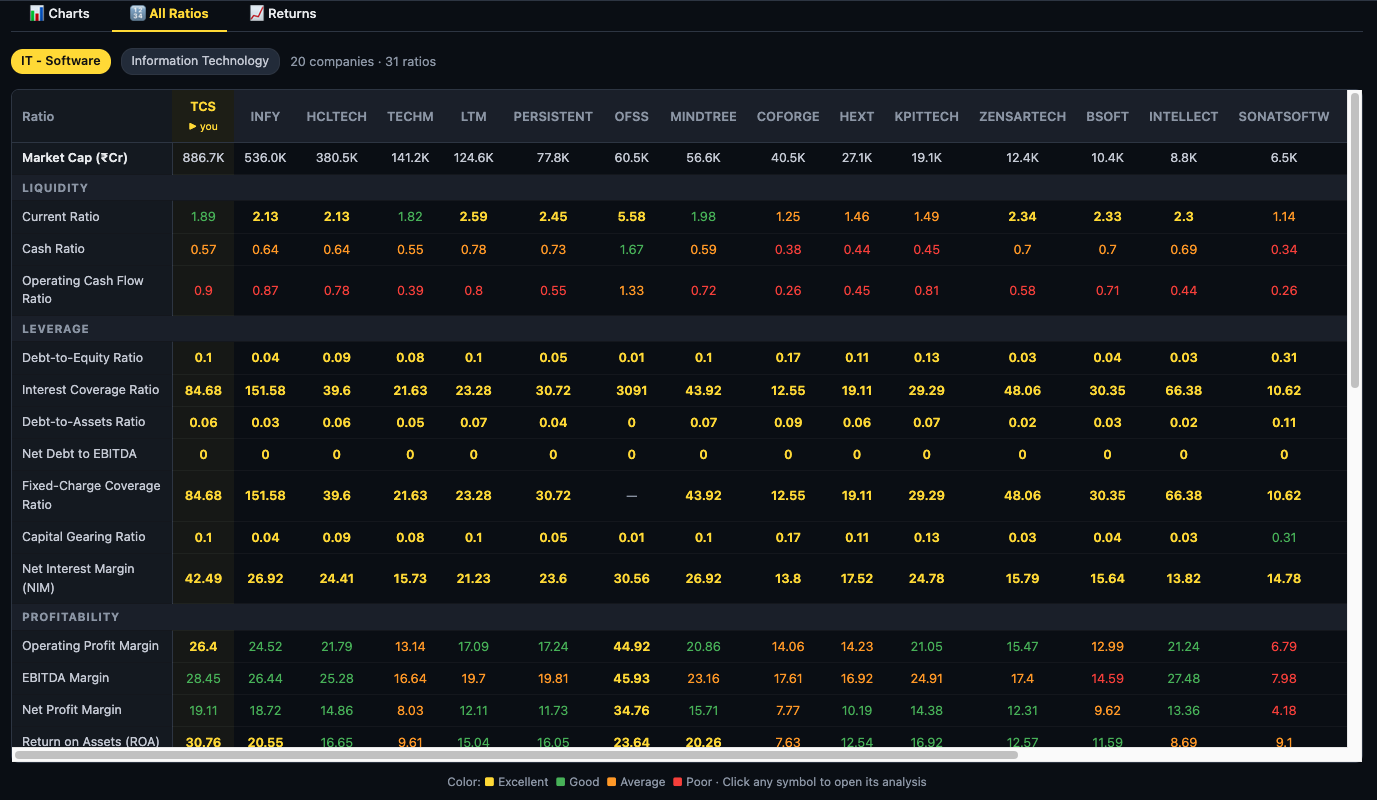
The All Ratios sub-tab is the deepest view in the Peers tab. It shows every peer side-by-side across 31 ratios, grouped into three analytical categories, with each cell colour-coded so you can scan across a row instantly rather than reading individual numbers.
The colour coding system
Thresholds are set per ratio category, not uniformly — a "Good" Current Ratio uses different absolute thresholds than a "Good" ROCE%, because what counts as healthy varies by metric. This makes the colour coding meaningful rather than decorative.
The three ratio groups
| Group | Ratios covered | What to look for |
|---|---|---|
| Liquidity | Current Ratio · Cash Ratio · Operating Cash Flow Ratio | Is the company meeting short-term obligations comfortably? High cash ratio peers face no near-term stress. |
| Leverage | Debt-to-Equity · Interest Coverage · Assets-to-Debt · Net Debt to EBITDA · Fixed-Charge Coverage · Capital Gearing · Net Interest Margin | Who carries the most debt risk? Find peers with the highest interest coverage and lowest D/E — these are the most recession-resilient businesses. |
| Profitability | Operating Profit Margin · Net Profit Margin · Return on Assets · Return on Equity · and more | Where does your stock rank on true earnings quality? Scan for peers with consistently green profitability cells — these are the margin leaders worth benchmarking against. |
How to read the table efficiently
- Scan your stock's column first. Note which cells are green (strong) and which are red (weak). This gives you the multi-ratio snapshot without reading every number.
- Find the green-column leaders. If a competitor's column is mostly green across all three groups, that is the gold-standard benchmark for the sector — study their business model.
- Look for outliers. A peer with excellent profitability but red leverage ratios is a high-return, high-risk bet. One with green liquidity and leverage but poor profitability is a stable, low-return business.
- Click any symbol to open that company's full analysis page and investigate the ratios in depth.
5. Returns View
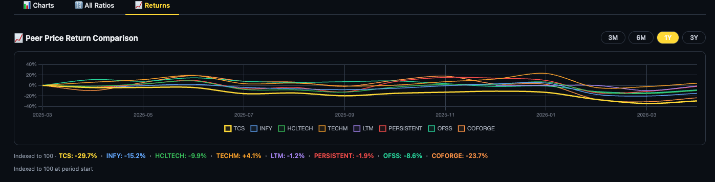
Fundamentals explain what a business is worth; price returns tell you what the market has paid for it. The Returns sub-tab plots the price return of every peer on a single chart so you can see relative performance — who has delivered alpha within the sector, who has underperformed, and whether your stock has decoupled from sector trends.
Using the Returns chart
- YTD toggle — year-to-date. Best for identifying which peers are leading the current market cycle.
- 1Y toggle — trailing 12 months. Smooths out recent volatility to reveal medium-term price leadership.
- 3Y toggle — three-year compounded return. This is the most useful for long-term investors — it shows who has actually compounded wealth at the portfolio level.
What to look for
- Your stock above the median line — it has outperformed most peers. Combined with strong fundamentals, this confirms the market is recognising quality.
- Your stock below most peers despite strong fundamentals — potential undervaluation signal. The business is better than the price reflects.
- All peers moving together — sector-level event (macro, regulation, commodity input price). Your stock's underperformance may be temporary rather than company-specific.
- Your stock diverging positively from all peers — company-specific catalyst. Investigate what drove it: earnings beat, management change, new product cycle.
6. A Four-Step Peer Analysis Workflow
The sub-tabs are most powerful when used in sequence rather than in isolation:
- Step 1 Charts — radar first. Get the holistic multi-metric view. Identify where your stock is clearly stronger than the Peer Median and where it lags. This shapes your hypothesis before any number-reading.
- Step 2 Charts — RS Rank check. The peer table is sorted by RS Rating by default. Find your stock's row and note its RS Rank badge and "#N in sector" label. Is the market currently rewarding your stock more or less than its peers? A fundamental leader that also leads on RS is the highest-conviction setup; a fundamental leader lagging on RS may be a value opportunity — or a warning sign worth investigating.
- Step 3 Charts — single-metric drill. For each area where you want precision (e.g., "where exactly does this company rank on ROCE?"), switch the dropdown and see the ordered list. RS Rating is available as a rankable metric in this dropdown too — useful to isolate the pure price-strength ranking from the default table sort.
- Step 4 All Ratios — deep validation. Scan colour columns to confirm that your stock's quality signals are consistent across 31 ratios, not just the six on the radar. A company that looks good on the radar but has poor leverage scores is a hidden risk.
End with Returns as a sanity check — does the market's price performance broadly track the fundamental quality story you have just built? Large divergences are where the most interesting investment opportunities (or traps) hide.
Ready to Analyse Indian Stocks Like a Pro?
Finmagine gives you 30+ computed financial ratios, sector benchmarks, FII/DII flows, the Finmagine Score, and AI-powered analysis — all in one place.