Following along? Open the live page
Finmagine — free to explore • premium for full access • no app needed
After reading this guide you will be able to:
- Interpret the overall Finmagine™ score — what 7.4 or 4.1 actually means
- Know the five dimensions and their exact contribution weights
- Read the radar chart and spot imbalanced companies
- Drill into the parameter analysis for any dimension
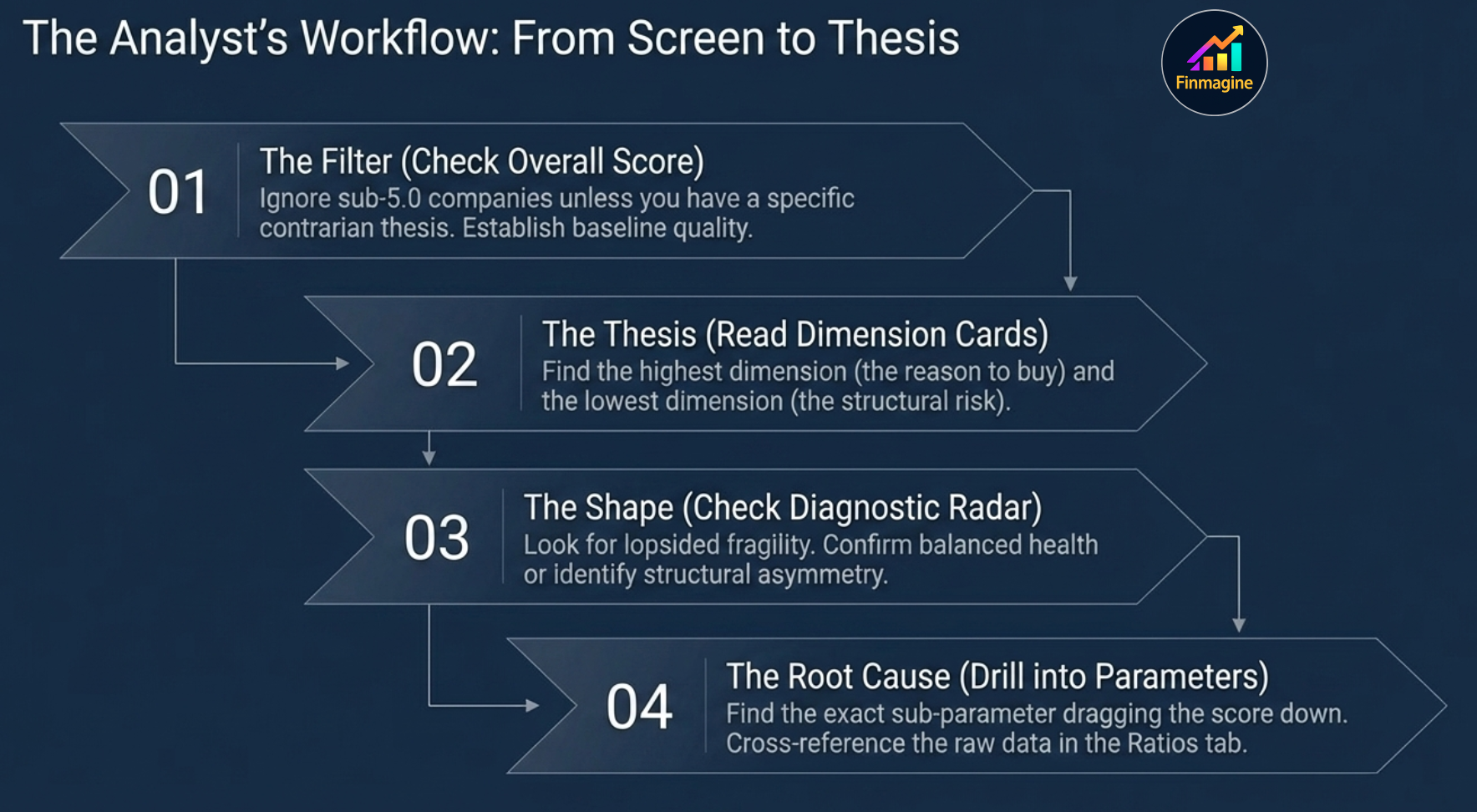
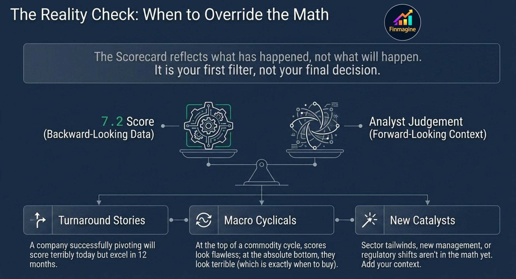
- Understand why the Scorecard and the Ratios tab tell different stories
- Know when to trust the score and when to override it with your own judgement
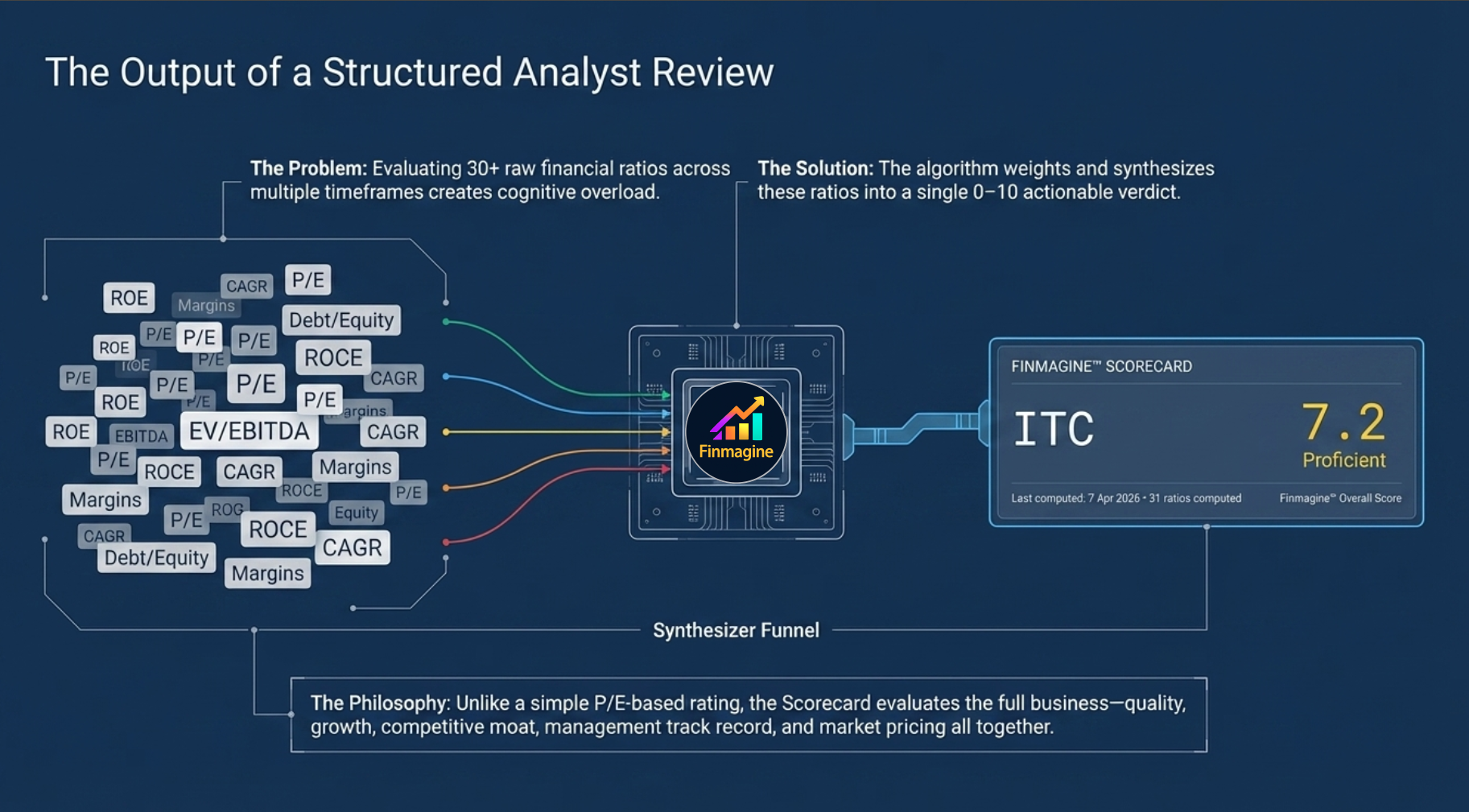
The Hidden Flaw in Stock Analysis (Why Investors Keep Losing Money)
How cognitive overload causes investors to anchor on the wrong numbers — and how the Finmagine™ Scorecard solves it by synthesising 30+ ratios into one structured, weighted verdict.
🎧 The Scorecard Investment Framework
A deep-dive conversation on how the Finmagine™ Scorecard solves the cognitive overload problem in stock research — covering dimension weights, radar chart interpretation, parameter diagnostics, and when to override the math with your own judgement.
Approx. 15–20 minutes · Financial education podcast · No investment advice
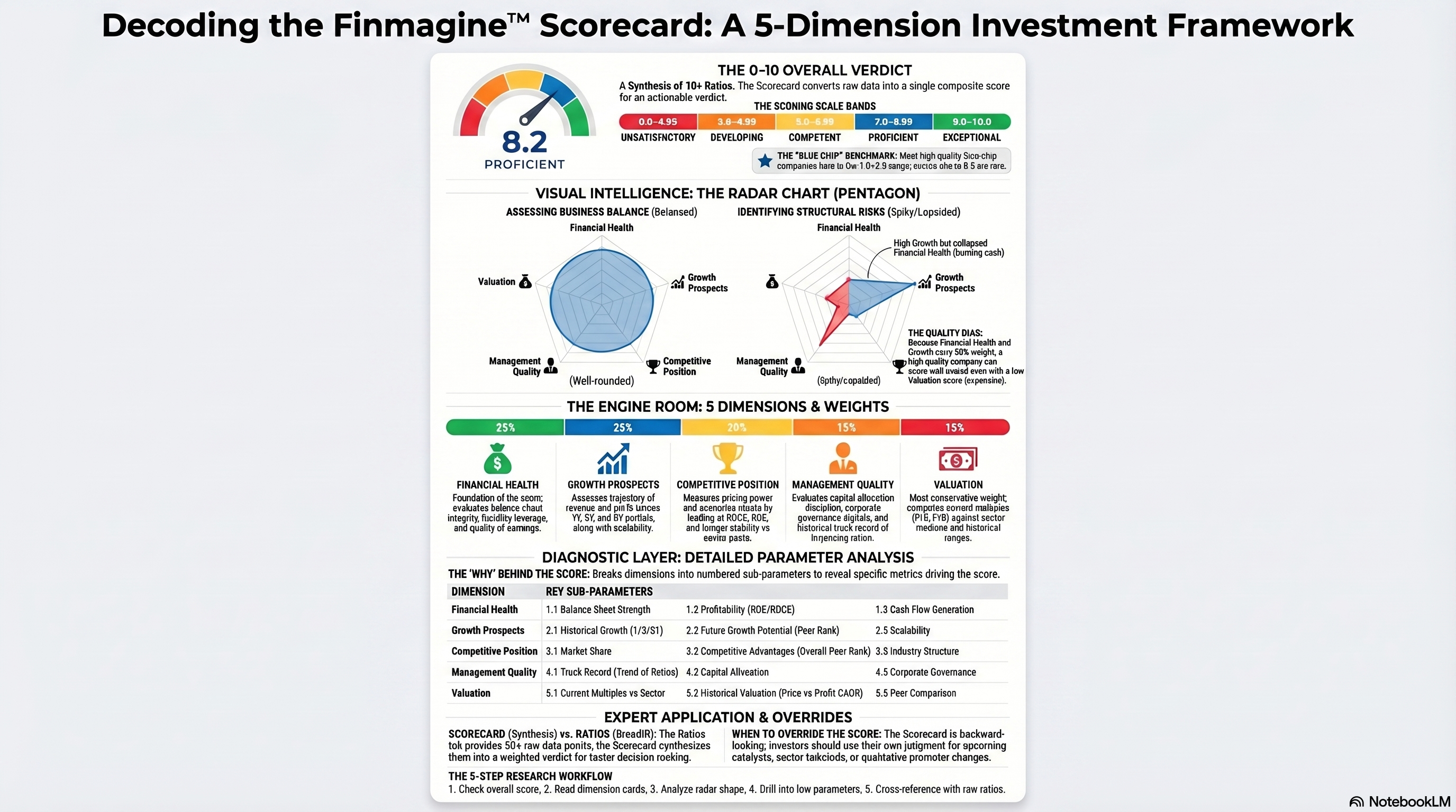
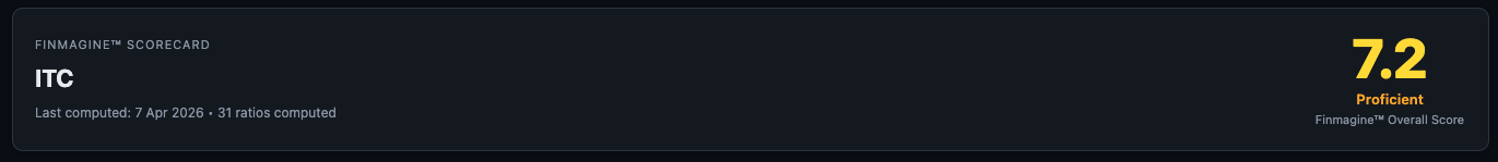
What Is the Finmagine™ Scorecard?
The Finmagine™ Scorecard is a 0–10 composite investment score built from 30+ financial ratios, synthesised across five weighted dimensions. It converts a sprawling set of ratio data into a single actionable verdict — without hiding the underlying detail.
Think of it as the output of a structured analyst review: someone looked at every ratio, weighted it by importance, and gave you a score you can act on. Unlike a simple P/E-based rating, the Scorecard evaluates the full business — quality, growth, competitive moat, management track record, and market pricing all together.
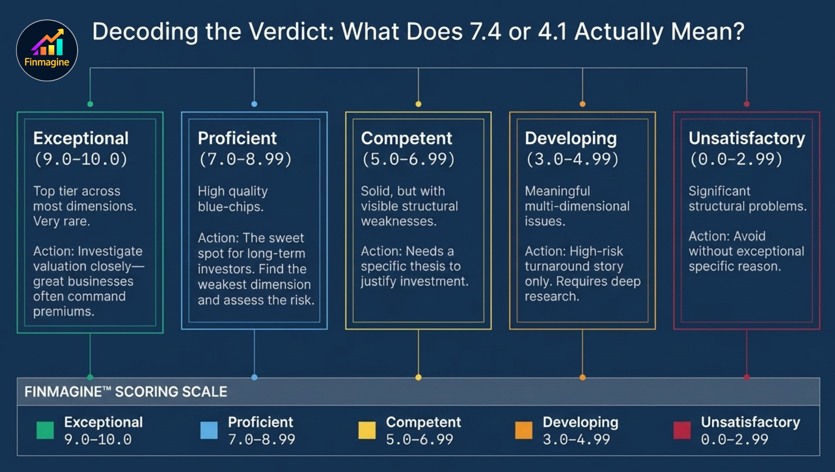
The Scoring Scale
The overall score runs from 0 to 10 and maps to five labels. The label appears directly below the score number in the hero section:

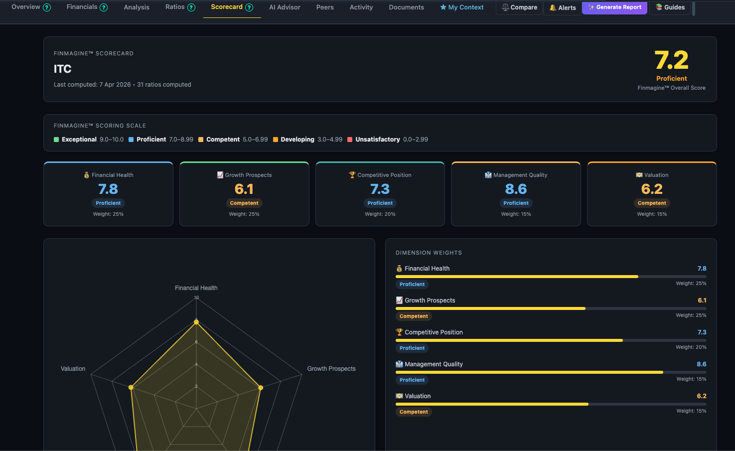
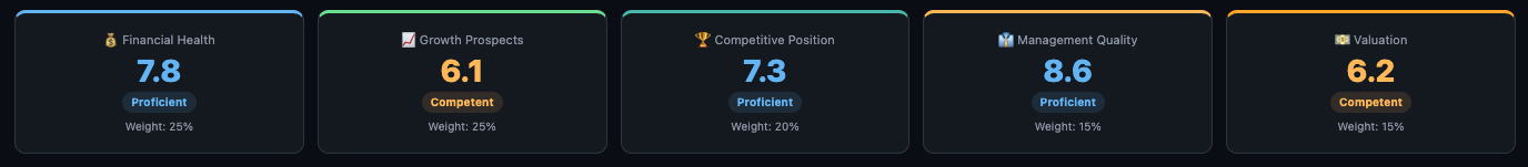
The Five Dimensions
Below the overall score hero, five dimension cards show the individual score and label for each of the five components. Each dimension has a colour-coded top border:
The Radar Chart
Below the dimension cards, a radar chart (pentagon shape) plots all five dimension scores on a single visual. Each axis represents one dimension; the further from the centre, the higher the score.
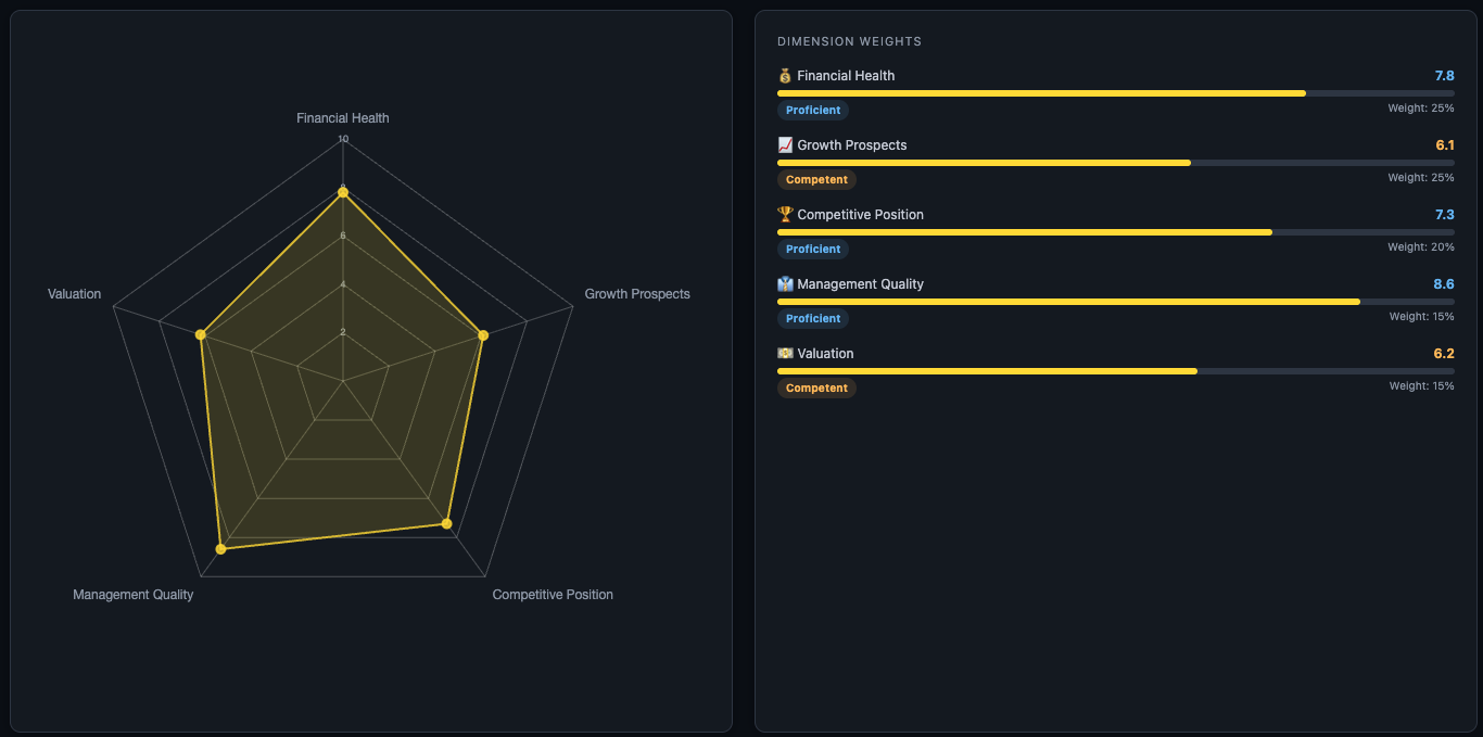
How to Read the Shape
- Near-circular, large pentagon — the company is strong and balanced across all five dimensions. This is a high-quality, well-rounded business.
- Near-circular, small pentagon — consistently weak across all dimensions. Uniform mediocrity.
- Spiky / lopsided shape — the company has a pronounced strength in one or two dimensions and a pronounced weakness in others. Read both carefully: the strength may be the investment thesis; the weakness may be the risk.
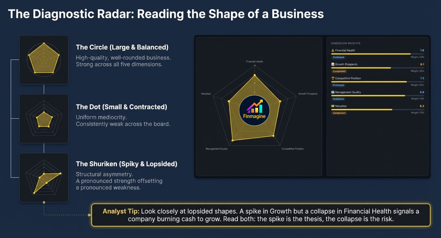
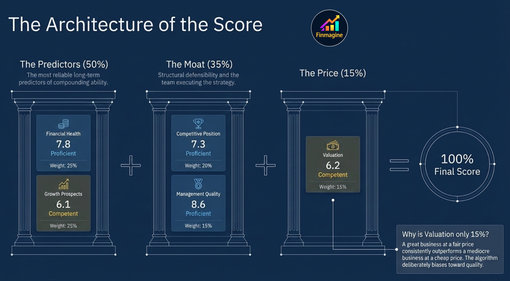
Dimension Weight Bars
Next to the radar chart, a horizontal bar chart shows each dimension's score alongside its weight contribution. This is the transparency layer — you can see that Valuation accounts for only 15% and adjust your interpretation accordingly. A company with a poor Valuation score but excellent scores across the other four dimensions can still reach 7.5+ overall.
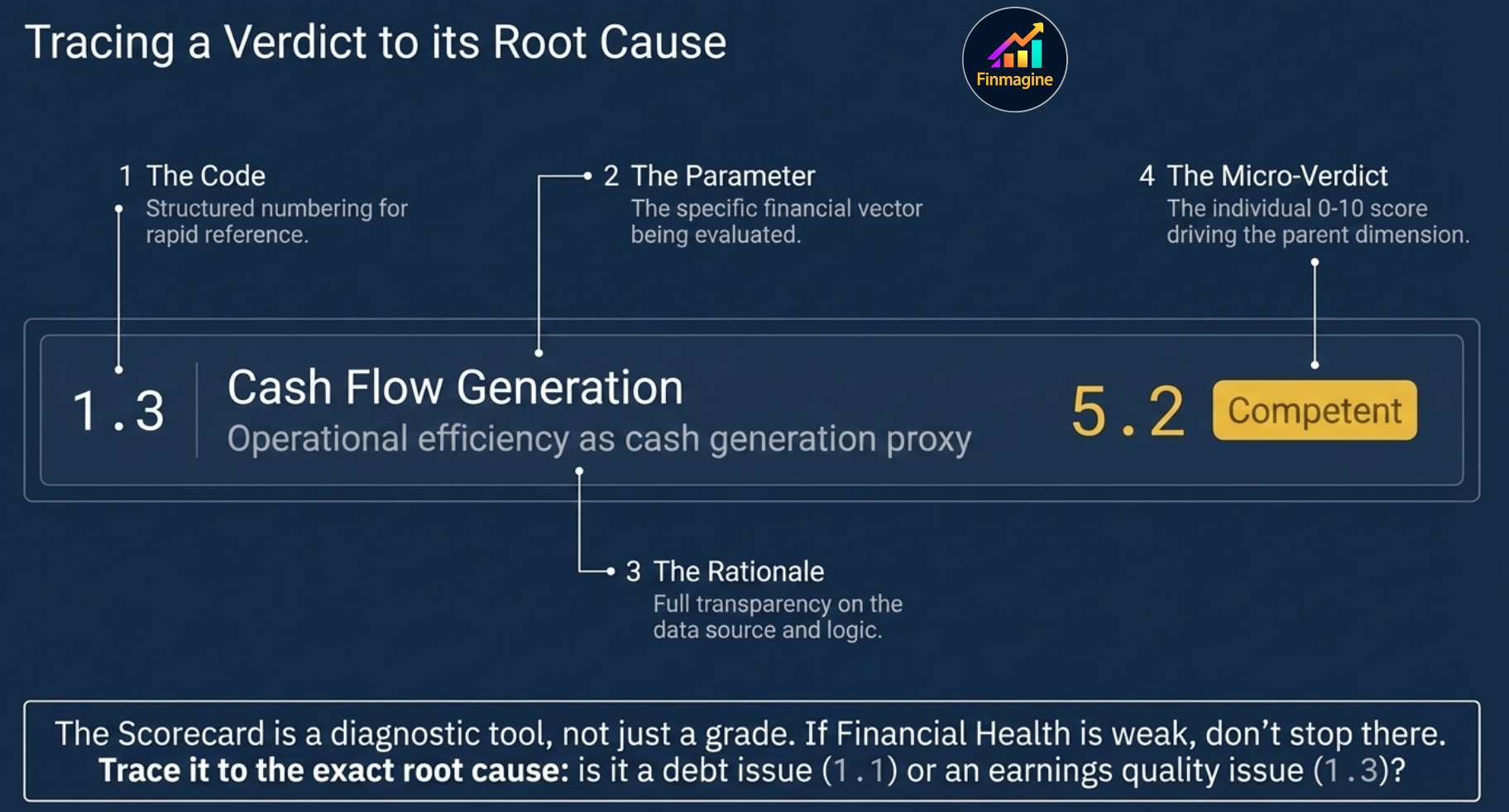
Detailed Parameter Analysis — Inside Each Dimension
Below the radar chart, the Detailed Parameter Analysis breaks each dimension into its individual sub-parameters — each with a numbering code (1.1, 1.2 etc.), a one-line description of the underlying data used, an individual 0–10 score, and a classification badge. This is where the Scorecard stops being a summary and starts being a diagnostic tool.
💰 Financial Health (25% weight)
Tests whether the business foundation is solid — balance sheet integrity, earnings quality, and cash generation.
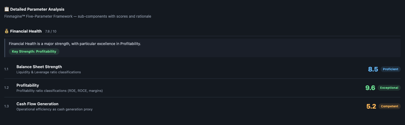
- 1.1 Balance Sheet Strength — Liquidity & Leverage ratio classifications. Measures whether the company has adequate short-term liquidity and sustainable long-term debt levels.
- 1.2 Profitability — Profitability ratio classifications (ROE, ROCE, margins). The most heavily weighted sub-parameter — persistently high ROCE is the single strongest indicator of business quality.
- 1.3 Cash Flow Generation — Operational efficiency as a cash generation proxy. Checks whether reported profits are translating into real cash — a low score here often flags earnings quality issues before they appear in the P&L.
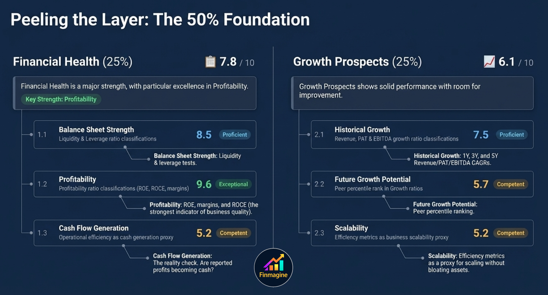
📈 Growth Prospects (25% weight)
Evaluates the trajectory of the business — how fast it has grown historically, whether that growth is durable, and how efficiently it scales.
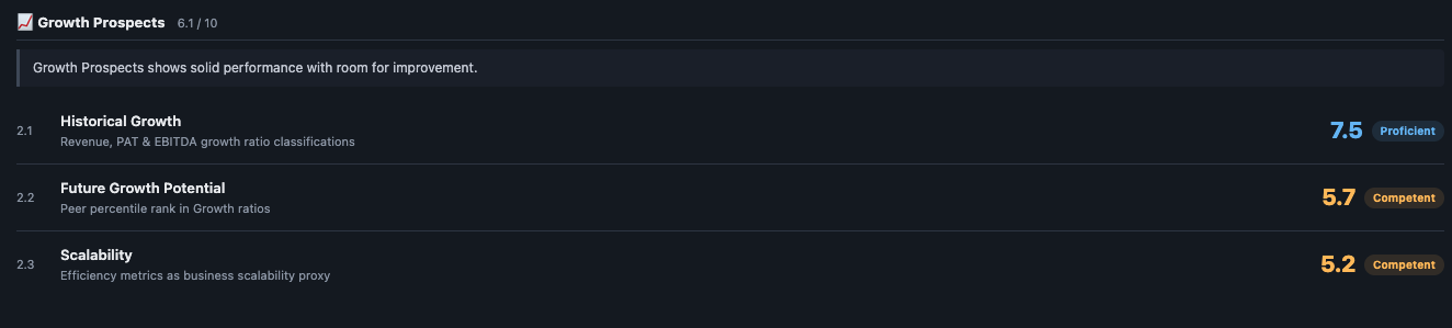
- 2.1 Historical Growth — Revenue, PAT & EBITDA growth ratio classifications across 1Y, 3Y, and 5Y periods.
- 2.2 Future Growth Potential — Peer percentile rank in Growth ratios. How does this company's growth trajectory compare to its sector peers?
- 2.3 Scalability — Efficiency metrics used as a business scalability proxy. A company that improves asset turnover as it grows is scaling efficiently; one that needs more and more assets per rupee of revenue is not.
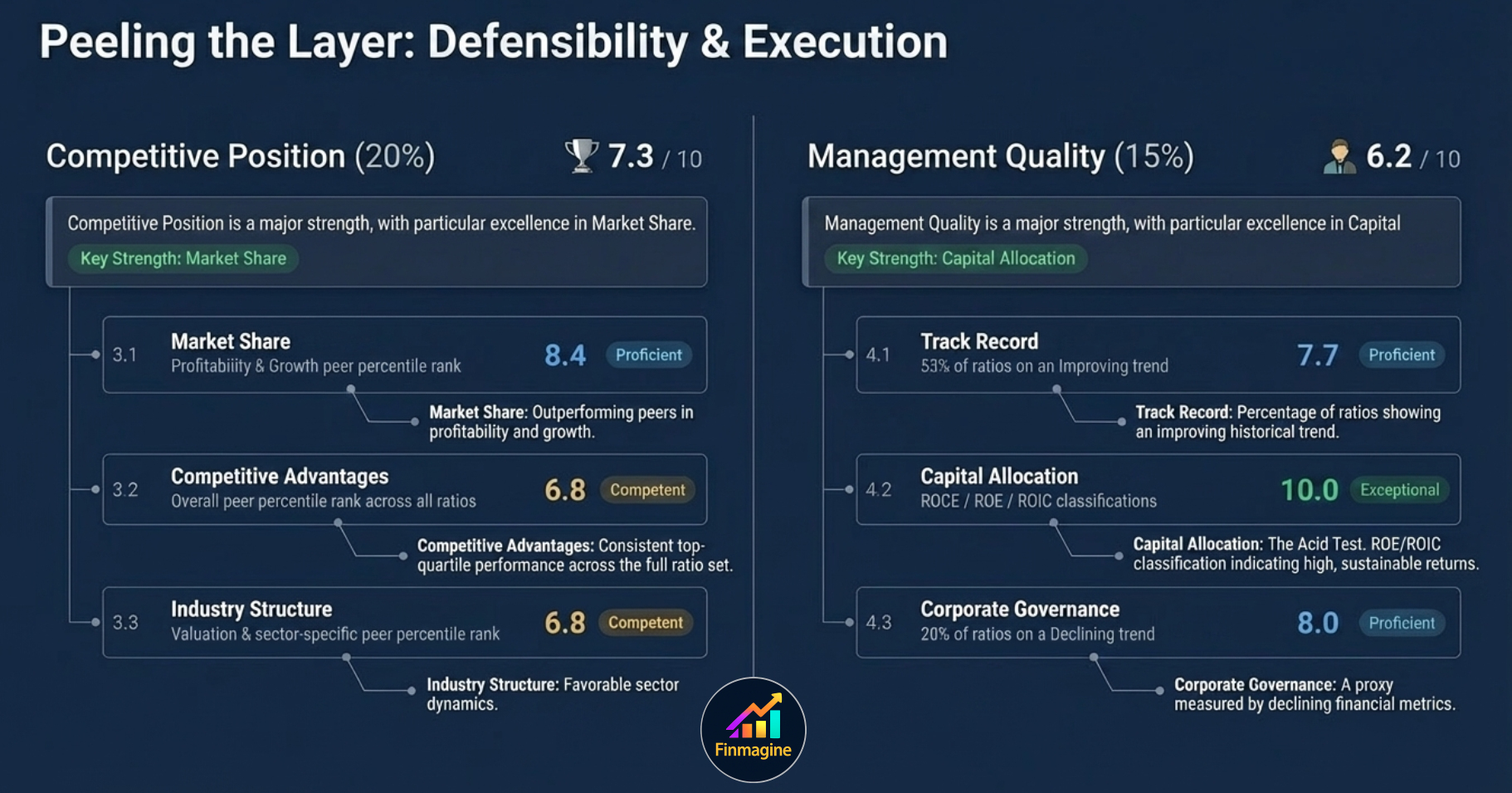
🏆 Competitive Position (20% weight)
Assesses whether the company has a structural edge — does it consistently outperform peers, and is the industry structure favourable?
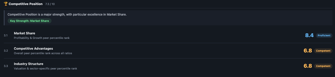
- 3.1 Market Share — Profitability & Growth peer percentile rank. A company that consistently sits in the top quartile of profitability and growth within its sector is likely defending or growing its competitive position.
- 3.2 Competitive Advantages — Overall peer percentile rank across all ratios. A broader view — does the company score well across the full ratio set relative to peers, not just on one or two metrics?
- 3.3 Industry Structure — Valuation & sector-specific peer percentile rank. Even a strong company in a structurally poor industry (commoditised, low-margin) will face ceiling effects on its competitive position score.
👔 Management Quality (15% weight)
Evaluates capital allocation discipline, the historical track record of ratio improvement, and governance signals.
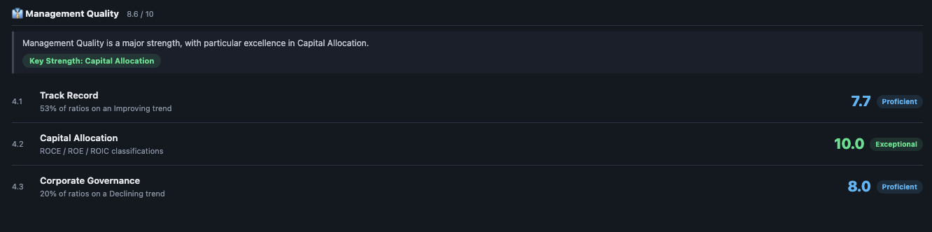
- 4.1 Track Record — What percentage of ratios show an improving trend? A management team that has consistently improved the financial profile over time is demonstrating execution capability, not just inheriting a good business.
- 4.2 Capital Allocation — ROCE / ROE / ROIC classifications. This is the acid test: are returns on invested capital high and sustainable? A 10.0 here (Exceptional) means capital is being deployed with extraordinary efficiency.
- 4.3 Corporate Governance — Percentage of ratios on a declining trend. A proxy for governance quality — if financial metrics are broadly deteriorating, it raises questions about whether management is making decisions in shareholders' interests.
💲 Valuation (15% weight)
Evaluates whether the current market price is reasonable relative to earnings, book value, and historical norms.
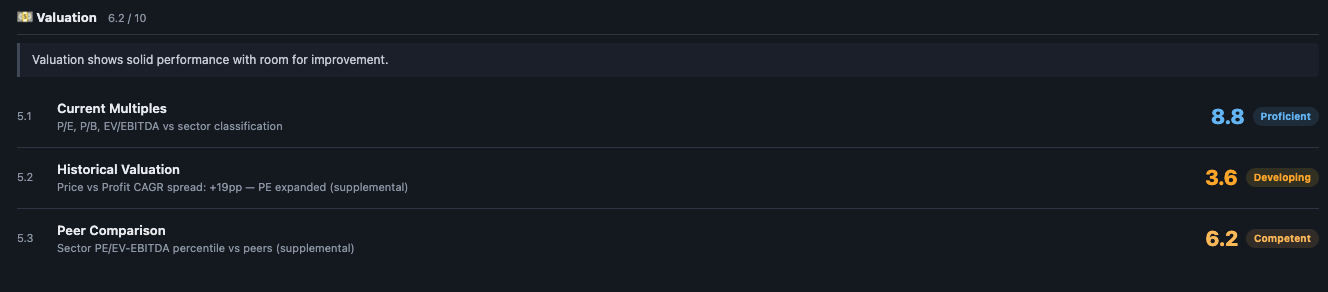
- 5.1 Current Multiples — P/E, P/B, EV/EBITDA vs sector classification. How expensive is the stock relative to its sector median right now?
- 5.2 Historical Valuation — Price vs Profit CAGR spread. If the stock's price has risen significantly faster than profits over multiple years, PE has expanded and the company may be priced to perfection. A positive spread (price CAGR > profit CAGR) is a flag; a negative spread is a potential opportunity.
- 5.3 Peer Comparison — Sector PE / EV-EBITDA percentile vs peers. Supplemental context: is the stock more or less expensive than its direct peers, not just the sector average?
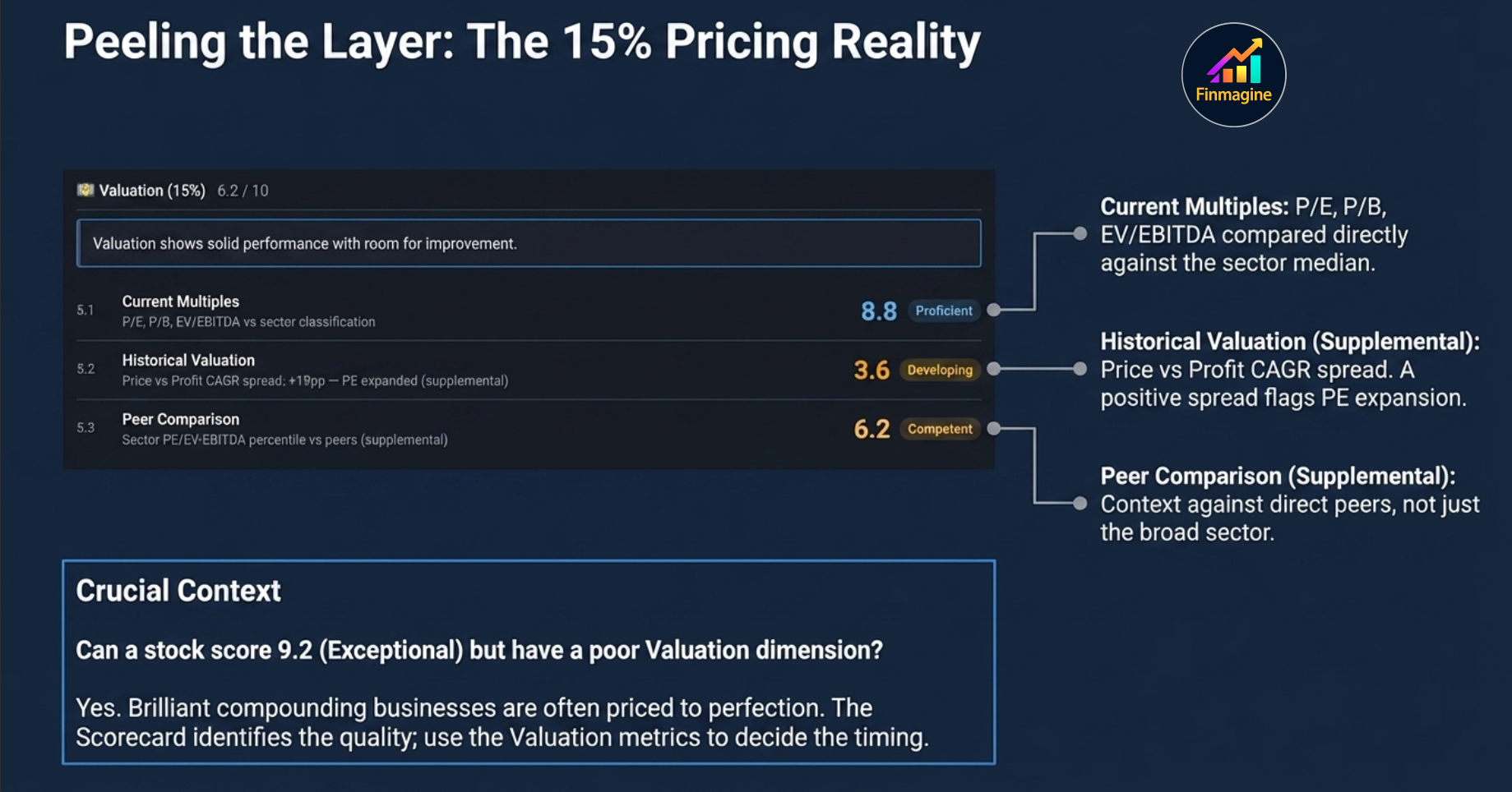
How to Use the Scorecard in Your Research
Step 1 Check the overall score first — is this a business worth spending time on? Below 5.0, you need a specific contrarian thesis. Above 7.5, you are starting from a position of quality.
Step 2 Read the dimension cards — find the highest and lowest scoring dimensions. The highest tells you the investment thesis; the lowest tells you the risk.
Step 3 Look at the radar shape — is it balanced or lopsided? A balanced high score is rare and more dependable. A lopsided shape means the investment thesis is conditional on the weak dimension not worsening.
Step 4 Drill into the lowest dimension via the Parameter Analysis — understand which specific sub-parameter is causing the score to be low. Then cross-reference it in the Ratios tab for the raw data.
Step 5 Remember what the Scorecard doesn't capture — it is entirely backward-looking. It reflects what the business has done, not what it will do. A company about to turn around may score poorly today and well in twelve months. Use the Financials tab to see if the trajectory is improving.
| Score Range | Label | How to Approach It |
|---|---|---|
| 9.0 – 10.0 | Exceptional | Investigate valuation closely — great businesses often command premiums. Check if the high score is sustained over multiple years. |
| 7.0 – 8.99 | Proficient | This is the sweet spot for long-term investors. Understand the weakest dimension and decide if you're comfortable with the risk it represents. |
| 5.0 – 6.99 | Competent | Needs a thesis. Find out what's suppressing the score and whether it's structural (skip) or cyclical (opportunity). |
| 3.0 – 4.99 | Developing | Multiple dimensions are weak. Turnaround story only — high risk, needs deep research. |
| 0.0 – 2.99 | Unsatisfactory | Avoid without exceptional specific reason. The probability of this being a compounding investment is very low. |
Ready to Analyse Indian Stocks Like a Pro?
Finmagine gives you 30+ computed financial ratios, sector benchmarks, FII/DII flows, the Finmagine Score, and AI-powered analysis — all in one place.