🌟 Finmagine Portfolio Manager — Now on the Chrome Web Store
Multi-broker tracker: Indian & global stocks, MFs, ETFs • Decision Journal, History Chart, Corporate Actions • Free
🎙 Multimedia Learning Hub
Video walkthrough, audio deep dive, and 74 interactive flashcards covering every aspect of the Blended Average Trap and portfolio discipline
What You Will Learn
Most portfolio trackers show you your blended average cost per stock. Finmagine Portfolio Manager does something different: it tracks each broker entry as a separate position with its own P&L, stop-loss, and XIRR. This article explains why that matters and what you get when every number is finally honest.
Core Concepts Covered:
- Why blended cost hides risk
- The re-entry illusion
- What “flat” really means
- 9 broker columns in Holdings
- -5% stop-loss per position
- Icon badge for breaches
- Annualised returns per holding
- Nifty 50 & 500 benchmark
- Portfolio-level XIRR
- Indian & Global Equities
- Indian MFs & Global ETFs
- Unified ₹ Overview
🎥 The Blended Average Trap: Why Your Portfolio Tracker Is Lying to You
This video explains the Blended Average Trap with concrete examples, demonstrates per-broker P&L isolation, the stop-loss badge system, XIRR vs P&L%, the local-first architecture, and the full Finmagine Portfolio Manager feature set.
🎧 Why Blended Averages Hide Portfolio Losses — Full Architecture Teardown
Approx. 50 minutes • NotebookLM Audio Deep Dive
This two-host audio deep dive covers the full engineering architecture: per-broker isolation, the statutory fee engine, Newton-Raphson XIRR, the four-layer cache, stale-while-revalidate rendering, sequential 1500ms rate-limited fetches, ChartInk signal integration, the Watchlist research terminal, Journey chart mechanics, and the local-first privacy model.
Test Your Knowledge — 74 Flashcards
Click any card to reveal the answer. Search by topic to focus on a specific area.
Table of Contents
- The Blended Average Trap — Why One Number Lies
- What Is Finmagine Portfolio Manager?
- Four Asset Classes, One Unified View
- Per-Broker Tracking — The Core Innovation
- The Holdings Table — What Every Column Tells You
- Seven Tabs at a Glance
- XIRR & Index Beat — Are You Really Beating the Market?
- Charts & Visual Analytics — 12 Chart Types
- Local-First Architecture — Privacy by Design
- Getting Started in 3 Steps
- What’s Next in This Series
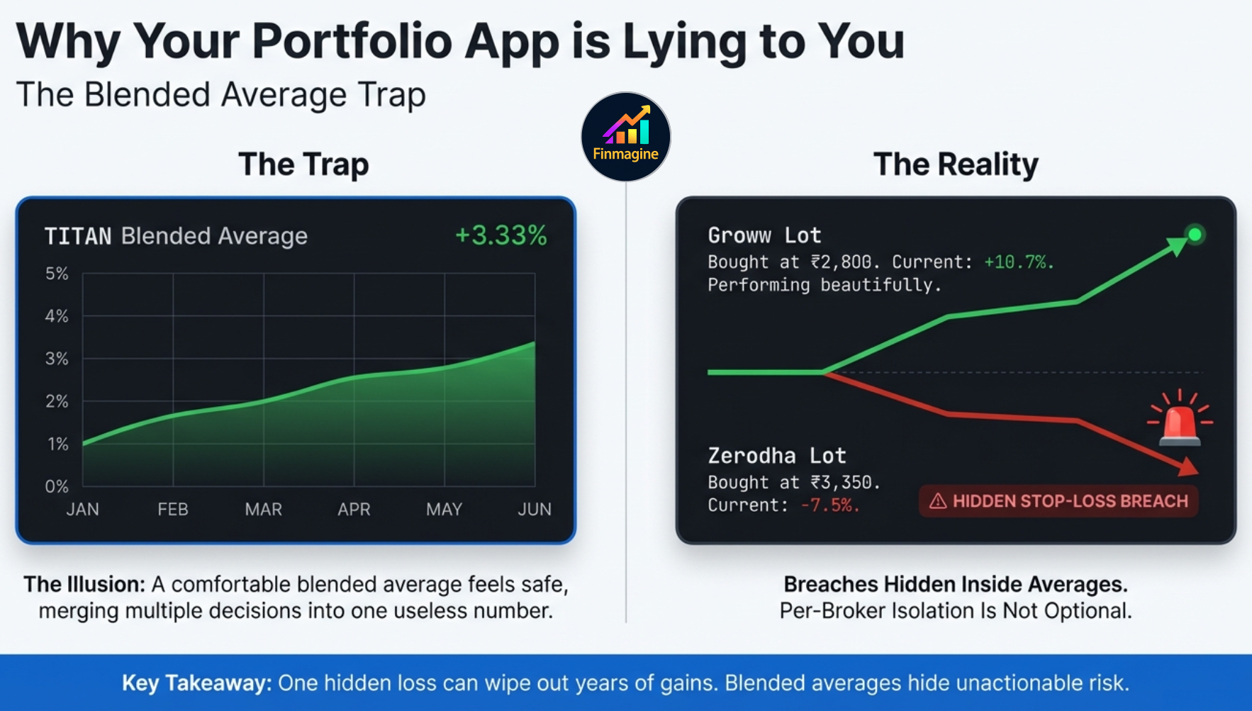
The Blended Average Trap — Why One Number Lies
It is Tuesday morning. You open your broker app and check your portfolio. TITAN is showing at ₹3,100. You bought it at a blended average of ₹3,000. You are up +3.33%. Everything looks fine. You move on.
But here is what that blended average is hiding:
| Stock | Broker | Buy Price | LTP | P&L% | Status |
|---|---|---|---|---|---|
| TITAN | Zerodha | ₹3,350 | ₹3,100 | -7.5% | ⚠ STOP-LOSS |
| TITAN | Groww | ₹2,800 | ₹3,100 | +10.7% | ✓ OK |
| Blended average | +3.33% | ― HIDDEN | |||
The Zerodha position is down -7.5%. It has crossed your -5% stop-loss. It should have been exited. But the Groww position — bought lower after a re-entry — is doing beautifully at +10.7%. The blended average merges these two completely different investment decisions into one number: +3.33%. And +3.33% does not tell you to do anything.
This is the Blended Average Trap. It is not a failure of arithmetic. It is a failure of design. Any tracker that blends your cost across entries, brokers, or purchase dates is hiding information you need to make decisions.
The INFY Cross-Broker Scenario
Here is a real-world example drawn directly from a common investor situation. You hold Infosys at two different brokers. You bought a substantial lot at Zerodha a few months ago. The market shifted unfavorably and that specific Zerodha lot is bleeding — currently sitting at -5.2%. You have a strict -5% stop-loss rule. That specific lot has officially breached your threshold. It demands immediate action.
But you also bought Infosys at Groww earlier, at a significantly lower price during a major dip. That Groww lot is doing beautifully — up a healthy +10.7%. Your standard tracking app forcefully blends these two completely different realities together and presents you with a comfortable, glowing, green +3.33%.
| Stock | Broker | Buy Price | LTP | P&L% | Status |
|---|---|---|---|---|---|
| INFY | Zerodha | ₹1,620 | ₹1,536 | -5.2% | ⚠ BREACH |
| INFY | Groww | ₹1,388 | ₹1,536 | +10.7% | ✓ OK |
| What your broker app shows | +3.33% | ― MISLEADING | |||
You open your app while drinking your morning coffee. You see a green +3.33% next to the INFY ticker. Your brain registers green and you do nothing. That fictitious blended average is actively lying to your risk management. It is causing you to completely miss a critical stop-loss breach that is hiding inside the blended math.
The same trap applies when you sell a position after a stop-loss breach and later re-enter the same stock from a different broker at a new cost basis. A tracker that blends your historical trades will show you a fictitious average. Finmagine shows you exactly what you paid, when, from which broker — and compares it against the live price. No averaging. No hiding.
What Is Finmagine Portfolio Manager?
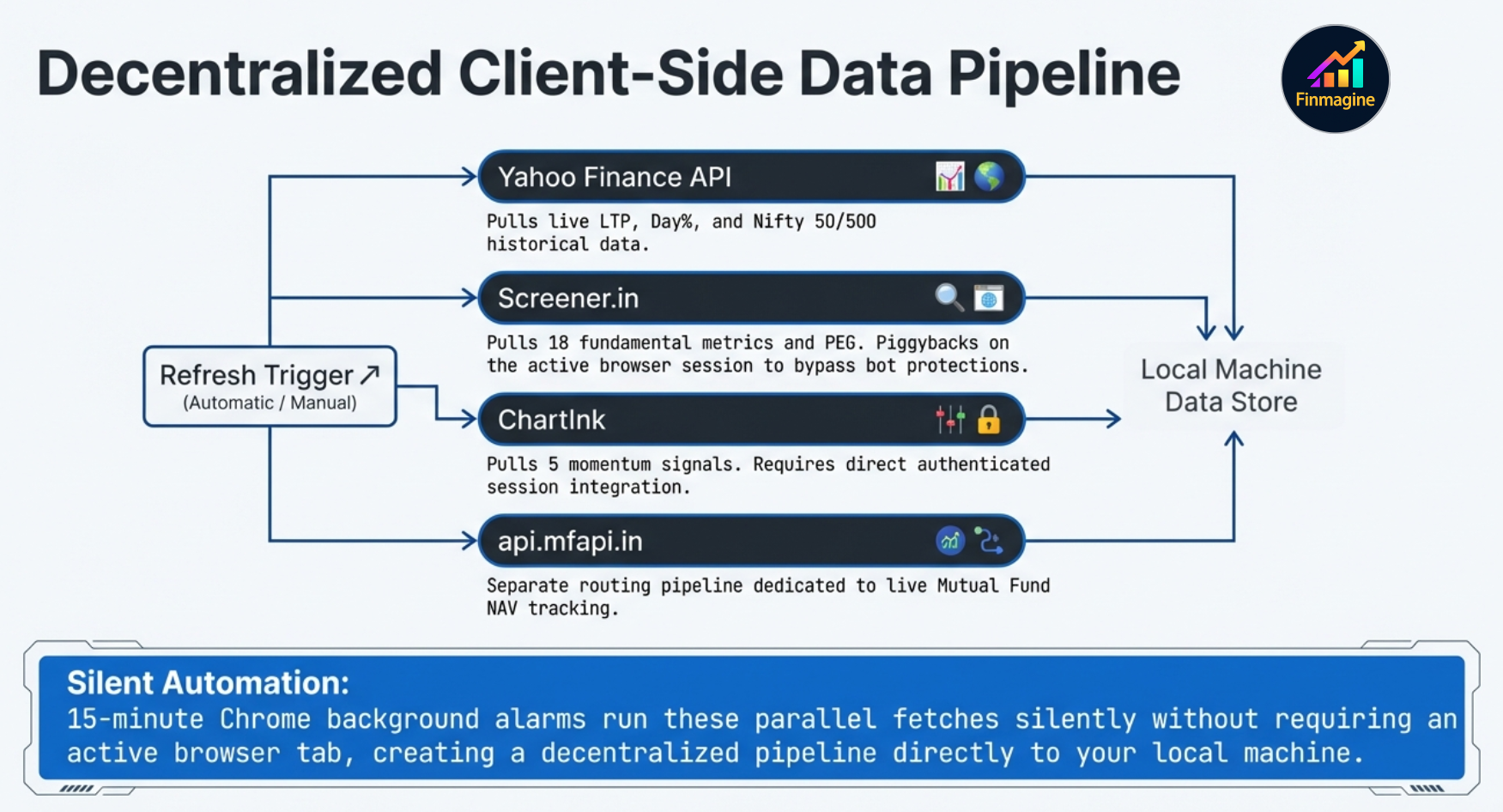
Finmagine Portfolio Manager is a Chrome extension that tracks your Indian and global investments across every broker you use, fetches live prices from Yahoo Finance and fundamentals via Finmagine's shared cache and Screener.in, computes annualised XIRR per holding, shows index beat vs Nifty 50/500, and provides on-demand charts — with a local-first architecture for core portfolio data and optional cloud backup for cross-device sync.
At a Glance
- 4 asset classes: Indian Equities, Global Equities (US stocks), Indian Mutual Funds, and Global Funds/ETFs
- Any broker: The extension is not connected to any broker. The broker name is a free-text label you enter yourself — use any broker, any platform, any shorthand.
- 7 tabs: Holdings, Alloted, Consider, Add More, Watchlist, Charts, Alerts
- Live data: Yahoo Finance (prices), Screener.in (PEG, CAGR, 18 fundamentals), ChartInk (5 signals), api.mfapi.in (MF NAV)
- Analytics: XIRR per holding + portfolio, N50/N500 Index Beat, PEG, 3Y%/5Y% Price CAGR, Score
- Charts: 7 chart types per asset class + 5 unified Overview charts (Composition, P&L, XIRR, Journey, Brokers/Platforms, Sector)
- Privacy-first: All data stored in
chrome.storage.localon your device
host_permissions, enabling direct access to Screener.in (which blocks cross-origin requests from web apps) and ChartInk (which requires your live logged-in session and cannot be proxied). A web app would need server-side proxies for Screener and simply cannot replicate ChartInk signals. The extension is the only architecture that makes this data accessible without a backend.
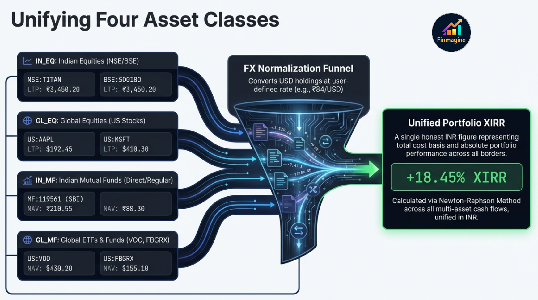
Four Asset Classes, One Unified View
Most Indian investors hold more than just NSE stocks today. Mutual funds, US ETFs through INDMoney or Vested, direct US stocks through Fidelity or IBKR — all of these need to be tracked together to get a true picture of your portfolio. Finmagine Portfolio Manager handles all four in one place.
| Pill | Asset Class | Ticker Format | Price Source | Example |
|---|---|---|---|---|
| 🇮🇳 | Indian Equities (IN_EQ) | NSE:TITAN, BSE:532281 |
Yahoo Finance | TITAN, HDFC Bank, Infosys |
| 🌎 | Global Equities (GL_EQ) | US:AAPL, US:ORCL |
Yahoo Finance | Apple, Oracle, Berkshire |
| 🏦 | Indian Mutual Funds (IN_MF) | MF:119551 |
api.mfapi.in NAV | SBI Bluechip, Mirae Emerging |
| 🌐 | Global Funds & ETFs (GL_MF) | US:VOO, US:FBGRX |
Yahoo Finance | VOO, SPY, FBGRX (Fidelity) |
| 📊 | Overview (ALL) | — | All sources, unified ₹ | Cross-AC summary + charts |
Indian Equities (IN_EQ)
The core asset class. Full charges breakdown at trade entry (STT, exchange fee, stamp duty, SEBI turnover fee, brokerage, GST). All 9 broker columns visible. Every column from PEG to Index Beat to Signals is available. The full Watchlist tab with 23 fundamental columns is available here.
Global Equities (GL_EQ) USD
US stocks held through platforms like INDMoney, Fidelity, Schwab, or IBKR. Prices in USD, converted to ₹ at the FX rate in your settings (default ₹84/USD). Charges: ~0.03% SEC fee on sell only. Full Watchlist tab is available for GL_EQ (stockanalysis.com powers fundamentals for US stocks).
Indian Mutual Funds (IN_MF) NAV
Add any AMFI-registered direct or regular scheme by searching the fund name — the scheme code is resolved automatically. NAV fetched from api.mfapi.in. Zero charges (direct plans). Fractional units supported. Columns: Fund | NAV ₹ | P&L% | XIRR | N50 | N500 | Invested ₹ | Value ₹ | Units | Platform | Weight%.
Global Funds & ETFs (GL_MF) USD
ETFs (VOO, SPY, QQQ) and US mutual funds (FBGRX, FDIVX from Fidelity) tracked exactly like GL_EQ via Yahoo Finance. Zero charges. Fractional units supported. If you hold Vanguard ETFs at Vanguard.com, or Fidelity mutual funds at Fidelity.com, this is the asset class for them.
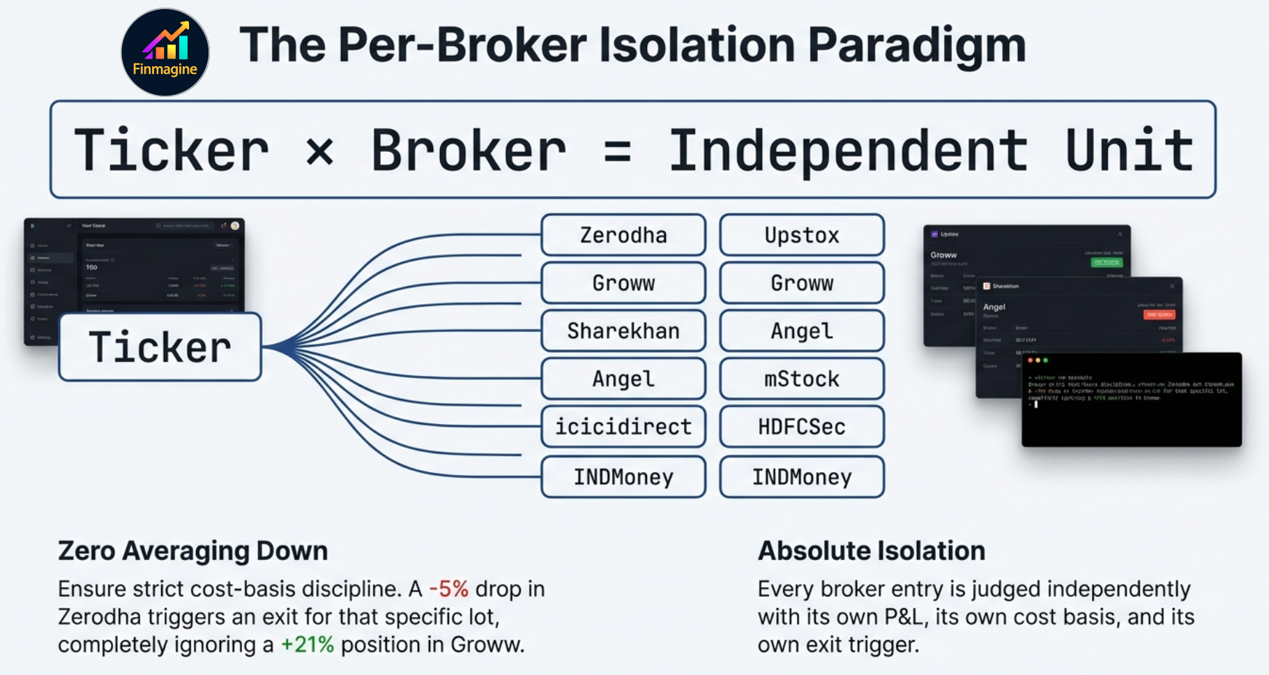
Per-Broker Tracking — The Core Innovation
Every trade you enter has three key identifiers: the stock symbol, the broker, and the date. Finmagine Portfolio Manager uses all three. Specifically, it treats each stock + broker combination as a distinct position. If you hold TITAN at Zerodha and TITAN at Groww, those are two separate rows in your Holdings table — each with its own buy price, P&L%, stop-loss status, and XIRR.
The 9 Broker Columns
The Holdings table has a broker column for each of the 9 supported Indian brokers. Each column shows the P&L% for that specific stock at that specific broker. Cells are left empty if you don't hold the stock there.
| Stock | LTP | P&L% | Zerodha | Groww | Upstox | XIRR |
|---|---|---|---|---|---|---|
| TITAN | ₹3,100 | +3.3% | -7.5% ⚠ | +10.7% | — | 14.2% |
| HDFC Bank | ₹1,720 | +8.1% | +8.1% | — | — | 22.8% |
| ZOMATO | ₹215 | -4.2% | -4.2% | — | -6.8% ⚠ | -11.4% |
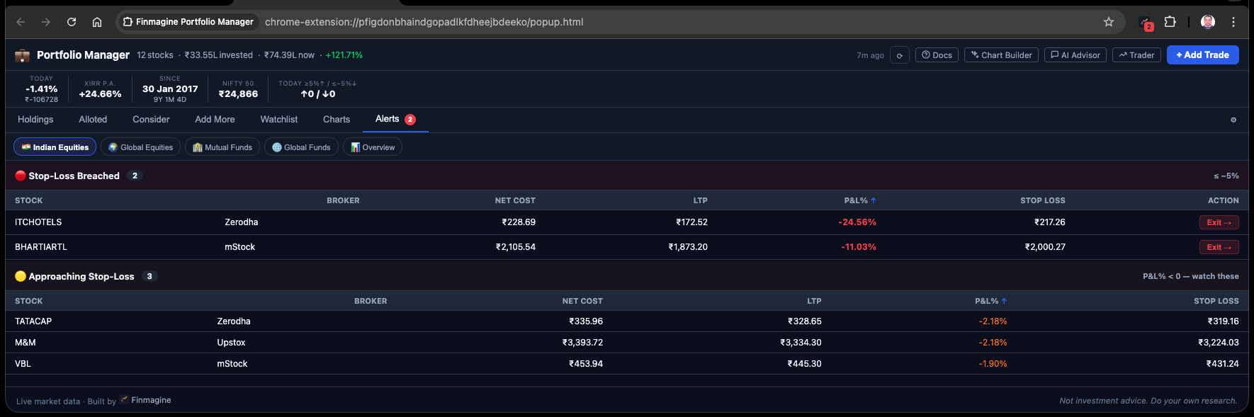
The red badge on TITAN's Zerodha column tells you exactly what the blended +3.3% was hiding: that position hit your stop-loss three percentage points ago.
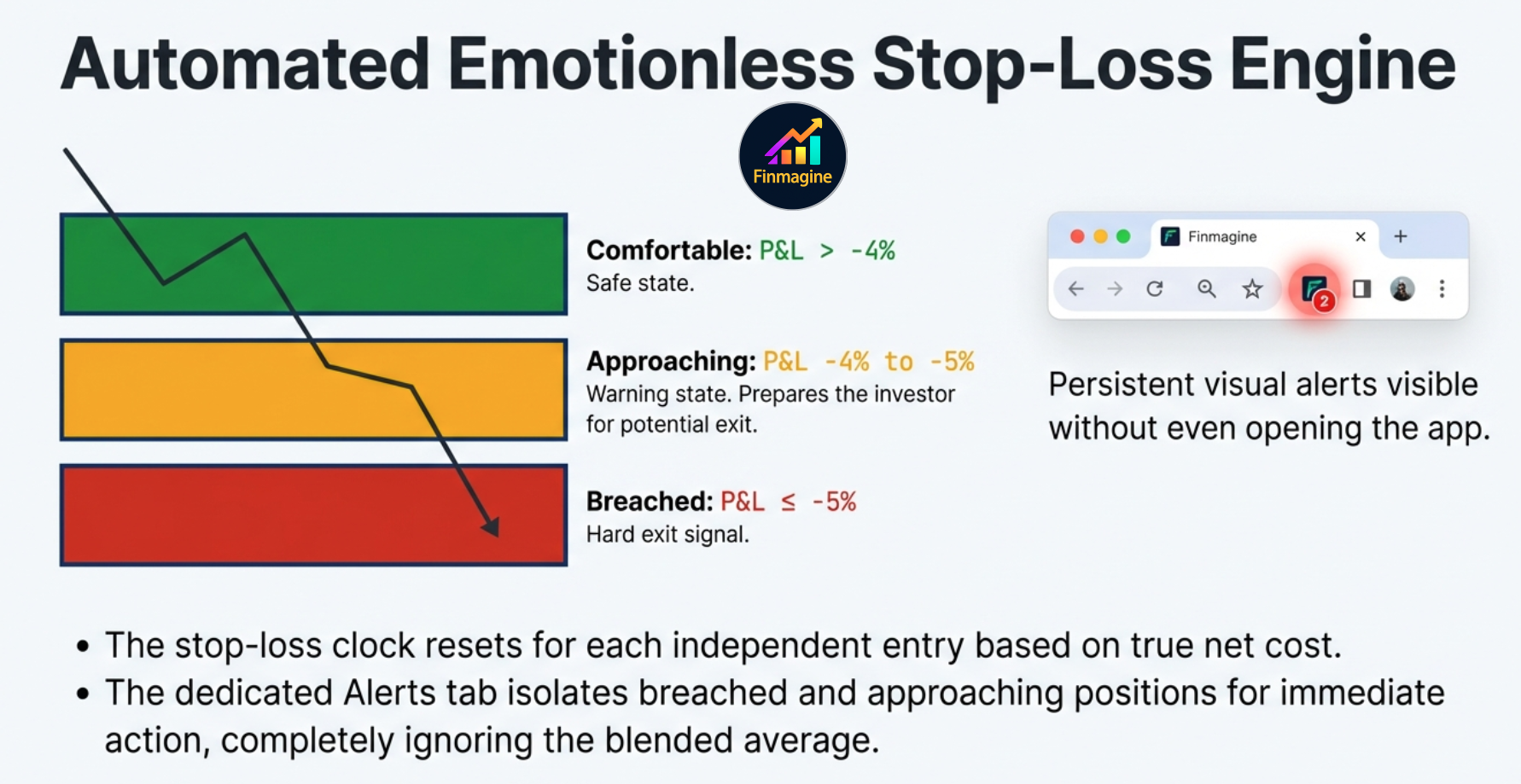
The Five-State Color System
Each per-broker P&L cell uses one of five distinct visual states — not just red/green, but a precise traffic-light hierarchy that replaces the need for mental math entirely:
Fully alloted on this entry. Position is working. No action needed.
In profit but still building the buffer. Monitor.
Taking a loss, but within your stop-loss tolerance. Stay alert.
Approaching the stop-loss. Within 1% of the trigger. Prepare to act.
Stop-loss BREACHED. This is a hard exit signal. Act now.
The Icon Badge — A Live Unavoidable Alarm
Finmagine does not just quietly change a cell color inside the app and hope you log in to notice. When any position crosses the -5% stop-loss threshold, the Chrome extension icon in your browser toolbar turns itself into a live, numbered red badge. If you are casually browsing, checking email, or reading news — you glance up at your toolbar and see a red “2” on the Finmagine icon. You instantly know, without opening the app, that exactly two specific isolated broker lots across your entire portfolio have breached the stop-loss and require your immediate execution.
One Stock, Multiple Entries, Multiple Chapters
Consider this realistic scenario: You bought ZOMATO at ₹230 in Zerodha in December. It fell to ₹200 and you exited (stop-loss triggered). In January, the setup looked good again, so you re-entered from Groww at ₹185. The price is now ₹215.
- The Zerodha entry: CLOSED (you sold). This trade is recorded and contributes to your realized P&L history.
- The Groww entry: ACTIVE at +16.2%. This is a fresh position with a clean cost basis.
- If you had a blended tracker, it would average ₹230 and ₹185 to show ₹207.50, up +3.6%. Neither story is told accurately.
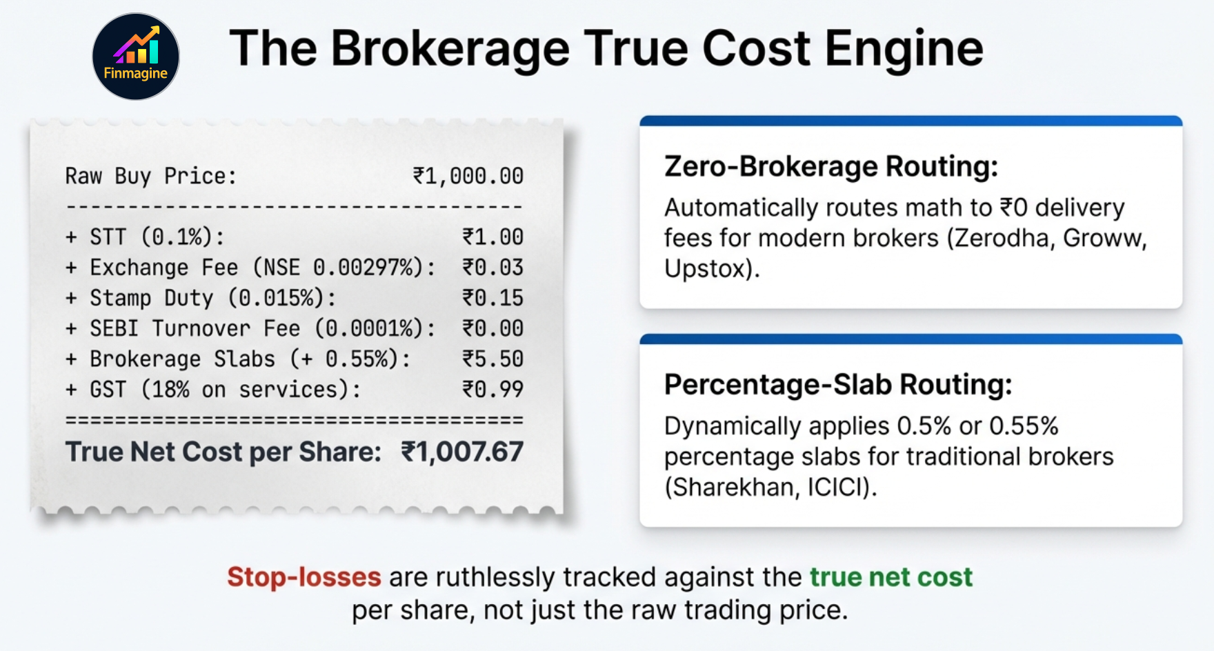
The Brokerage Fee Engine — True Cost, Not Raw Price
A strict -5% stop-loss rule is fundamentally useless if it is being calculated against a raw, inaccurate buy price. Most investors simply enter the exchange price they paid. But ₹1,000 per share is not your real cost. To solve this, Finmagine built an obsessive fee engine that calculates your exact true entry cost down to the paisa, factoring in the entire statutory environment before applying the stop-loss rule.
| Charge | Rate | Applies On | Notes |
|---|---|---|---|
| STT (Securities Transaction Tax) | 0.1% | Buy & Sell | Government tax on equity delivery turnover |
| NSE Exchange Fee | 0.00297% | Buy & Sell | Zerodha: capped at ₹20/trade (dynamically adjusted) |
| BSE Exchange Fee | 0.00375% | Buy & Sell | Applied when ticker is BSE-listed |
| Stamp Duty | 0.015% | BUY only ✓ | Never applied on sell side — most calculators get this wrong |
| SEBI Turnover Fee | 0.0001% | Buy & Sell | Mandatory regulatory fee |
| Brokerage — Zero-Brokerage | ₹0 | — | Most modern discount brokers — ₹0 on delivery. Any unrecognised broker also defaults to ₹0. |
| Brokerage — Traditional | 0.50% – 0.55% | Buy & Sell | Traditional full-service brokers. Pre-configured for popular ones; any other broker defaults to zero-brokerage. |
| GST | 18% | On services | Applied on: Brokerage + Exchange fee + SEBI fee (not on STT or stamp duty) |
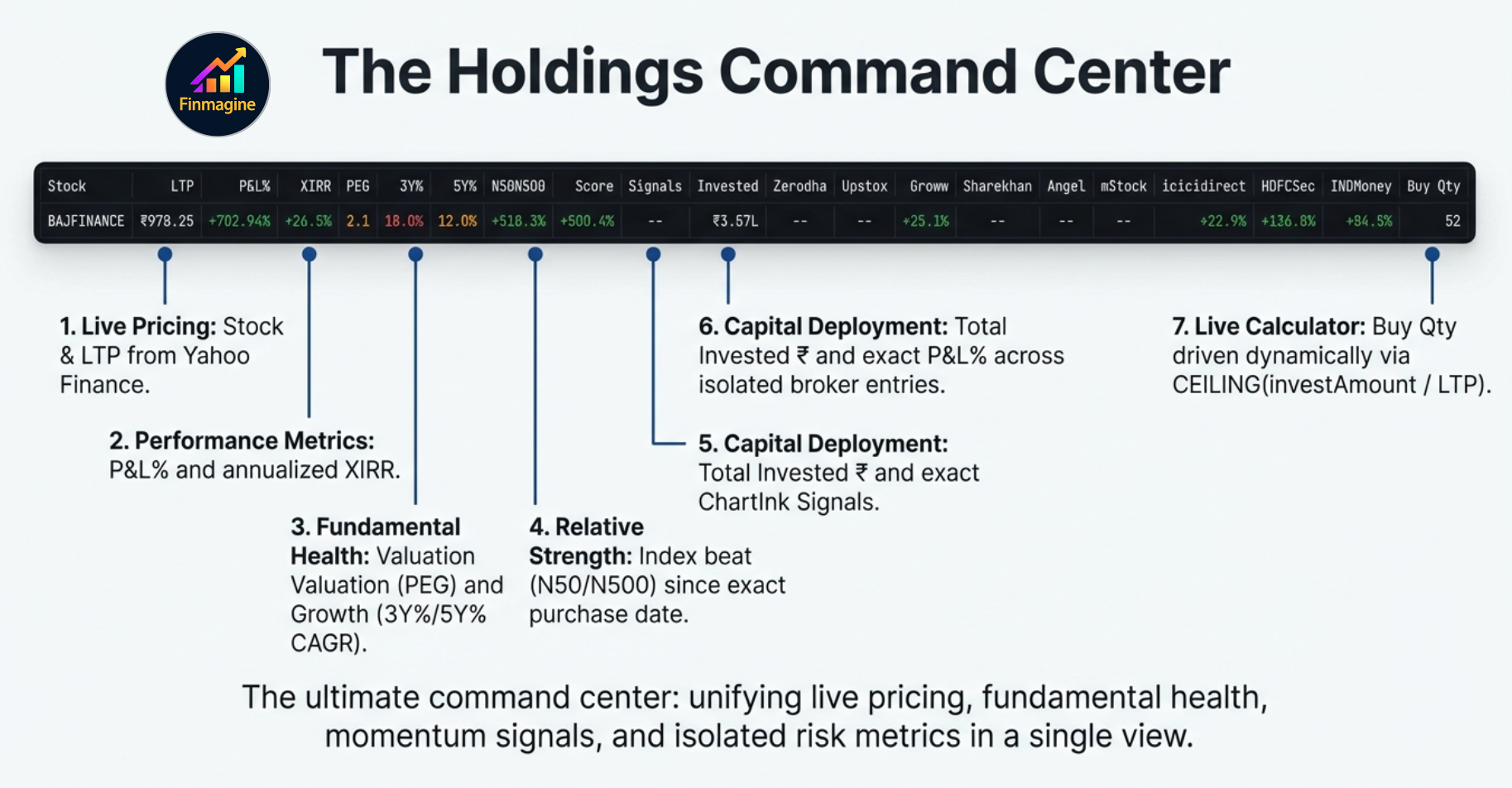
The Holdings Table — What Every Column Tells You
The Indian Equities Holdings table is the densest and most information-rich view in the extension. Here is a reference for every column:
| Column | What It Shows | Source |
|---|---|---|
| Stock | NSE/BSE symbol + company name (truncated) | — |
| LTP | Last traded price in ₹ | Yahoo Finance |
| P&L% | Overall P&L% across all broker entries for this stock | Computed |
| XIRR | Annualised return accounting for timing of all buy trades | xirr.js (Newton-Raphson) |
| PEG | P/E ratio ÷ 3-Year Price CAGR. Valuation relative to growth. | Screener.in (24h cache) |
| 3Y% / 5Y% | 3-year and 5-year compounded price CAGR | Screener.in (90d cache) |
| N50 | Nifty 50 return since your earliest purchase date for this stock | Yahoo Finance (permanent cache) |
| N500 | Nifty 500 return since your earliest purchase date | Yahoo Finance (permanent cache) |
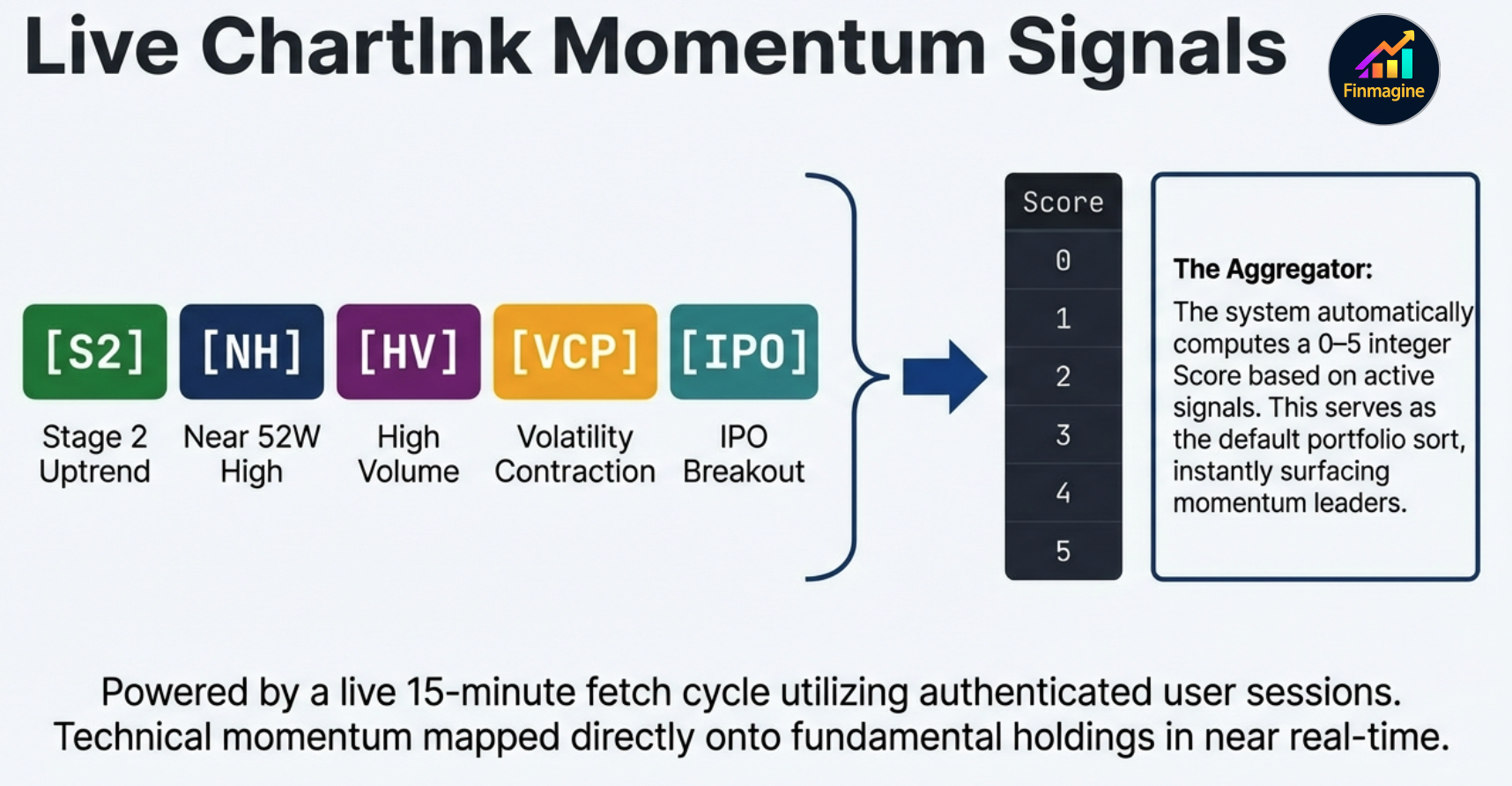
| Score | Count of momentum signals (0–5). Higher = more screeners agree. | ChartInk |
| Signals | Badges for each passing signal: S2 (Stage 2), NH (Near 52W High), HV (High Volume), VCP (VCP Breakout), IPO (IPO Breakout) | ChartInk |
| Invested ₹ | Total ₹ deployed in this stock across all brokers (net of charges) | Computed |
| [9 Broker Cols] | Per-broker P&L% for this stock. Dark red = breach, amber = approaching, dark green = fully committed. | Computed |
| Buy Qty | How many shares you can buy at LTP given the invest amount you set in the sticky calculator | Computed |
Every column is sortable. Click a column header once to sort descending, again to sort ascending. Sorting by Score and then by N50 is a powerful two-pass filter for stocks that are both technically strong and have genuinely beaten the index since your entry date.
The Stats Strip
Above the Holdings table sits a compact stats strip that answers the five most common quick questions about your portfolio:
- Today Δ% — Your portfolio's aggregate day change based on all holdings' prev-close vs LTP
- XIRR p.a. — Portfolio-level annualised return across all trades
- Since — Date of your earliest trade + total days held
- Nifty 50 — Current Nifty 50 index level
- Movers — How many stocks in your portfolio are up ≥5% or down ≤-5% today
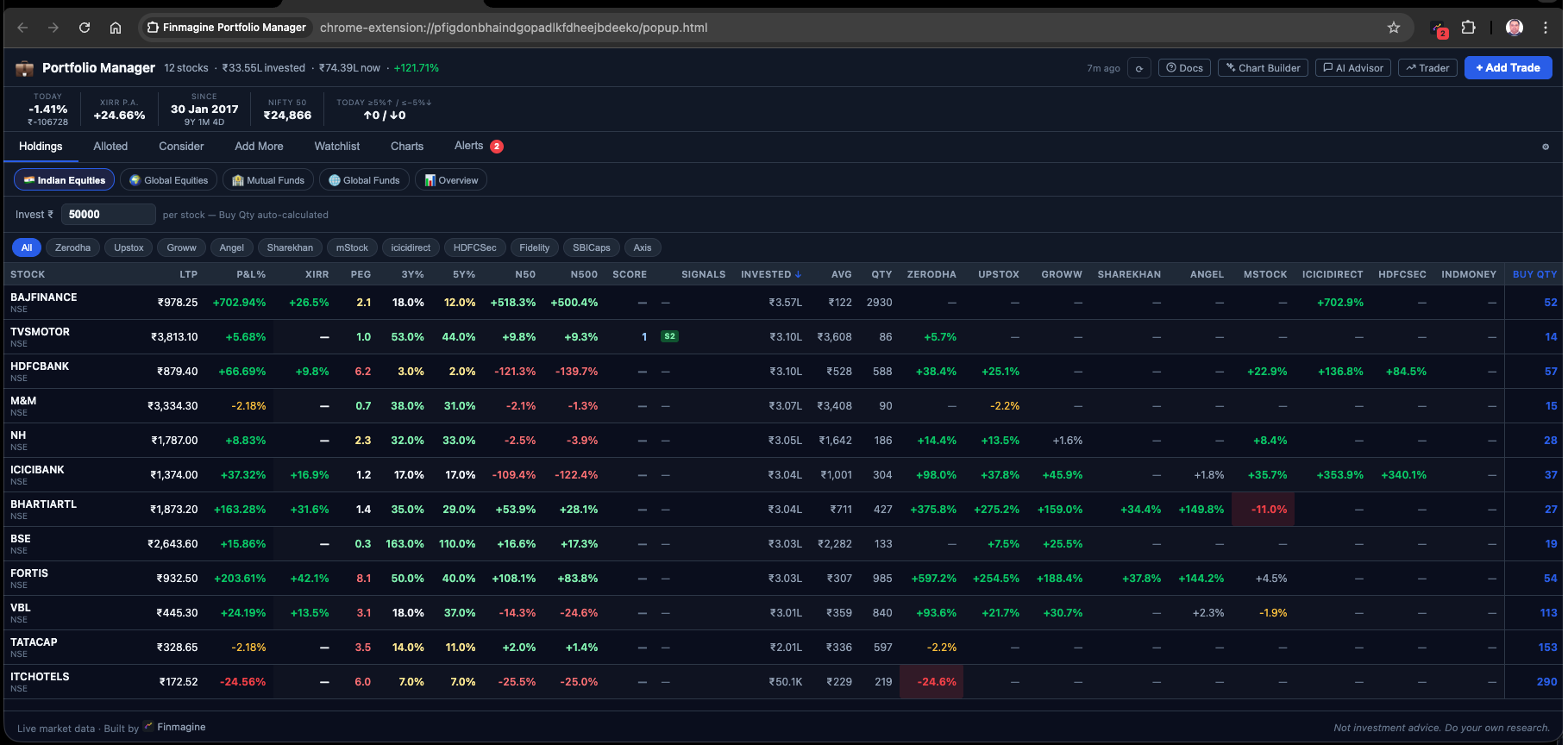
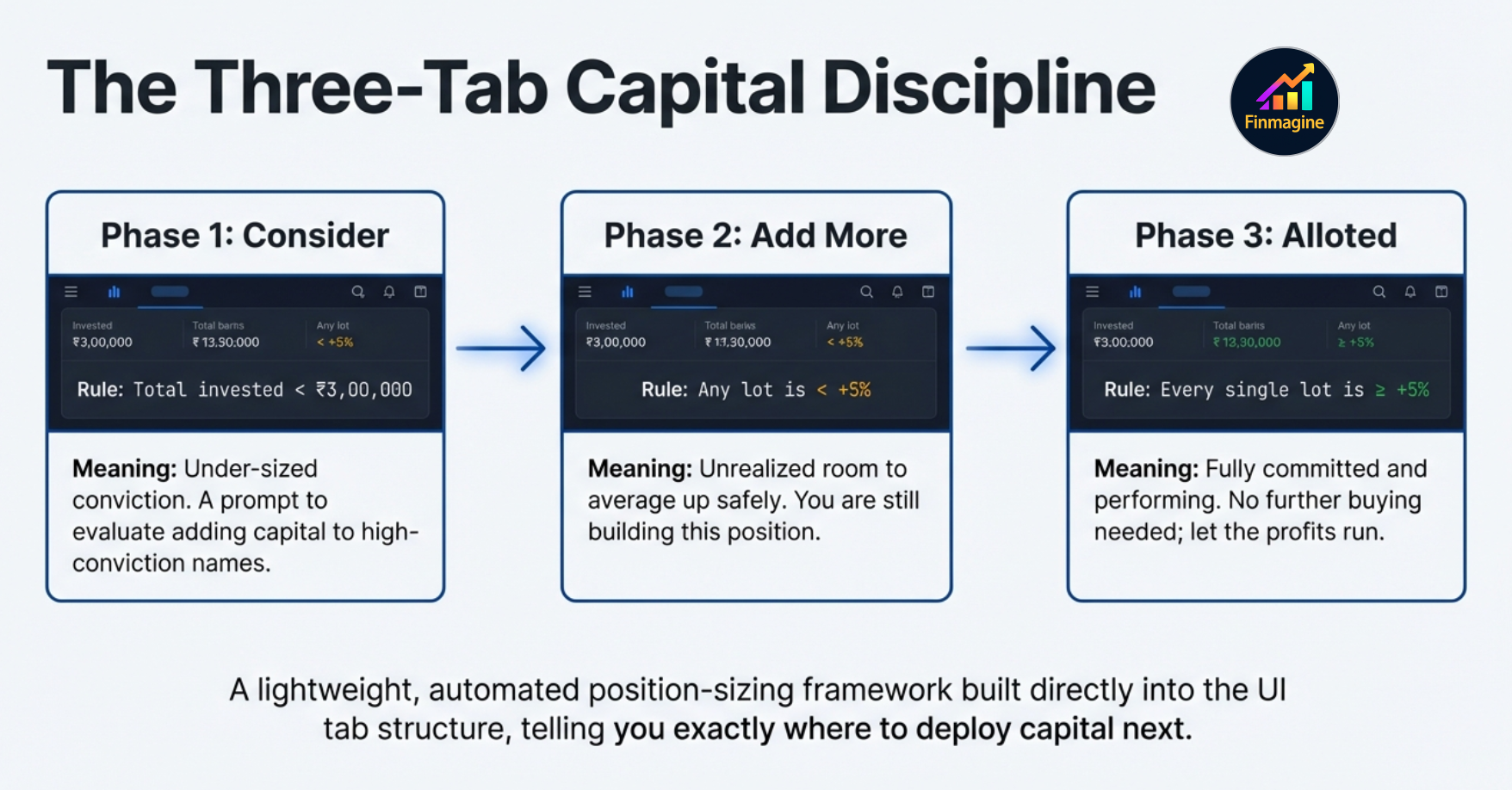
Seven Tabs at a Glance
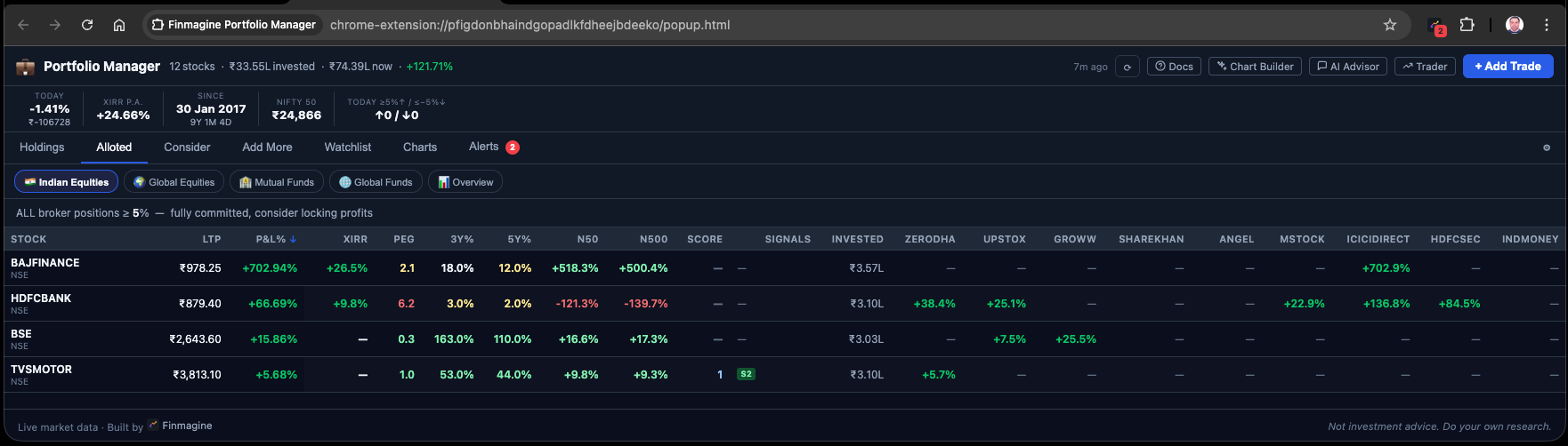
Beyond Holdings, six more tabs each answer a specific portfolio management question:
| Tab | Question It Answers | Filter Logic |
|---|---|---|
| Holdings | What do I own and how is it performing? | All active positions |
| Alloted | Which positions am I fully committed to? (all entries ≥ +5%) | Every broker entry for the stock is ≥ +5% P&L |
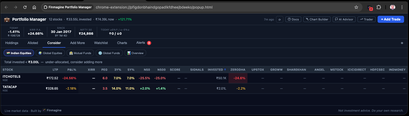
| Consider | Where am I under-allocated by conviction? | Total invested < ₹3,00,000 threshold (configurable) |
| Add More | Where could I add at a better average? | At least one broker entry is < +5% P&L (room to add) |
| Watchlist | How do my holdings and research list compare on fundamentals? | Holdings auto-included + manually added tickers; 23 Screener.in columns |
| Charts | What does my portfolio look like visually? | On-demand: Composition, P&L, XIRR, Journey, Brokers, Sector charts |
| Alerts | Which positions need my immediate attention? | Stop-loss breaches (< -5%) and approaching positions (within 1%) |
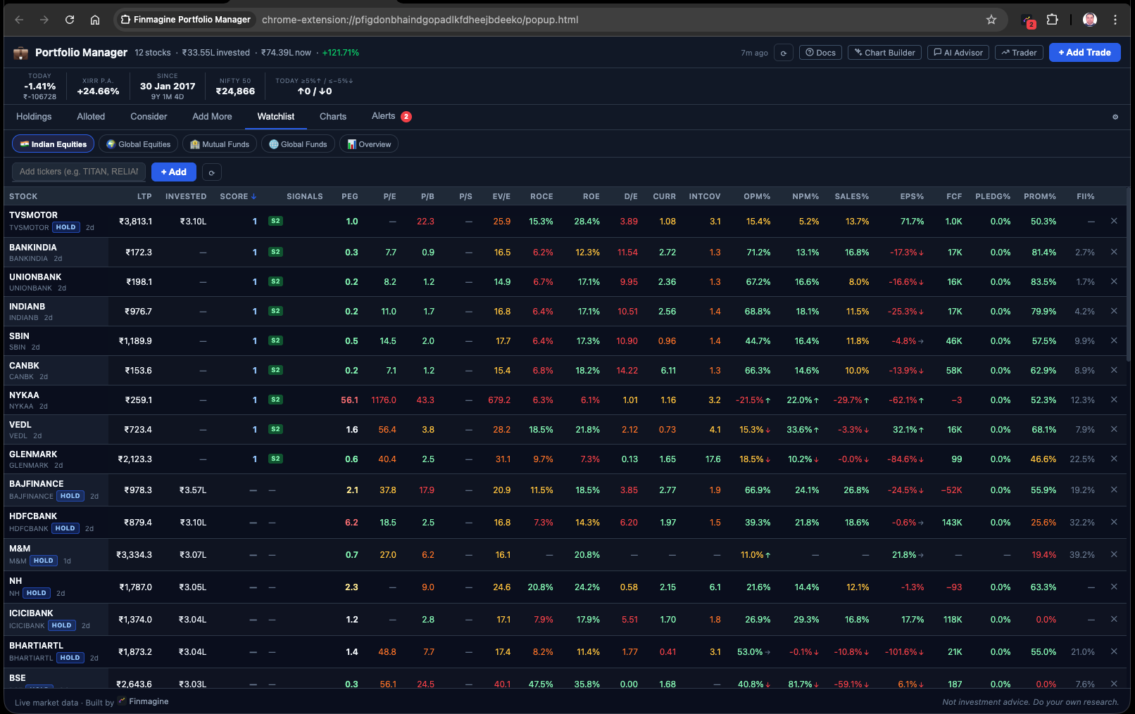
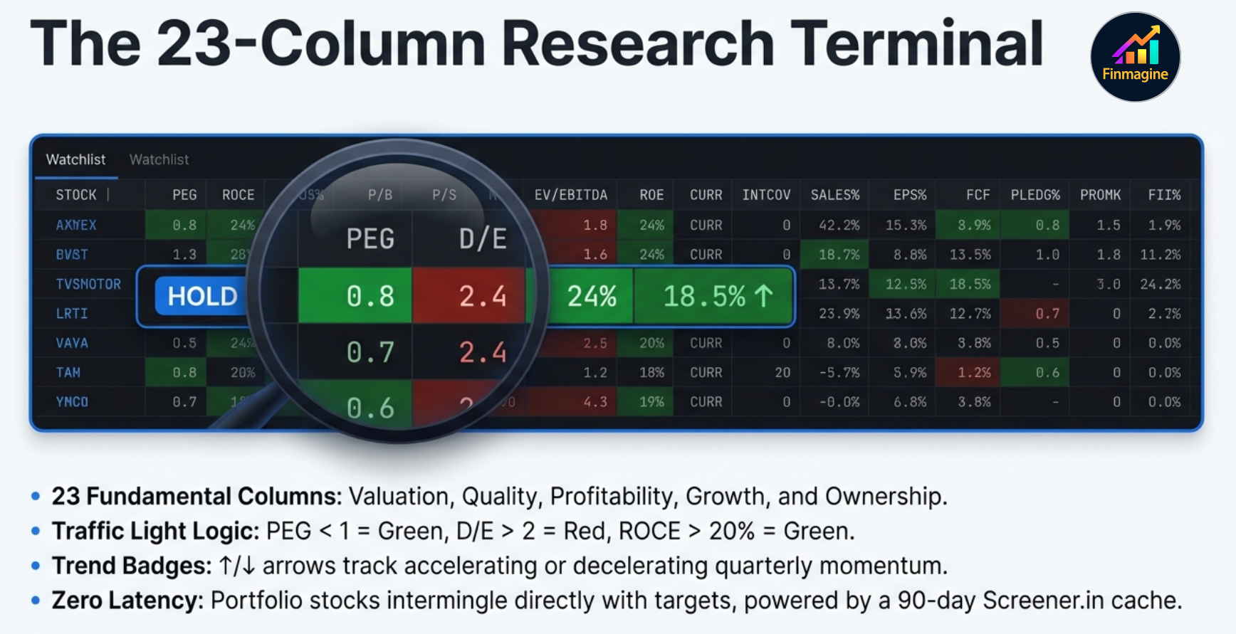
The Watchlist Tab
The Watchlist tab is a 23-column fundamental comparison table. All of your Holdings are automatically included (tagged with a HOLD badge). You can manually add any additional stock you are researching. Columns include:
LTP | Score | Signals | PEG | P/E | P/B | P/S | EV/EBITDA | ROCE | ROE | D/E | Current Ratio | Interest Coverage | OPM% | NPM% | Sales Growth% | EPS Growth% | FCF | Pledging% | Promoter% | FII%
Each metric is color-coded (green/yellow/orange/red) based on sector-appropriate thresholds from Screener.in. Trend badges (↑/↓/→) appear on OPM%, NPM%, Sales%, and EPS% to show direction over the past year. Everything is sortable, cached for 90 days, and loaded lazily on first tab click.
XIRR & Index Beat — Are You Really Beating the Market?
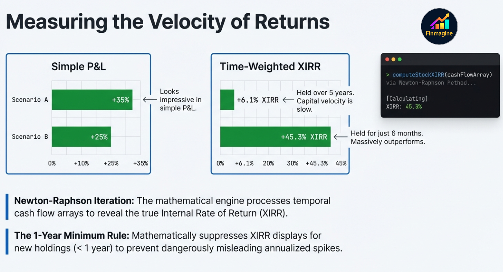
P&L% tells you how much you made. XIRR tells you how fast you made it. A +30% return over 5 years is very different from a +30% return over 18 months. XIRR normalises all of this into an annualised percentage, making every holding comparable regardless of when you bought it.
XIRR Per Holding
For each stock, the extension takes every buy trade as a cash outflow (negative) on its purchase date, and the current market value as a hypothetical sell (positive) on today's date. It then solves for the discount rate that makes the net present value of all cash flows equal to zero — this is the XIRR. The algorithm used is Newton-Raphson iteration, running through dozens of iterative calculations in milliseconds. The engine maps out a precise timeline: every buy is a negative cash flow on its historical date, today's market value is a positive hypothetical cash flow. The algorithm constantly adjusts until it finds the exact annualised discount rate that balances the entire cash flow timeline to zero.
A Tale of Two Investments
Consider two ₹5 lakh investments. P&L% looks at them one way. XIRR reveals the truth:
🐢 Investment A — The Slow Compounder
- Deployed: ₹5,00,000
- Holding period: 5 years
- P&L%: +35% — looks great!
- XIRR: 6.1% p.a.
Once you factor in inflation (~5% p.a.), this capital is barely growing in real terms. The 35% headline masked 5 years of opportunity cost.
🐊 Investment B — The Fast Compounder
- Deployed: ₹5,00,000
- Holding period: 6 months
- P&L%: +25% — looks smaller
- XIRR: 45.3% p.a.
Lower P&L%, dramatically higher XIRR. Capital is compounding aggressively. Simple P&L would have ranked this as the inferior investment.
XIRR exposes the truth: Investment B is vastly superior, and that is where your capital is actually accelerating. Without XIRR, you might deprioritise the wrong holding. The extension enforces a one-year minimum rule — XIRR is suppressed (shown as —) for any holding under 365 days old, because annualising a short-term return can inflate the figure to thousands of percent, creating a completely misleading signal.
Index Beat (N50 / N500)
The N50 and N500 columns answer a question P&L% cannot: did I beat the benchmark from my specific entry date? For each holding, the extension looks up the Nifty 50 and Nifty 500 index level on the exact date of your earliest trade in that stock, and computes what those indices returned from that date to today.
Example: You bought IREDA at ₹180 on January 15, 2024. LTP today is ₹210. Your P&L% is +16.7%. But Nifty 50 returned +11.2% and Nifty 500 returned +13.8% from that same date. So your Index Beat is +16.7% − 13.8% = +2.9% over N500. That is real alpha — not impressive alpha, but real.
Index data is fetched once from Yahoo Finance and cached permanently per date. Once you have the Nifty level for a specific date, you never fetch it again. The Index Beat calculation is instant from then on.
Portfolio XIRR (All ACs, Unified ₹)
The stats strip shows a single Portfolio XIRR computed across all trades in all four asset classes. USD trades are converted to ₹ at the FX rate in your settings. This gives you one honest answer to the hardest portfolio question: what is my actual annualised return, accounting for the timing of every rupee I deployed?
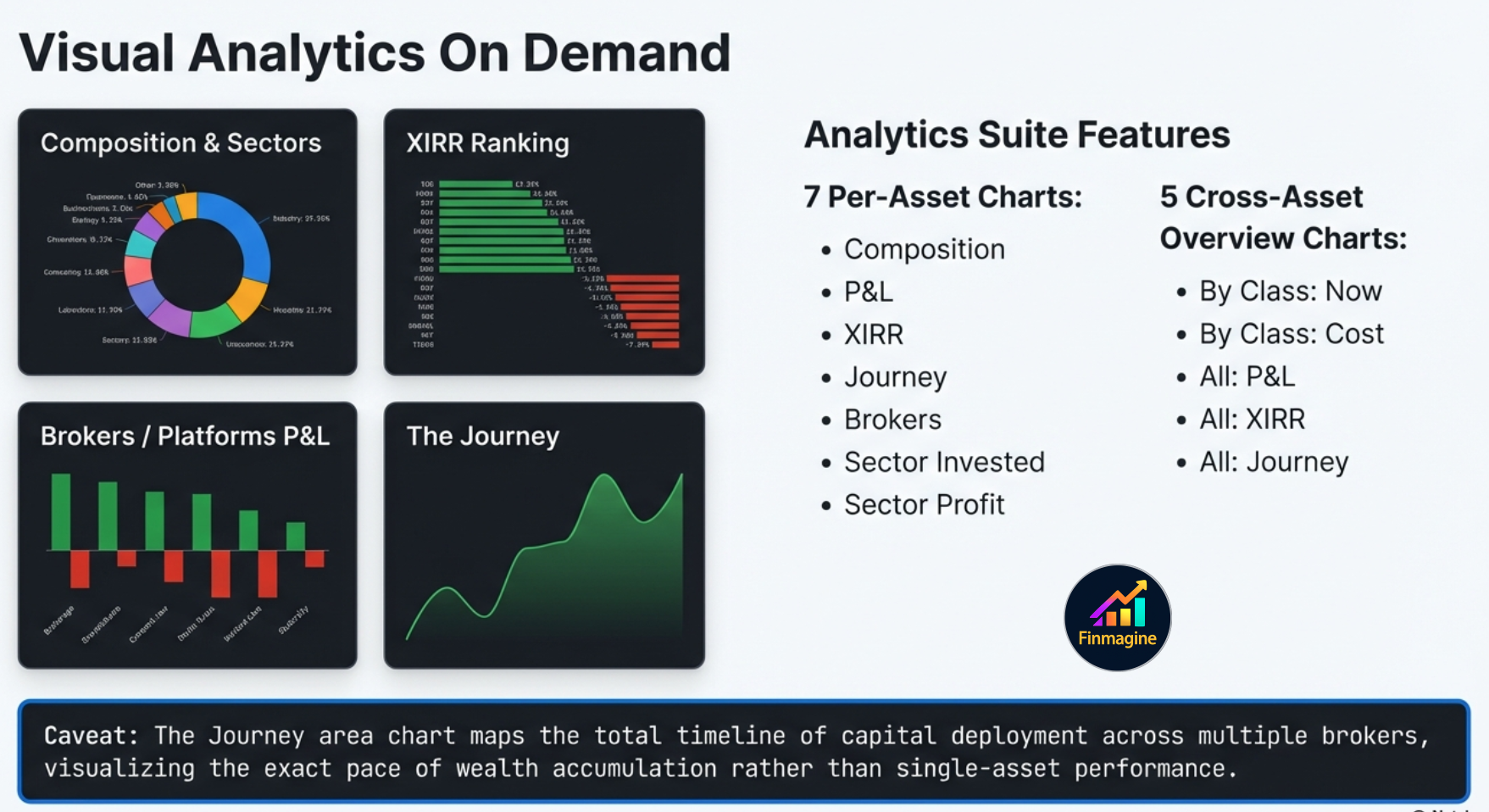
Charts & Visual Analytics — 12 Chart Types
The Charts tab is not a generic pie chart. It is a purpose-built visualization engine with 12 specialized chart types available on demand. When you are analyzing a specific asset class, seven charts are available. When you switch to the Overview pill, five additional cross-asset charts unlock.
| Chart Type | What It Shows | Available In |
|---|---|---|
| Composition (Donut) | Portfolio allocation by current value — which stocks dominate | Per AC |
| P&L (Horizontal Bar) | Absolute winners and losers in ₹ terms | Per AC |
| XIRR (Horizontal Bar) | Best and worst compounders by annualised return | Per AC |
| Journey (Area) | Cumulative invested ₹ over time vs current value | Per AC |
| Brokers (Grouped Bar) | Invested vs current value per broker platform | Per AC |
| Sector: Now (Donut) | Current value allocation by sector | Per AC |
| Sector: Invested (Donut) | Capital deployed by sector — cost basis view | Per AC |
| By Class: Now | Allocation across all 4 ACs by current value in ₹ | Overview only |
| By Class: Cost | Capital deployed across all 4 ACs in ₹ | Overview only |
| All: P&L | P&L ranking across all holdings in all 4 ACs | Overview only |
| All: XIRR | XIRR ranking across all holdings in all 4 ACs | Overview only |
| All: Journey | Total capital deployment timeline across all 4 ACs | Overview only |
The Journey Chart — An Important Caveat
The Journey chart is an area chart that plots your cumulative cost basis (blue wave) alongside your current value (green line). It is a beautiful and informative view of how you have deployed capital over your investing lifetime. However, there is a critical architectural caveat you must understand before interpreting it.
Instead, the chart calculates backward from today. It plots the current real-time market value of investments that were physically executed by that historical date. So the January 2023 data point shows the current value of all trades made on or before that date — not what those trades were worth in January 2023. The expanding gap between the green and blue lines represents your unrealized P&L on those historical cohorts of capital.
The Overview Pill — Unified Cross-Asset View
When you switch to the 📊 Overview pill, the extension applies live FX normalization across all four asset classes. US stocks and ETFs are converted to ₹ at your configured exchange rate (default ₹84/USD) in real time. The result is a single unified portfolio view — every holding speaking the same currency.
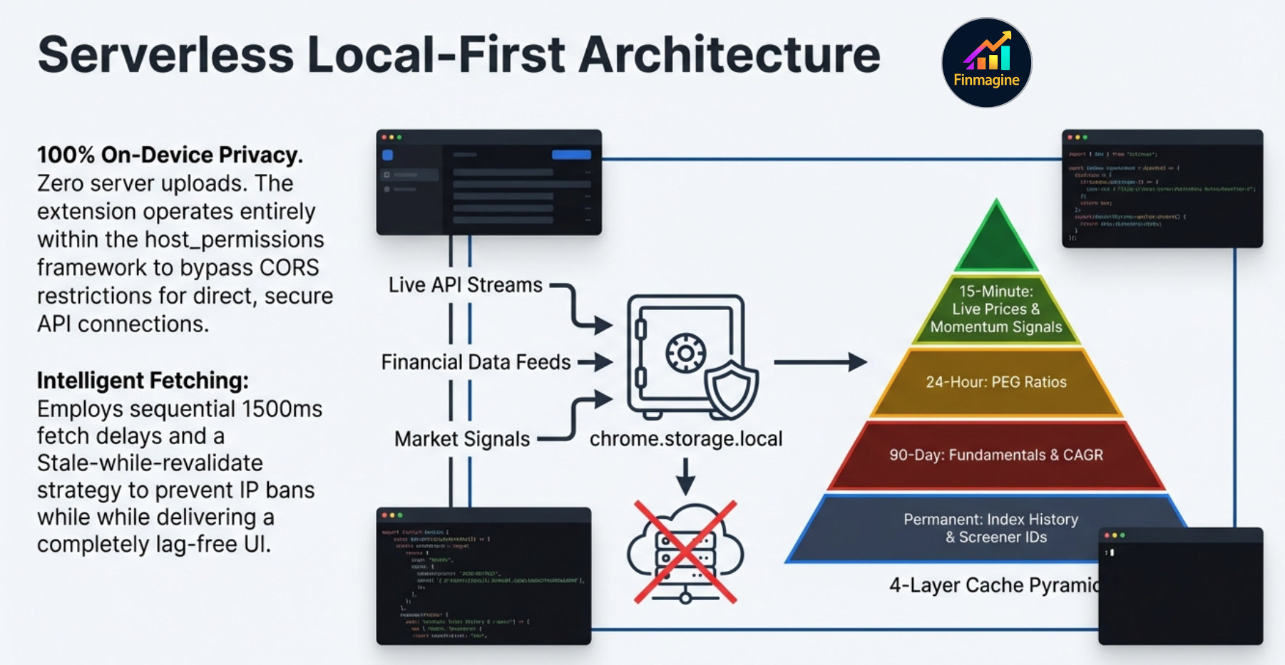
Local-First Architecture — Privacy by Design
Core portfolio data — trade history, holdings, net worth calculations — stays in chrome.storage.local on your device. No account required for core tracking. Live prices come directly from Yahoo Finance. Fundamental data is served from Finmagine's shared cache for speed, and cloud sync (optional, requires a Finmagine account) lets you back up and restore your portfolio across devices.
The CORS Bypass — How It Accesses Screener and ChartInk
Think of Screener.in as an exclusive nightclub. If you build a standard portfolio tracking website and program it to fetch data from Screener, the browser immediately blocks the request. This is CORS (Cross-Origin Resource Sharing) — a core web security feature. Traditional financial apps are forced to build an expensive central server to proxy all data requests.
Finmagine sidesteps this completely because it is a Chrome extension using Manifest V3 host_permissions. This gives the extension a VIP all-access pass. It acts exactly like you, the authenticated user. When the extension reaches out to Screener.in or ChartInk, those platforms do not see a third-party app. They see you — the verified user — requesting data from your own browser session. ChartInk signals work because the extension piggybacks on your live logged-in ChartInk session. No backend. No proxies. No server costs.
The Four-Layer Cache
With this power comes the risk of overwhelming external servers with requests. To handle all incoming data without rate-limiting bans, Finmagine employs a structured four-layer cache stack organized by data volatility:
Stale-While-Revalidate
When you open the Watchlist, the extension instantly renders the interface using whatever cached data it already holds in local storage. The visual experience is perfectly smooth and lag-free. Meanwhile, completely invisibly in the background, a sequential background fetch is quietly updating metrics one by one. As fresh data trickles in, the cells update without ever interrupting your workflow. You get the blazing speed of a native desktop app with the data depth of an institutional terminal.
Sequential 1500ms Fetch — Protecting Screener.in
When the extension needs to update the 90-day fundamental cache, it does not grab everything at once. A burst of 50 simultaneous requests to Screener.in would trigger their DDoS detection and permanently ban your home IP. Instead, the extension initiates a background sequence that fetches pages one by one, with a hard-coded 1500ms delay between every single network request. It behaves like a polite user slowly clicking through pages — entirely respecting the rate limits and security protocols of the host servers.
Getting Started in 3 Steps
Finmagine Portfolio Manager is available on the Chrome Web Store. Getting started takes about 5 minutes from install to your first live portfolio view.
Install & Open
Click the extension icon (or find it in your Chrome toolbar). The full-page portfolio manager opens as a Chrome tab. Select your asset class pill (start with 🇮🇳 Indian Equities).
Add Your First Trade
Click "Add Trade". Enter: Stock (e.g. NSE:TITAN), Broker (e.g. Zerodha), Buy Price, Quantity, and Date. The charges breakdown computes automatically. Click Save.
Refresh Prices
Click ⟳ Refresh. Three parallel fetches fire: Yahoo Finance prices, ChartInk signals, and Nifty index prices. Your holdings table populates with live P&L%, XIRR, N50, N500, and Score within seconds.
Data for each stock is fetched from three independent sources on a staggered schedule. Here is exactly what happens after you add a new stock and hit ⟳:
| What appears | Source | Timing |
|---|---|---|
| Trade row (invested, qty) | Local storage | Instant |
| LTP, P&L%, XIRR | Yahoo Finance | 3–5 seconds after ⟳ |
| PEG ratio | Screener.in (P/E chart API) | 5–15 seconds after ⟳ |
| Score, Signals (S2, NH, VCP…) | ChartInk screener | 5–10 seconds after ⟳ |
| N50 / N500 index beat | Yahoo Finance (historical) | ~10 seconds (first time only, then cached forever) |
| ROCE, ROE, sector, P/B (Charts) | Screener.in (full page parse) | 45 seconds → 2 minutes (background, auto) |
The Screener.in full-page fetch is the slow one — it parses the entire company HTML page to extract 15+ metrics, and is intentionally rate-limited (sequential, 1500ms delay per stock) to avoid overloading Screener. Once fetched, all fundamentals are cached for 90 days — on every subsequent open the data appears instantly. Only brand-new stocks trigger the 1–2 minute wait, and only once.
Or: Import Your Existing Trades via CSV
If you already have your trade history in a broker export, use the Import feature. Supported formats:
- Generic CSV — Universal format: symbol, broker, type, date, price, qty, asset_class columns
- Zerodha Tradebook — Direct export from Zerodha Console
- Groww Tradebook — Direct export from Groww Portfolio
- Angel One — Trades export from Angel One SmartAPI
- Upstox Holdings — Holdings export from Upstox
Settings Worth Configuring First
Before your first price refresh, visit the Settings tab and set:
- USD/INR Rate — Current exchange rate (default ₹84). Affects all GL_EQ and GL_MF valuations.
- Stop-Loss Threshold — Your per-broker exit trigger. Default -5%.
- Consider Threshold — Minimum invested to consider a position "alloted". Default ₹3,00,000.
- Invest Amount — Sticky value for the Buy Qty calculator column. Enter how much you plan to invest per trade.
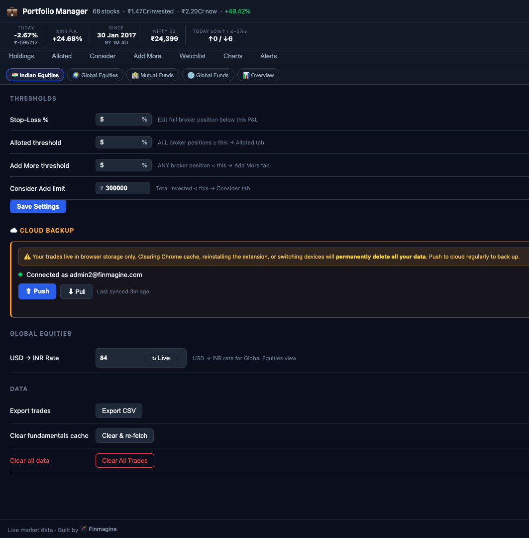
All your trades and portfolio data are stored in browser storage only (chrome.storage.local). This means:
- Clearing Chrome cache or browsing data → all trades permanently deleted
- Uninstalling the extension → data gone
- Switching to a new laptop or Chrome profile → no data
Scroll down in Settings to the ☁ Cloud Backup section. Log in with your finmagine.com account and click Push after every batch of trades you add. Pull on a new device to restore. Takes 2 seconds — do it now before you forget.
What’s Next in This Series
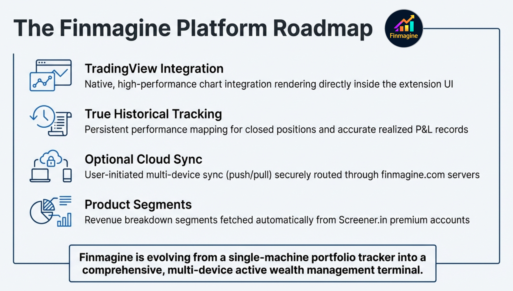
This is article 1 of 8 in the Finmagine Portfolio Manager series. Each article goes deep on one aspect of the extension.
📚 Finmagine Portfolio Manager — 8-Article Series
-
1
You are here: Introducing Finmagine Portfolio Manager — The Blended Average Trap
- 2
- 3
- 4
- 5
- 6
- 7
- 8
Finmagine Portfolio Manager
Per-broker stop-loss discipline, live prices, XIRR, Index Beat, Charts — for Indian Equities, US Stocks, Mutual Funds & Global ETFs. Local-first portfolio tracking, optional cloud backup.
Learn More about Portfolio Manager →Also From Finmagine
The one-click NSE momentum scanner — Stage 2, Near High, VCP, IPO Breakout across every NSE stock in seconds.
Display Modes, Period Filters, CSV Export & Chart Type Flexibility in Finmagine Chart Builder v2.6.0 & v2.7.0.
Altman Z-Score, Piotroski F-Score, ROIC-WACC, Analyst Outlook — all US-exclusive Chart Builder features explained.