🌟 Finmagine Portfolio Manager — Now on the Chrome Web Store
Multi-broker tracker: Indian & global stocks, MFs, ETFs • Decision Journal, History Chart, Corporate Actions • Free
🎙 Multimedia Learning Hub
Video walkthrough, audio deep dive, and 64 interactive flashcards — covering the full Finmagine Portfolio Manager architecture
What You Will Learn
Most investors set a mental stop-loss. Very few stick to it. And almost none track it at the granularity of which broker entry is breaching it. This article explains the full stop-loss system built into Finmagine Portfolio Manager — how it works mechanically and why it matters psychologically — along with a complete architecture teardown of every major feature.
- Why -5% per broker, not per stock
- Configuring your own threshold
- What the badge count means
- Breaches vs approaching positions
- True cost basis after all charges
- Brokerage fee engine routing
- Newton-Raphson iteration explained
- Why 35% in 5 years beats 25% in 6 months? No.
- The 1-year minimum rule
- Local-first core, optional cloud sync
- 4-layer cache system
- CORS bypass via host_permissions
- 12 portfolio chart types
- 23-column watchlist terminal
- 5 ChartInk momentum signals
- 4 asset classes in one view
- Indian MF, US stocks, global ETFs
- Unified ₹ XIRR across all
🎥 Why Most Portfolio Apps Are Lying to You
This video walks through the Blended Average Trap with a real example — INFY at two brokers — and shows every key feature of the Finmagine Portfolio Manager: Holdings tab, stop-loss system, XIRR, Charts, and Watchlist.
▶ If the video doesn't load, watch it directly on YouTube.
🎧 Full Architecture Deep Dive — Audio
A comprehensive two-host technical teardown covering every component of the Finmagine Portfolio Manager: the blended average trap, brokerage fee engine, Newton-Raphson XIRR, multi-asset FX normalization, 100% local-first architecture, CORS bypass, 4-layer caching, watchlist, 12 charts, journey chart caveat, CSV import engine, cloud sync, and the roadmap. No fluff.
🎧 Finmagine Portfolio Manager — Full Architecture Teardown
Approx. 45 minutes • NotebookLM Audio Deep Dive
🎙 This audio covers everything in this article and more — best listened to while following along with the sections below.
Test Your Knowledge — 64 Flashcards
Click any card to reveal the answer. Covers the full Finmagine Portfolio Manager architecture.
Table of Contents
- The Blended Average Trap — Why Conventional Apps Fail
- Per-Broker Isolation — The Core Solution
- How the -5% Stop-Loss Rule Works Mechanically
- The Alerts Tab — Your Daily Risk Checklist
- Stop-Loss, Then Re-entry Clean — The Full Cycle
- The Three-Tab Discipline: Alloted, Consider, Add More
- XIRR: The Only Return Metric That Tells the Truth
- ChartInk Momentum Signals: Five Signals, One Score
- The Watchlist: 23 Columns of Institutional Data
- 12 Portfolio Charts: Visual Intelligence on Demand
- Four Asset Classes, One Unified Portfolio
- Local-First Architecture — Privacy by Design
- The Psychology: Why Rules Beat Intuition
- Configuring Your Thresholds
The Blended Average Trap — Why Conventional Apps Fail
Almost every portfolio tracking app available today is, in a very specific and measurable sense, misrepresenting your risk. Not through malice — through design. These apps are built for comfort and engagement, not for rigid risk management. They aggregate your data to present the most optimistic view of your holdings, and in doing so, they actively work against your investment discipline.
This is what the Finmagine Portfolio Manager was architected to solve. The tool calls it the Blended Average Trap: the situation where a profitable early investment in a stock completely masks a stop-loss breach in a more recent purchase of the same stock, at a different broker, at a different time, under a different thesis.
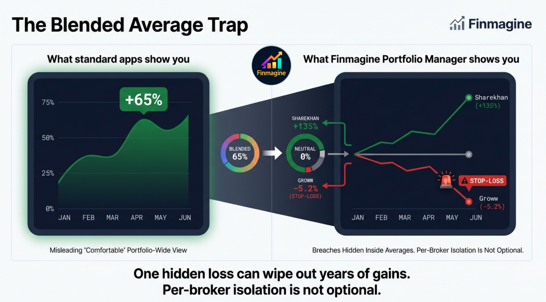
The left panel of that graphic is what most apps show you: a portfolio-wide return that feels reassuring. The right panel is the truth: one position that is performing well is silently covering for another that has already violated your stop-loss rule and should have been exited. The comfortable green number on the aggregate view is an illusion — and it is actively preventing you from making the correct risk management decision.
Per-Broker Isolation — The Core Solution
Here is the scenario that happens to multi-broker investors constantly. You hold INFY at two brokers. You bought the first tranche at ₹1,600 in Zerodha during a dip six months ago. Three months later, INFY broke out and you bought a second tranche at ₹1,900 in Upstox. The price is now ₹1,780.
| Entry | Broker | Buy Price | LTP | P&L% | Status |
|---|---|---|---|---|---|
| Tranche 1 | Zerodha | ₹1,600 | ₹1,780 | +11.3% | ✓ Comfortable |
| Tranche 2 | Upstox | ₹1,900 | ₹1,780 | -6.3% | ⚠ STOP-LOSS |
| Blended (standard apps) | +2.5% | ― HIDDEN | |||
The blended average of ₹1,750 shows you up +2.5% and nothing requiring action. But the Upstox tranche is at -6.3% — it has crossed your -5% stop-loss. That position represents a specific bet made at a specific price at a specific time. It has failed that bet's own entry condition. The fact that an earlier trade is cushioning the blended P&L is irrelevant — these are two separate decisions.
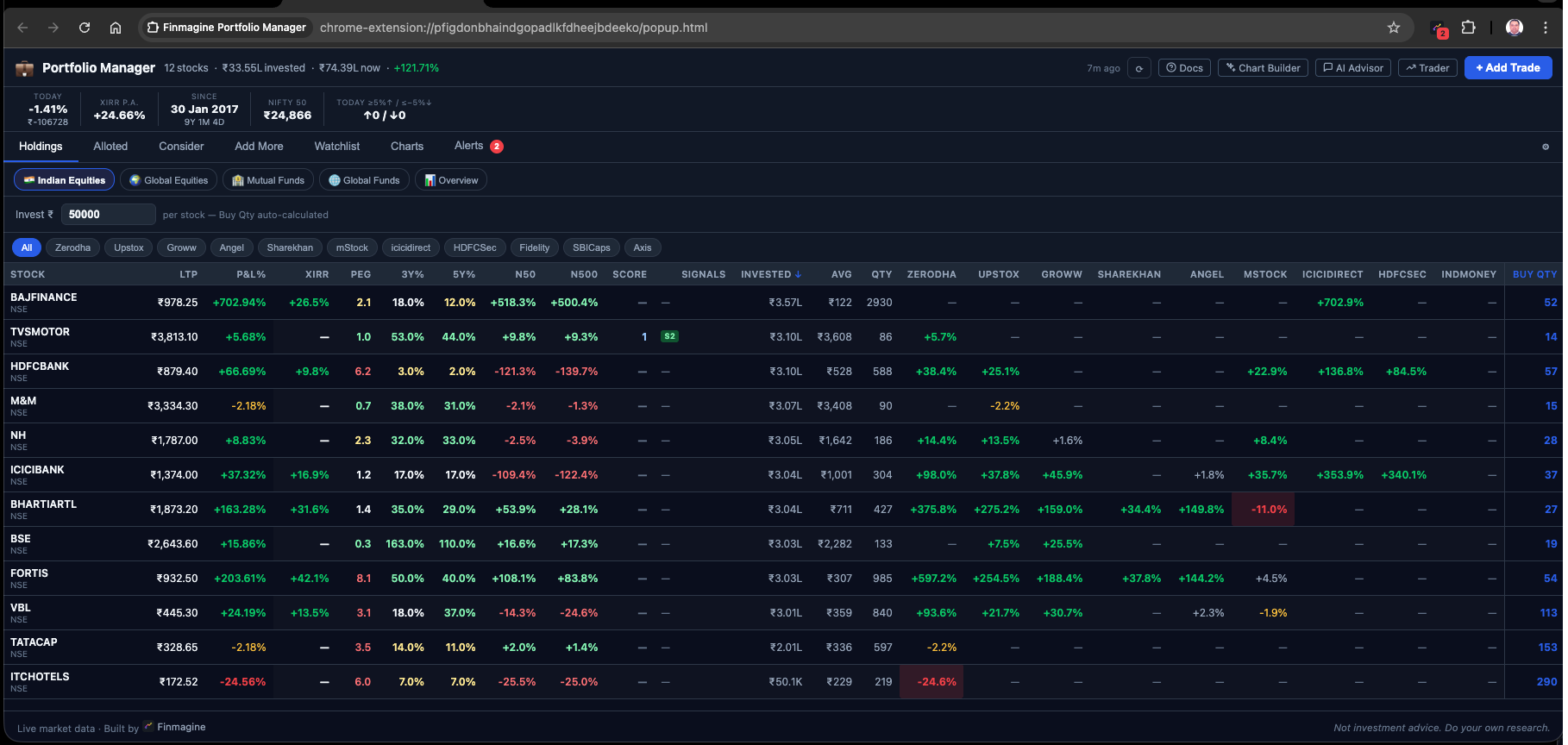
Finmagine Portfolio Manager's Holdings tab refuses to blend brokers. Each broker column shows that entry's own P&L independently. One stock can show green at Zerodha and red at Upstox simultaneously. You cannot hide from the failure of one decision behind the success of another.
The Re-entry Model and Why Averaging Down Is Forbidden
The extension supports only one trade per stock per broker. This is not a limitation — it is the rule that enforces the re-entry model. If your Zerodha position in a stock hits -5%, the correct action is to exit. If a month later the setup re-establishes and you want back in, you execute that re-entry at a different broker — say, Groww. This creates a virgin data stream: clean cost basis, zero P&L%, and a freshly started stop-loss clock. No emotional baggage from the previous trade contaminates the new decision.
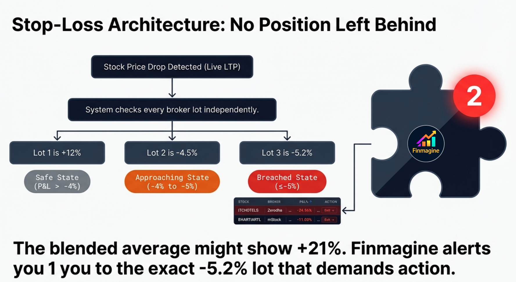
How the -5% Stop-Loss Rule Works Mechanically
The extension monitors every broker column cell for every stock in your portfolio. The calculation is straightforward:
Per-Broker P&L% = (LTP − Net Cost per Share) ÷ Net Cost per Share × 100
The Net Cost per Share is the all-in cost after charges: buy price + STT + exchange fee + stamp duty + SEBI fee + brokerage + GST. This is what you actually paid, not what the quote showed. The stop-loss trigger is applied against this real cost, not the raw buy price.
The extension also auto-calculates a Sell Above price at trade entry — the minimum LTP at which you can exit the position and break even after all sell-side taxes and charges. This is the true break-even, not the quoted buy price.
The True Cost Basis: Brokerage Fee Engine
Using the raw buy price as your stop-loss anchor is a mathematical fiction. The extension's brokerage fee engine calculates the exact amount of capital that physically left your bank account, routing the calculation through different logic based on which of the 9 broker columns you used.
| Charge Component | Rate | Applies To |
|---|---|---|
| Securities Transaction Tax (STT) | 0.1% | Both buy and sell transactions on delivery equity |
| Exchange Transaction Charge | 0.00297% (NSE) | All equity transactions |
| Stamp Duty | 0.015% | Buy side only (state-level charge) |
| SEBI Turnover Fee | 0.0001% | All transactions |
| GST | 18% on (brokerage + exchange fee + SEBI fee) | Applicable to all fee components |
| Brokerage — Zero-Fee Brokers | ₹0 | Most modern discount brokers. Any unrecognised broker also defaults to ₹0. |
| Brokerage — Legacy Brokers | 0.50%–0.55% | Traditional full-service brokers. Pre-configured for popular ones; any other defaults to zero. |
The practical impact is significant. If you execute a ₹10 lakh trade on a zero-brokerage platform, your friction cost is a few hundred rupees. The same trade on a 0.5% legacy broker incurs ₹5,000 in brokerage plus ₹900 in GST on the brokerage, plus all the statutory charges. Your true cost basis is not ₹1,000 per share — it might be ₹1,006 per share. A strict -5% stop-loss must be calculated from ₹1,006, not ₹1,000. The fee engine eliminates this mathematical slippage entirely.
The Three-Color Broker Column System
| P&L% Range | Color | Meaning | Recommended Action |
|---|---|---|---|
| Above -4% | ● Green | Position is healthy — within acceptable range | Hold, monitor normally |
| -4% to -5% | ● Amber | Approaching stop-loss — 1% buffer remaining | Review the setup; prepare exit plan |
| Below -5% | ● Red + ⚠ | Stop-loss breached | Exit the broker position per your rule |
The amber zone is a warning buffer. It gives you time to review the setup before a breach, not after. If your risk rule is strict ("exit at -5%, no exceptions"), the amber zone is preparation time. If your rule allows discretion for high-conviction names, amber is where you make that call.
The Extension Icon Badge
The Chrome extension icon in your browser toolbar shows a red badge with the count of active stop-loss breaches across your entire portfolio. If 3 broker positions are below -5%, you see a 33 badge on the icon. This means you never have to open the extension to know if something needs attention. The badge is visible at all times, across all browser tabs — whether you are reading news, checking email, or watching a video.
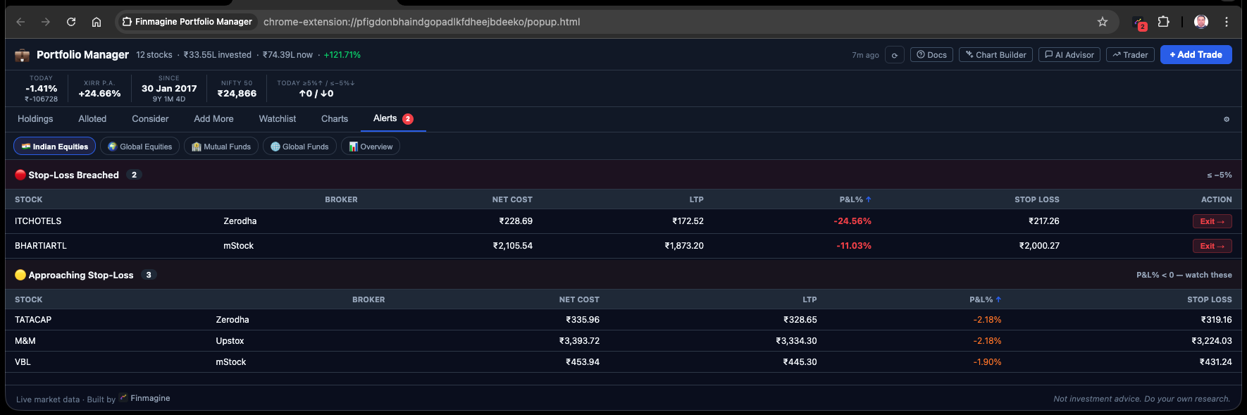
The Alerts Tab — Your Daily Risk Checklist
The Alerts tab consolidates all stop-loss information into one actionable view. It shows two categories of positions: active breaches (already below -5%) and approaching positions (currently between -4% and -5%).
Here is what the Alerts tab looks like with a mixed portfolio of breaches and warnings:
Each alert row shows: stock + broker, current P&L%, buy price and LTP, how far from the threshold, and the invested amount. The invested amount matters because exiting a ₹50,000 breach and exiting a ₹3,00,000 breach are very different decisions in terms of capital at risk.
Stop-Loss, Then Re-entry Clean — The Full Cycle
The per-broker model is specifically designed for investors who re-enter positions after a stop-loss. This is a common strategy among momentum investors: you exit cleanly when a position breaches your threshold, watch for the setup to re-establish, and re-enter from a different broker at a new cost basis.
Why a Different Broker for Re-entry?
Re-entering the same stock at the same broker that just triggered a stop-loss creates a practical problem: the extension would average the old trade with the new one. That average would look different from what you actually paid. By using a different broker for re-entry, you keep the positions completely separate — clean cost basis, clean P&L%, clean stop-loss clock. It also acts as a mental palate cleanser: a different broker means a virgin data stream, entirely disconnected from the frustration of the previous loss.
| Event | Broker | Price | Action | P&L% |
|---|---|---|---|---|
| Original entry | Zerodha | ₹3,350 | BUY 50 shares | 0% |
| Stop triggered | Zerodha | ₹3,175 | SELL 50 shares | -5.2% |
| Setup re-establishes | Groww | ₹2,980 | BUY 60 shares | 0% (fresh) |
| Today | Groww | ₹3,240 | HOLD | +8.7% |
The Zerodha trade is recorded as a closed sell in your trade history (contributing to realized P&L). The Groww position is entirely independent, starting from ₹2,980 with its own stop-loss clock. You sold once and re-entered better — a complete cycle that a blended tracker would have muddled into a confusing average.
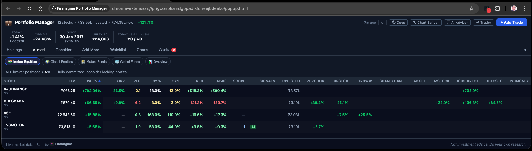
The Three-Tab Discipline: Alloted, Consider, Add More
The stop-loss system in the broker columns tells you when to exit. Three other tabs tell you how to size and build positions correctly in the first place. Together they form a complete position management framework.
| Tab | Condition | What It Means | Typical Action |
|---|---|---|---|
| Alloted | ALL broker entries for this stock are ≥ +5% | Position fully committed. Every entry is in profit above the green threshold. | Hold. Do not add. Let it run. |
| Add More | At least ONE broker entry is < +5% | At least one entry is still in its "building" window — not yet locked in profit above threshold. | Consider adding at a lower average if thesis is intact. |
| Consider | Total invested < threshold (default ₹3L) | Under-allocated by your own conviction standard — you haven't committed enough capital yet. | Review and decide: add or remove from watchlist. |
XIRR: The Only Return Metric That Tells the Truth
Simple P&L percentage is a fundamentally incomplete metric for any position held longer than a few months. It tells you the absolute return on your initial cost, but it is completely blind to the dimension of time. A 35% gain achieved over five years looks identical to a 35% gain achieved over five months. In capital allocation, time is the heaviest anchor — capital has an opportunity cost.
After real inflation, this capital generated near-zero wealth.
Simple P&L looks smaller. XIRR reveals the true compounder.
XIRR — the Extended Internal Rate of Return — solves this by calculating the precise annualized compound growth rate of your chaotic, irregularly timed series of cash flows. Every buy date, every amount, every dividend is accounted for. XIRR answers the question that P&L cannot: how hard is this capital actually working per year?
Newton-Raphson: How XIRR Is Computed Client-Side
Calculating XIRR without a server is computationally meaningful. The extension's dedicated xirr.js module uses the Newton-Raphson iteration method — a mathematical algorithm dating to the 17th century, originally designed to find the roots of a real-valued function.
In finance, the root being found is the exact interest rate that makes the net present value of all your specific cash flows equal exactly zero. The algorithm starts with an educated guess at your annualized return (say, 10%), runs the present value math for every transaction date, measures the error, uses the derivative of the function to calculate a corrected second guess, and iterates rapidly. Within fractions of a millisecond, even running locally in Chrome, it converges on the precise annualized compound growth rate of your entire holding history.
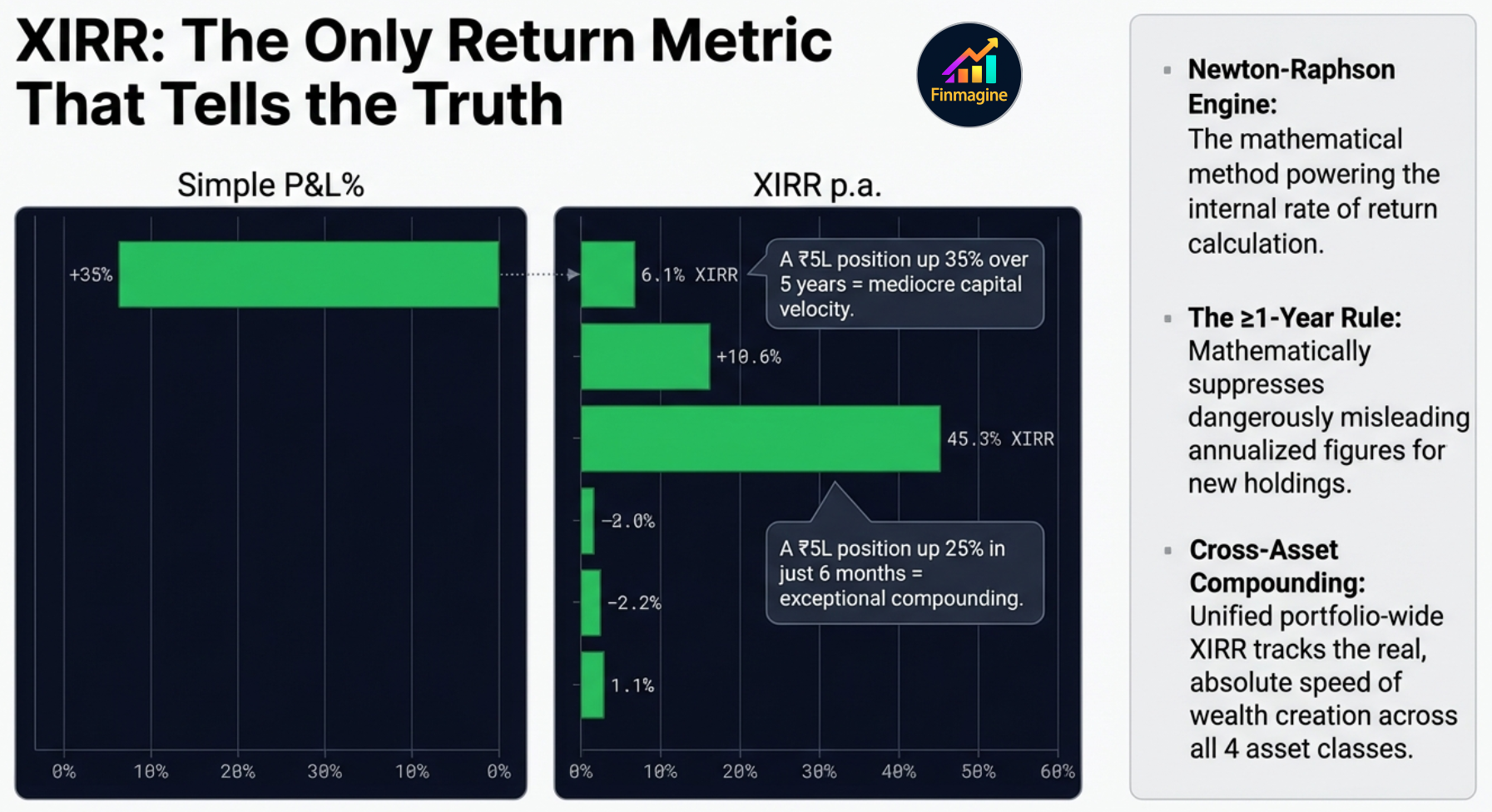
The 1-Year Minimum Rule — Why Short-Term XIRR Is Hidden
The extension deliberately does not display XIRR for holdings less than one year old. This is a behavioral guardrail. Consider: if a stock gains 5% in just two weeks, annualizing that return implies a roughly 250% annual rate. That number is mathematically accurate and practically impossible to sustain — but seeing it on a dashboard triggers enormous dopamine, leading to irrational over-allocation at the top of a short-term spike.
By enforcing a strict one-year marination period, the extension protects investors from their own extrapolated data. Short-term trades are evaluated on simple P&L and risk metrics only. Only capital that has survived the full volatility of a calendar year earns the right to be measured by XIRR.
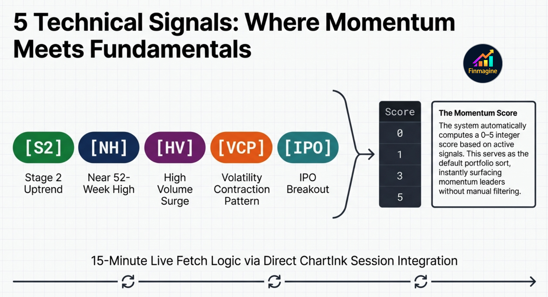
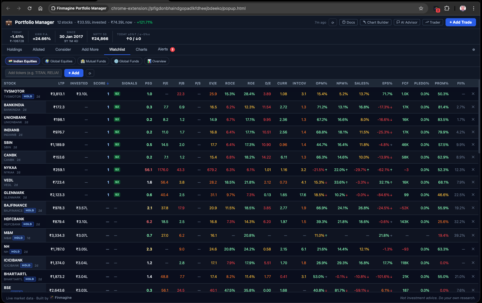
ChartInk Momentum Signals: Five Signals, One Score
Every stock in the Holdings and Watchlist tabs has a Score column (0–5) and a Signals column. These are powered by ChartInk, a screener platform that tracks specific technical conditions in real time. The extension fetches these signals using your active ChartInk session — requiring you to be logged into ChartInk in your browser for them to populate.
The Score column simply counts how many of these five signals are active simultaneously for a stock. A Score of 4 or 5 means the stock is in a Stage 2 uptrend, near its 52-week high, showing a VCP or IPO setup, and experiencing high volume — a rare, high-conviction confluence. A Score of 0 means none of the five conditions are currently active.
The Watchlist: 23 Columns of Institutional Data
The Watchlist tab is not a simple list of tickers. It is a 23-column localized research terminal that puts institutional-grade fundamental data alongside momentum signals, allowing you to ask the most critical question in portfolio management: is this new idea actually better than what I already own?
Your existing holdings are automatically included in the Watchlist (marked with a blue HOLD badge). You can manually add any Indian equity or global stock you are researching. The extension fetches 23 data points per stock from Screener.in (cached for up to 90 days) and applies a traffic light evaluation system that color-codes metrics against institutional benchmarks — so you scan for color patterns rather than reading every number.
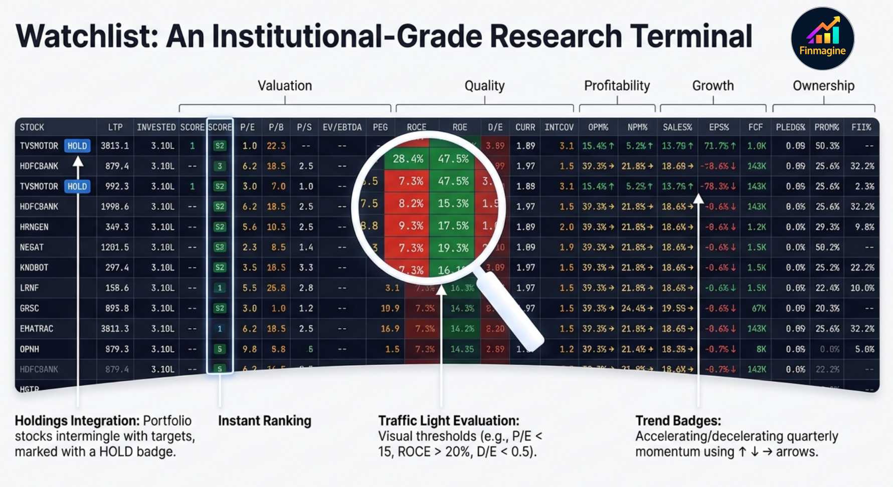
Traffic Light System — What Each Color Means
- PEG ratio < 1 (green): Stock is cheap relative to its 3-year price CAGR — growth is under-priced.
- PEG ratio 1–2 (amber): Fairly valued. Neither cheap nor expensive relative to growth.
- ROCE > 20% (green): High-quality business — generating strong returns on the capital employed.
- D/E > 2 (red): High financial leverage — the business carries very high debt relative to equity.
- Trend badge ↑: Latest two-quarter average of Sales% or EPS% improved by ≥1% over the prior two quarters — business momentum is accelerating.
- Trend badge ↓: Momentum is decelerating — the business is slowing on this metric.
- Trend badge →: No meaningful change in momentum direction.
Some ratios like P/B (price to book) and P/S (price to sales) are not fetched directly from Screener to conserve bandwidth. Instead, the extension calculates them dynamically by taking the cached book value per share and dividing it by the live last-traded price from the 15-minute Yahoo Finance cache — building live analytics from separately cached parts.
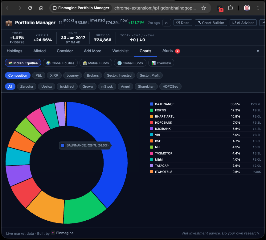
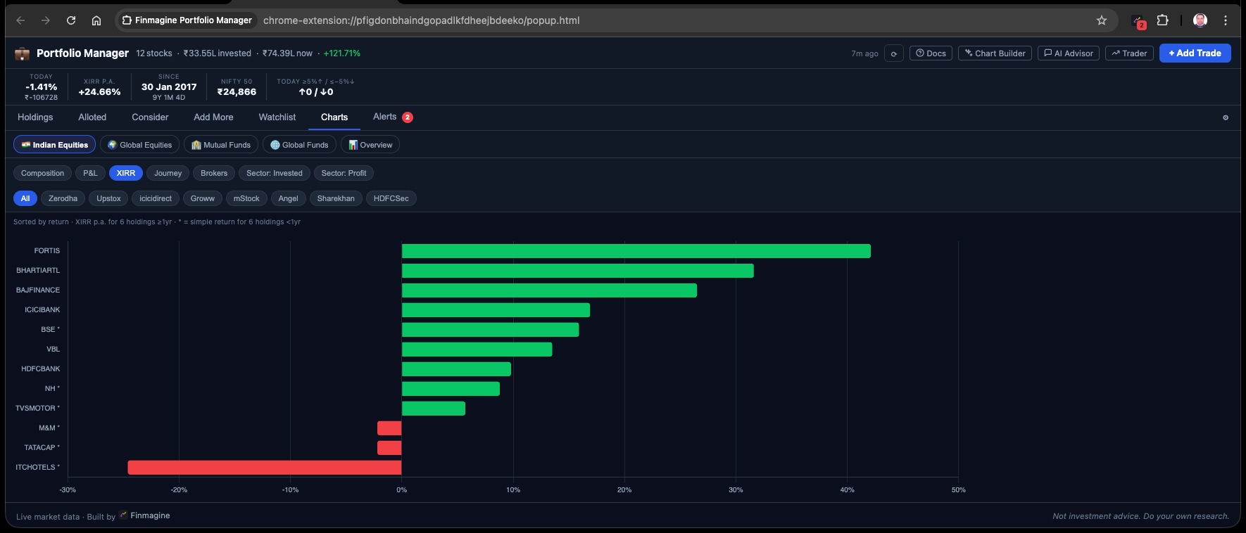
12 Portfolio Charts: Visual Intelligence on Demand
The Charts tab provides 12 distinct chart types covering every dimension of your portfolio — composition, performance, time, and comparative analysis across brokers. The key architectural decision is that charts are rendered on demand, not all at once. Rendering 12 interactive, data-dense canvas elements simultaneously would spike CPU usage and cause the browser thread to lag. Instead, you click to generate a specific chart when you want to ask a specific question of your data.
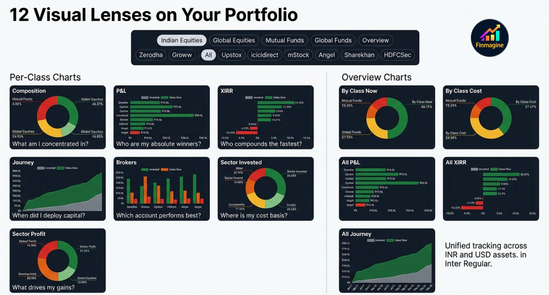
| Chart Type | Question It Answers |
|---|---|
| Composition Donut | Am I too concentrated in any single stock? (flags >20% concentration) |
| XIRR Horizontal Bar | Which positions are actually compounding the fastest per year? |
| P&L Horizontal Bar | Which stocks are my biggest absolute ₹ winners and losers? |
| Journey Area Chart | How has my total capital deployment and portfolio value grown over time? |
| Brokers Bar Chart | Which broker account is working hardest for me? |
| Sector: Invested | Am I over-concentrated in a specific sector despite diversification by stock? |
| Sector: Profit | Which sectors are actually generating the most profit in absolute ₹ terms? |
Four Asset Classes, One Unified Portfolio
The extension tracks wealth across four distinct asset classes, applying the same per-broker isolation and stop-loss discipline to all of them:
Indian Equities
NSE/BSE listed stocks. Works with any broker — the broker name is a free-text label you enter. STT, exchange fees, stamp duty, and brokerage routing all applied. Live prices from Yahoo Finance.
Global Equities
US stocks (prefix US:, e.g., US:AAPL). Supports fractional shares to full double-precision floating point. Prices from Yahoo Finance. Values converted at configurable USD/INR rate.
Indian Mutual Funds
Prefix MF: followed by AMFI scheme code. ISIN auto-resolved via the AMFI master NAV mapping file (cached 30 days). Live NAV from api.mfapi.in.
Global Funds / ETFs
International mutual funds and ETFs (e.g., Fidelity, Schwab, Vanguard). Free-text platform tracking. USD values converted to INR for unified portfolio XIRR.
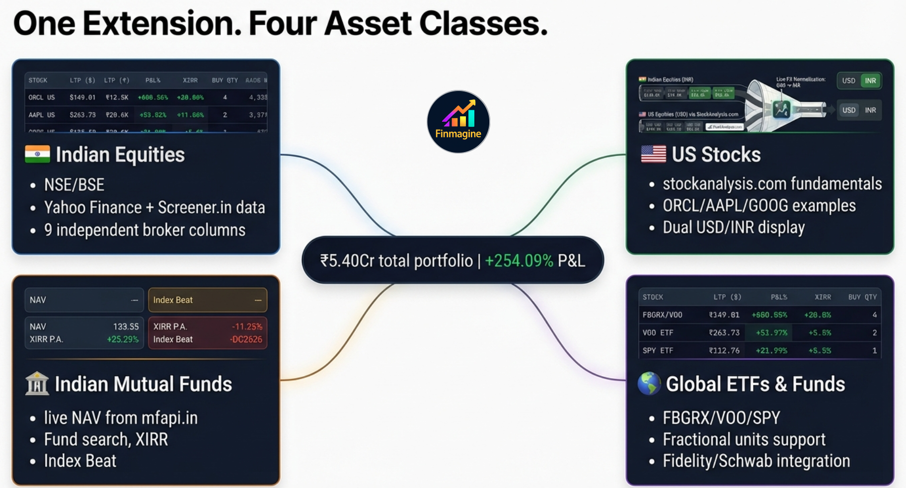
FX Normalization and Unified XIRR
When the extension calculates Portfolio XIRR across all four asset classes, it must merge INR and USD cash flow timelines. It does this by detecting the US: prefix on global tickers and applying the user-configured USD/INR rate (default ₹84) to convert all USD values to INR before running Newton-Raphson iteration across the combined timeline. The result is a single annualized return number for your entire net worth in your home currency.
The FX rate is not fetched from a live API on every page load (which would introduce severe latency and rate-limiting issues). Instead, it is stored in Settings and updated manually by the user periodically — a deliberate design choice that keeps the extension fast and dependency-free.
Local-First Architecture — Privacy by Design
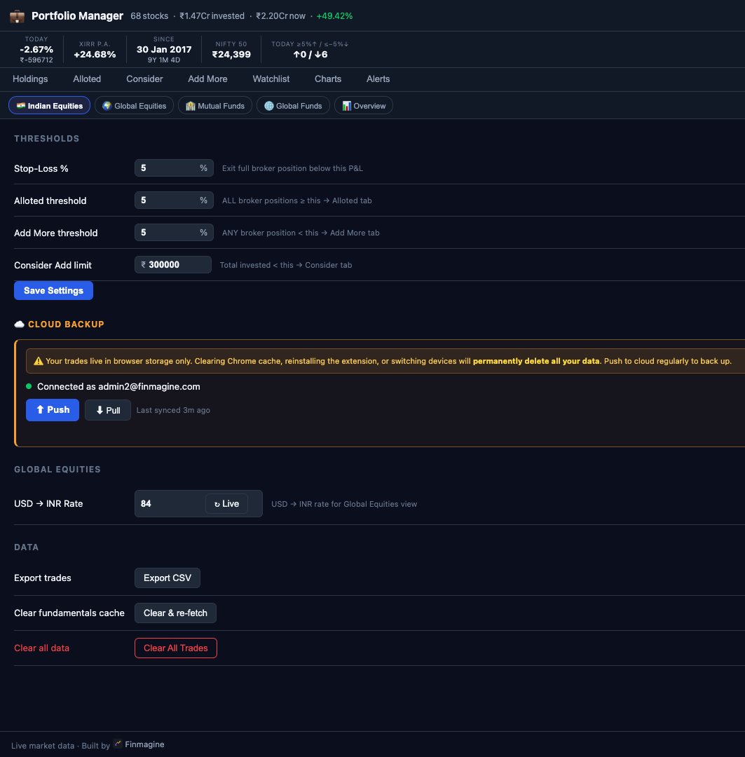
Core portfolio data — every broker lot, every custom setting, trade history — resides in Chrome's local storage inside your browser profile. No account required for core portfolio tracking. Live prices are fetched directly from Yahoo Finance. Fundamental data is served from Finmagine's shared cache server, which is faster than hitting Screener.in directly and avoids rate-limiting. Cloud sync is available as an optional feature (requires a Finmagine account) and sends your trades, settings, and watchlist to Finmagine's servers when you enable it.
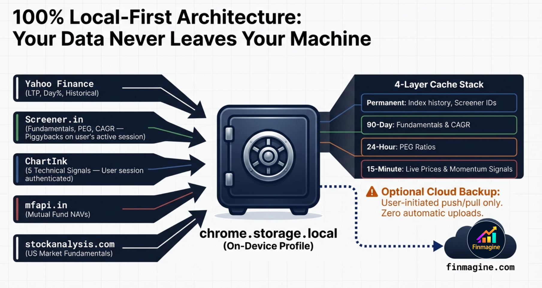
Why a Chrome Extension — Not a Web App
Web browsers enforce strict Cross-Origin Resource Sharing (CORS) rules that would prevent a standalone web app from fetching data from Screener.in or ChartInk. Chrome extensions using Manifest V3 can declare host_permissions in their manifest.json — explicit whitelisting of external domains. When you install the extension, you authorize the browser's background service worker to make direct cross-origin HTTP requests to Yahoo Finance, Screener.in, and ChartInk. Your machine connects directly to those sources. Fundamental data is additionally served from Finmagine's cache for speed and to protect your Screener.in session from rate-limiting.
The 4-Layer Cache Architecture
Every data fetch is expensive — in time, bandwidth, and the risk of rate-limiting. The extension uses a four-layer caching system within chrome.storage.local that ensures the UI renders instantly, even on a 90-second sequential fundamental refresh in the background.
🔒 Layer 1: Permanent Cache
Screener.in company IDs and Nifty index history. Immutable identifiers that never change once fetched.
📆 Layer 2: Long-Term Cache
Deep fundamentals: ROCE, ROE, D/E, 3Y and 5Y Price CAGR. Change at most quarterly — daily refresh is wasteful.
🕐 Layer 3: Daily Cache
PEG ratio. The growth component changes quarterly; the price component changes daily. Once per day is the optimal balance.
⚡ Layer 4: Working Memory
Live prices from Yahoo Finance and momentum signals from ChartInk. Expires rapidly to stay current through the trading day.
Stale-While-Revalidate: Zero Perceived Latency
When you open the extension, the UI immediately renders using whatever is in the 15-minute cache — even if that data is 45 minutes old. While you are reading the dashboard, the background service worker silently initiates live fetches. As each new price arrives from Yahoo Finance, the specific cell in the UI updates. You see old data for a fraction of a second before it becomes current, but you never see a loading screen. This is the stale-while-revalidate pattern: prioritize rendering speed, let accuracy follow immediately behind.
Rate-Limiting Protection: Sequential Fetch with 1500ms Delay
Screener.in has rate-limiting protection against bot-like parallel requests. If the extension fired 50 simultaneous requests for a 50-stock portfolio, Screener's WAF would flag your IP and issue a temporary ban. Instead, the extension uses a sequential architecture: it fetches fundamentals for the first stock, waits 1,500 milliseconds, fetches the second stock, and so on. This mimics the cadence of a human user slowly clicking through pages, entirely preventing bot-detection triggers. A 50-stock fundamental refresh takes about 75 seconds — but because of the stale-while-revalidate pattern and the 90-day fundamental cache, this full refresh rarely runs.
The Psychology: Why Rules Beat Intuition
The hardest part of a stop-loss rule is not knowing it. It is following it when the stock is down -4.8% and you are certain it will bounce. Research on investor psychology is unambiguous: we hold losers too long and sell winners too soon. Behavioral economists Kahneman and Tversky proved mathematically that humans feel the psychological pain of financial loss approximately twice as intensely as the pleasure of an equivalent gain.
This deep-seated aversion to realising losses is the exact reason investors average down into failing positions (hoping for a bounce to break even), and why they sell outperforming winners too early (desperate to lock in success before it evaporates). A pre-committed, automatically-enforced rule at -5% solves this. The rule was set when you were rational and emotionally detached from the position. The badge and the Alerts tab simply surface the fact that the rule has triggered — the decision to exit was already made, before the trade opened.
Four Rules That Make Stop-Loss Discipline Work
- Rule is set before entry, not during the trade. Know your -5% (or your custom threshold) before you hit Buy. The Alerts tab enforces what you decided when you were calm.
- No averaging down at the same broker. The model only supports one trade per stock per broker. If the position is at -5%, the answer is not to buy more at the same broker to lower the average. Exit and re-evaluate.
- Re-entry is a separate decision. After a stop-loss, the question of whether to re-enter the same stock is a fresh analysis. It is not an obligation to recover losses from the original trade.
- The badge count is the accountability mirror. If the badge shows 5 breaches, 5 stop-loss rules have been violated. The number is objective. You cannot debate with the Newton-Raphson engine. You cannot hide the failure inside a blended average cost. It is staring at you, demanding action.
The system exists to remove ambiguity at the worst possible moment. When the red badge lights up in the corner of your browser — while you are reading news, checking email, or watching a video — it is a hard, unyielding mathematical fact that a rule has been violated. Trust the isolated columns and the rigid rules you built for yourself when your mind was clear, not the emotional rationalizations you generate in the heat of a drawdown.
Configuring Your Thresholds
The default -5% stop-loss threshold and ₹3,00,000 "Consider" threshold are starting points, not prescriptions. Go to the Settings tab to adjust them to match your risk tolerance and portfolio size.
| Setting | Default | What It Controls | When to Change |
|---|---|---|---|
| Stop-Loss Threshold | -5% | Triggers red badge + Alerts tab breach entry | More aggressive traders may use -3%; longer-term investors may use -8% or -10% |
| Consider Threshold | ₹3,00,000 | Minimum invested to remove stock from Consider tab | Scale to your typical position size — if you normally invest ₹1L per position, set to ₹1,00,000 |
| Invest Amount | ₹0 | Drives the Buy Qty column in Holdings | Set to your standard per-trade investment amount |
| USD/INR Rate | ₹84 | Converts all GL_EQ and GL_MF values to ₹ | Update periodically to reflect current exchange rate |
Finmagine Portfolio Manager — Article Series
📚 8-Article Series
- 1
- 2You are here: Per-Broker Stop-Loss — The Full Architecture Deep Dive
- 3
- 4
- 5
- 6
- 7
- 8
Finmagine Portfolio Manager
Per-broker stop-loss discipline, live prices, XIRR, Index Beat, Charts — for Indian Equities, US Stocks, Mutual Funds & Global ETFs. Local-first portfolio tracking, optional cloud backup.
Learn More about Portfolio Manager →