Following along? Install the extension first
Finmagine Financial Chart Builder — free • no account needed • Chrome, Edge, Brave
Multimedia Learning Hub
Master every card in the Price Analysis tab through a comprehensive guide, real company examples, and 90 interactive flashcards
What You Will Master
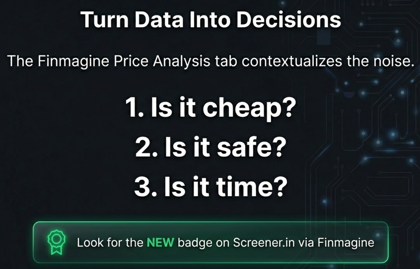
The Price Analysis tab is the only tab in the Finmagine Chart Builder that answers this question directly: is the stock price ahead of the business, or is the business ahead of the price? For Indian investors using US stocks, it adds a second question that no standard screener addresses: what have you actually earned in rupees?
This guide goes card by card — formula, threshold, real examples, and interpretation traps. By the end you will know exactly what each number means and when to trust it.
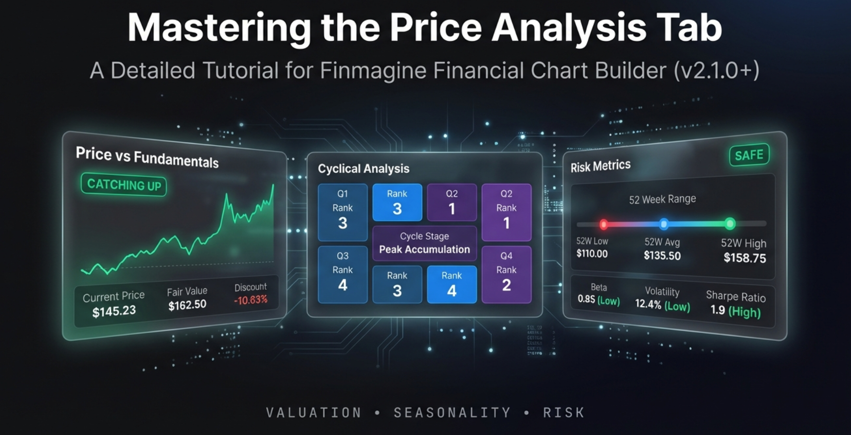
The 7 Cards / Panels Covered:
- Valuation Status Badge
- Price/Profit Growth Ratio
- CAGR Comparison Table
- USD Stock Return
- $ Boost (INR Depreciation)
- ₹ Total Return
- Beta, RSI
- 50/200 Day SMA
- Golden / Death Cross
- CYCLICAL Badge
- Quarter Ranking
- Seasonal Patterns
- 52W Range Bar
- Max Drawdown
- From High / From Low
Plus: The 5-minute price analysis workflow, accuracy guide for Indian Investor Returns across 7 US stocks tested against IndMoney ground truth, USD/INR rate history (2016–2026), and 90 flashcards.
The Hidden Rupee Return Nobody Talks About
The scoreboard fallacy, the multiplicative FX math, real M&M and Polycab case studies, cyclical patterns, and the complete 5-tab analysis workflow — all in one deep-dive.
The Scoreboard Fallacy & Hidden Returns — Audio Deep Dive
A two-host conversation covering the full Price Analysis tab: price vs fundamentals, the rupee alpha maths, USD/INR depreciation history, cyclical entry timing, risk metrics, and the 5-minute workflow. ~30 minutes.
Generated with NotebookLM · Script sourced from this guide · Transcript available on request
Test Your Price Analysis Knowledge — 90 Flashcards
Click any card to reveal the answer. Search by topic to focus on a specific area.
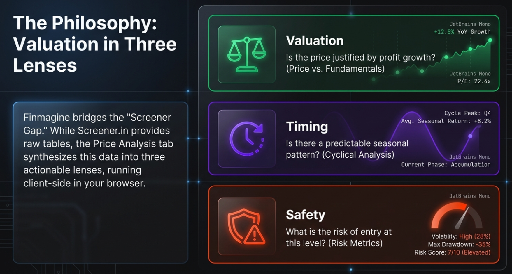
Why Price Analysis Asks a Different Question
Every other tab in the Finmagine Chart Builder is about the business — how profitable it is, how efficiently it runs, whether it is cheap or expensive relative to history. The Price Analysis tab is about the stock. Specifically, it asks: is the stock price keeping pace with the business, running ahead of it, or falling behind?
This distinction matters enormously. A company can have spectacular fundamentals — 25% profit growth, expanding margins, strong balance sheet — and still be a poor investment if the stock has already priced in ten years of that growth. Conversely, a business in a rough patch can be a great buy if the stock has fallen far more than the fundamentals justify.
For Indian investors in US stocks, the tab goes one step further. It answers a question that no standard screener in India addresses: what have you actually made in rupees? When AMZN goes up 110% in US dollar terms and the rupee depreciates 5% against the dollar in the same period, your rupee return is not 110%. It is higher. The Indian Investor Returns card computes this exact figure.
How to Open the Tab
- Navigate to a company page on Screener.in (Indian stocks) or stockanalysis.com (US stocks)
- Click the Finmagine icon in your Chrome toolbar — the analysis panel opens
- Select the “Price Analysis” tab — it is the fourth tab, after Charts, Quick Analysis, and Calculated Ratios
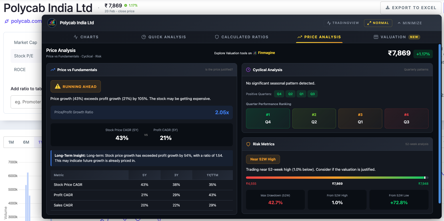
Price vs Fundamentals — Is the Stock Earning Its Price?
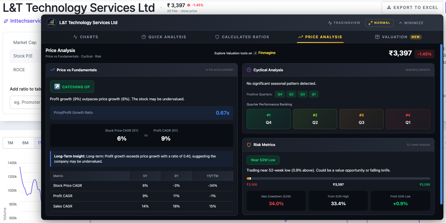
This is the foundational panel of the entire tab. Before looking at any other metrics, this panel gives you a rapid verdict on one question: has the stock price been justified by the growth in the underlying business?
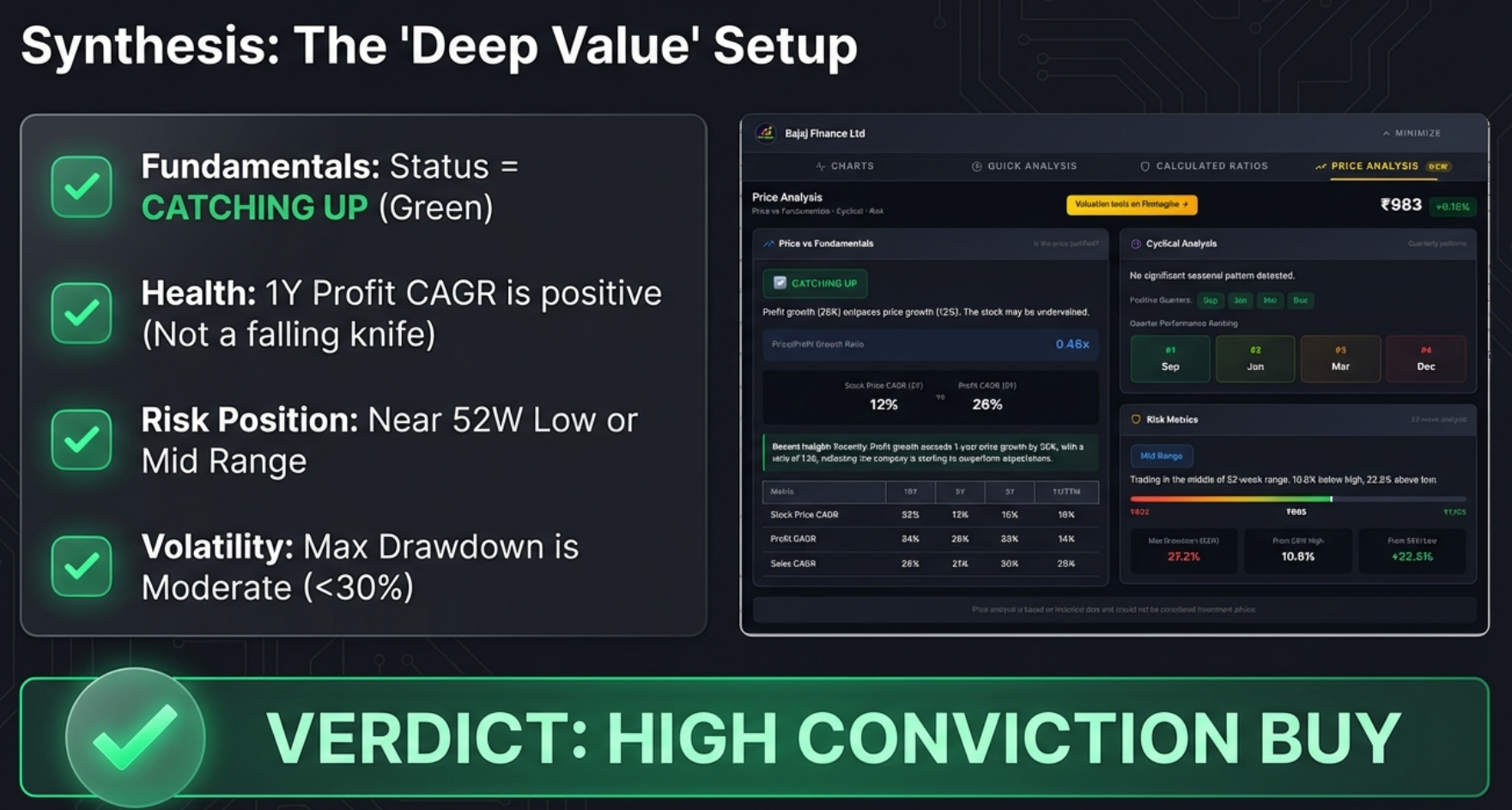
Card 1 — Valuation Status Badge
The Logic Behind the Badges
The status is derived by comparing the Stock Price CAGR (how fast the share price has grown) against the Profit CAGR (how fast earnings have grown). These two numbers should, over the long run, converge — a company that doubles its profits should eventually see its stock price double. When they diverge significantly, it signals either a mismatch to be exploited or a story the market knows that the data doesn’t yet show.
| Status | What Happened | Possible Reasons | What to Check Next |
|---|---|---|---|
| CATCHING UP | Profits grew much faster than the stock price | Market overlooked the company; sector out of favour; short-term negative news overshadowed good results | Valuation tab — are multiples below median? Quick Analysis — is the health score strong? |
| FAIRLY VALUED | Price and profits grew at broadly similar rates | Efficient pricing; the market correctly tracked the fundamentals | Check 1Y vs 5Y trend — is this balance recent or long-standing? |
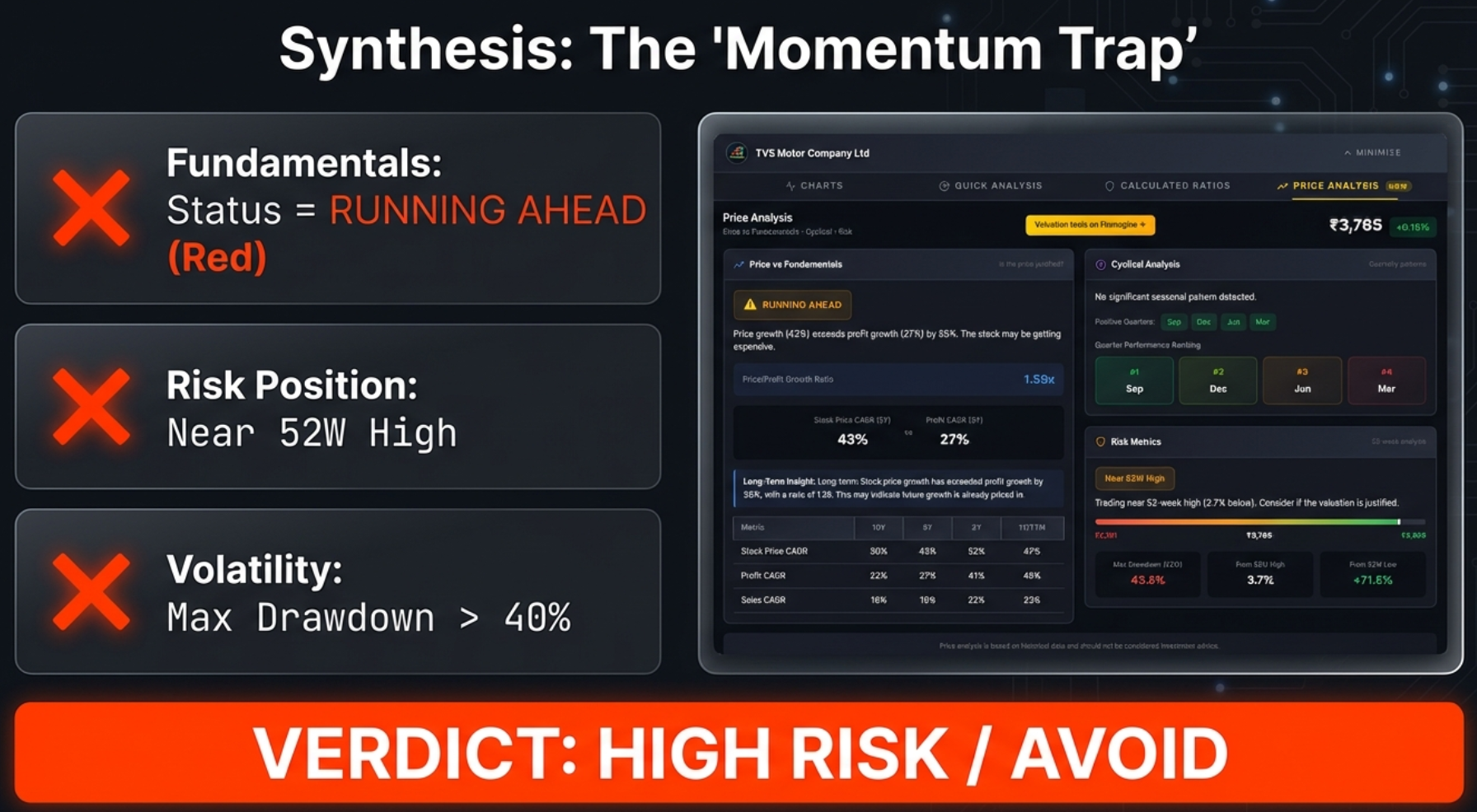
| RUNNING AHEAD | Price grew much faster than profits | Multiple expansion; speculative premium; market priced in future growth that hasn’t arrived yet | Is the Forward PE justified? Valuation tab — are multiples far above median? |
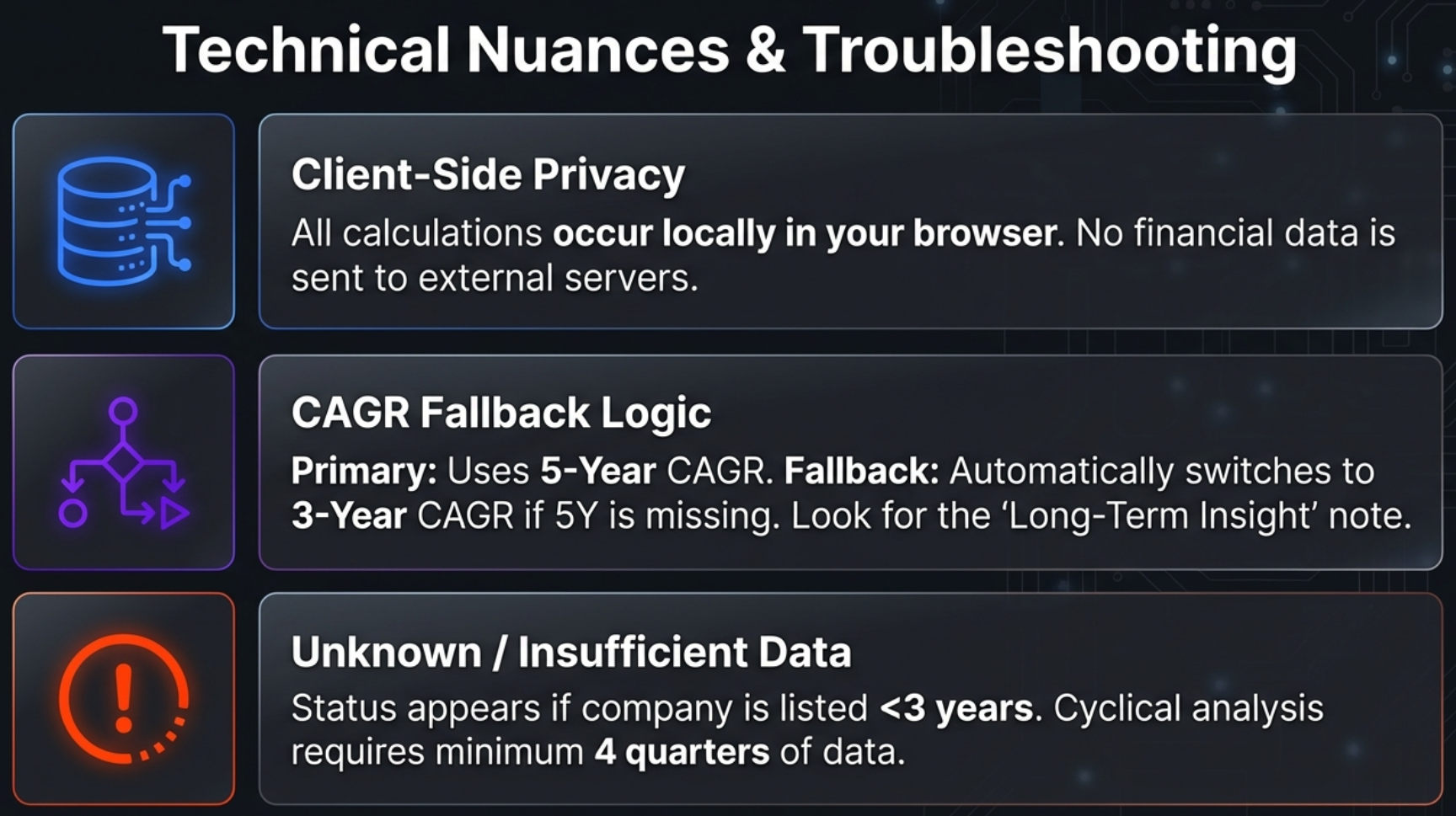
| UNKNOWN | Insufficient CAGR data | Recently listed company; data extraction issue; company does not report in standard format | Use Cyclical Analysis and Risk Metrics panels; open Charts tab and compare price with profit visually |
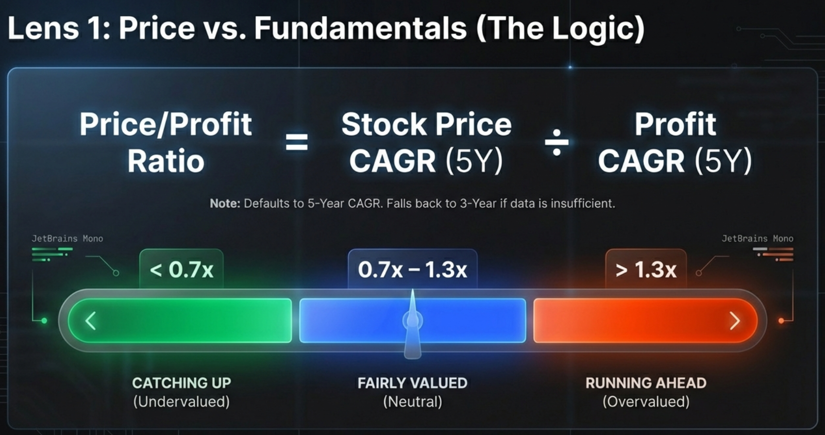
The Price/Profit Growth Ratio
Below the status badge, the panel shows a Price/Profit Growth Ratio — the ratio of Stock Price CAGR to Profit CAGR. This single number summarises the relationship:
| Ratio | Status | Meaning |
|---|---|---|
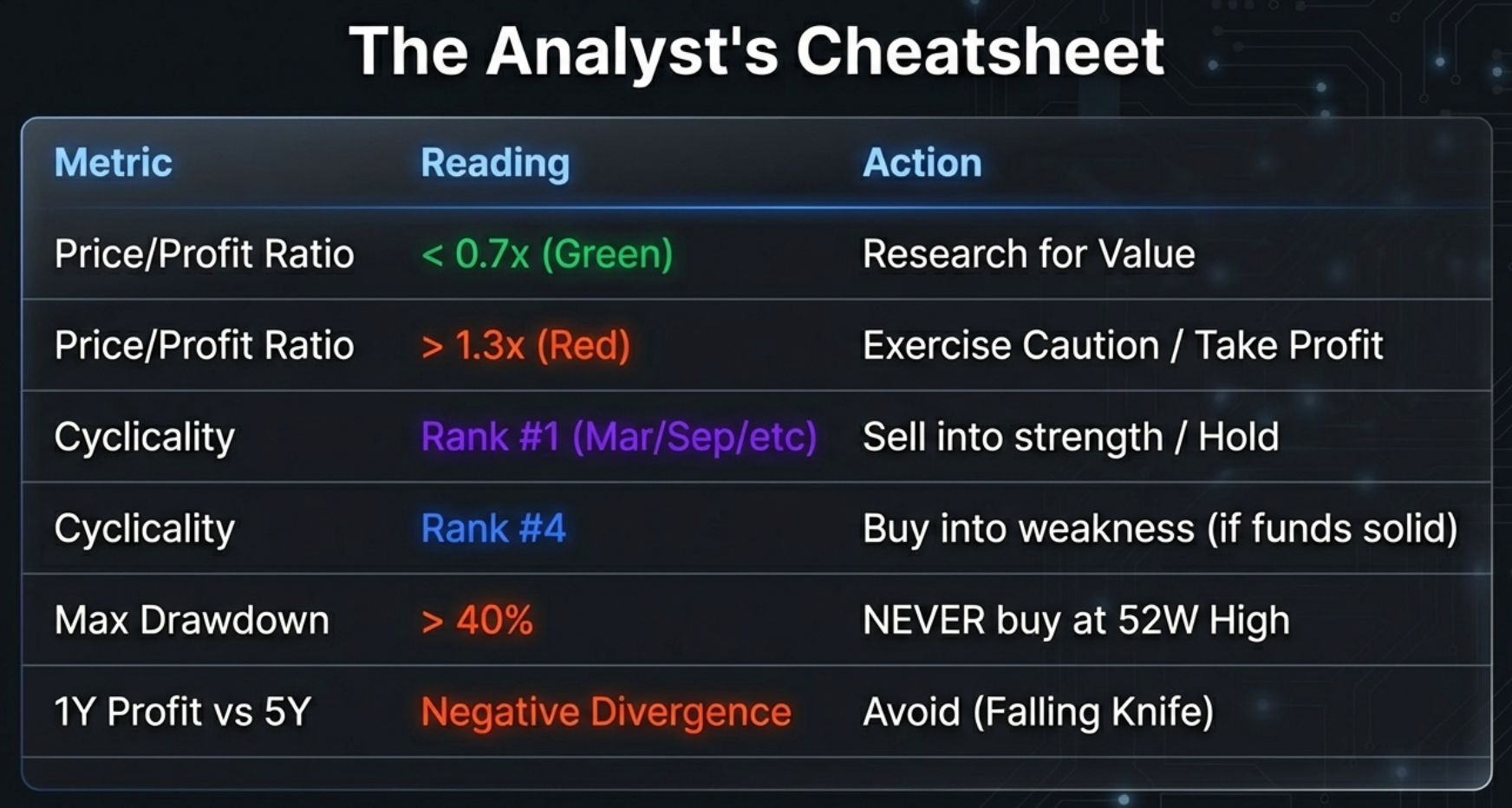
| < 0.7x | CATCHING UP | Price grew less than 70% as fast as profits — significant underperformance vs. fundamentals |
| 0.7x – 1.3x | FAIRLY VALUED | Price and profits broadly in sync — market efficiency at work |
| > 1.3x | RUNNING AHEAD | Price grew more than 30% faster than profits — multiple expansion territory |
| Negative | Complex | One metric (price or profit) is negative — context required; cannot compute a meaningful ratio |
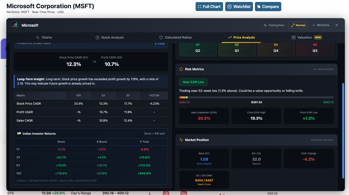
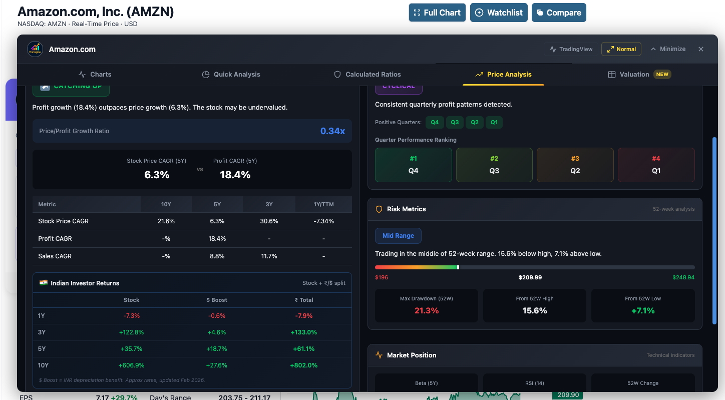
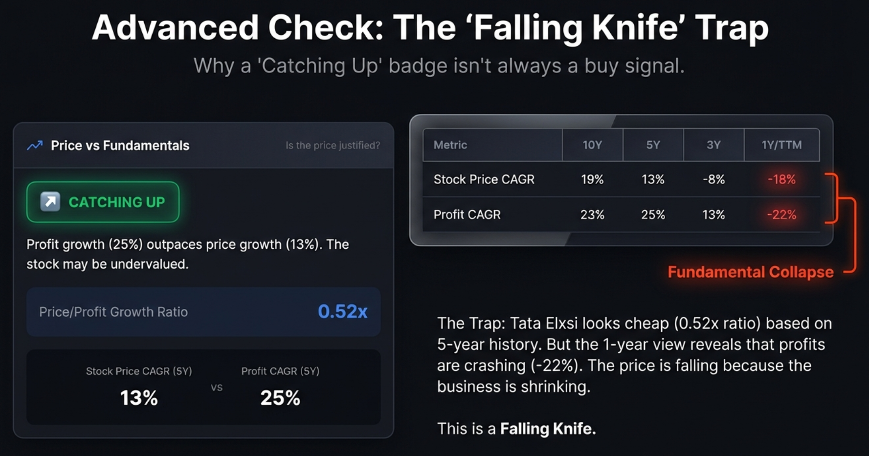
Real Company Examples


The CAGR Comparison Table — Pattern Across Time
The status badge is a snapshot. The CAGR table is a movie. It shows Stock Price CAGR, Profit CAGR, and Sales CAGR across four timeframes simultaneously — 10Y, 5Y, 3Y, and 1Y. This is where patterns emerge.
How to Read the CAGR Table
| Metric | 10Y | 5Y | 3Y | 1Y | What to Look For |
|---|---|---|---|---|---|
| Stock Price CAGR | 15% | 43% | 38% | 33% | Is it accelerating or decelerating? |
| Profit CAGR | 28% | 21% | 29% | 43% | Is earnings growth speeding up (1Y > 5Y)? |
| Sales CAGR | 17% | 20% | 22% | 29% | Is revenue growth supporting earnings? |
The Five Patterns to Recognise
| Pattern | What It Looks Like | What It Means |
|---|---|---|
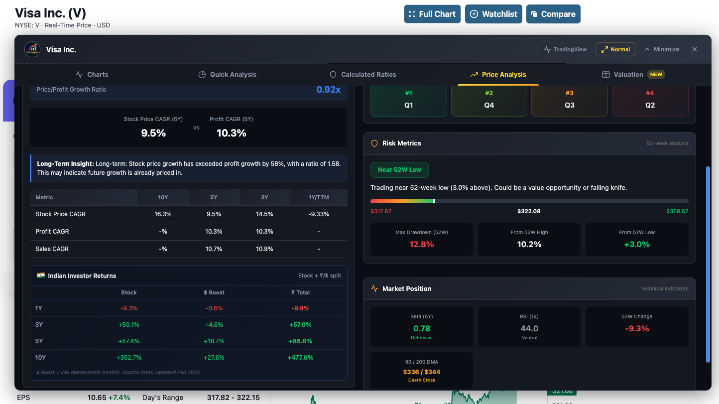
| Consistent Alignment | Price CAGR ≈ Profit CAGR across all periods | Market prices the company efficiently. No systematic mispricing. Visa is a textbook example. |
| Long-run Catch-up | Profit CAGR > Price CAGR in 10Y and 5Y but converging in 3Y/1Y | The re-rating has begun. You may have missed the best entry but the fundamental support is there. |
| Recent Acceleration | 1Y Profit CAGR >> 5Y Profit CAGR | Business is inflecting. Check if the Charts tab shows margin expansion starting in the last 4–6 quarters. This is where tomorrow’s compounders hide. |
| Price Detached (Upward) | 1Y Price CAGR far exceeds 1Y Profit CAGR | Market is pricing in future growth that has not yet materialised. Verify with the Valuation tab — are multiples far above 5Y median? |
| Price Detached (Downward) | 1Y Price CAGR far below 1Y Profit CAGR | Business is performing but market is discounting it. Check for sector headwinds, governance concerns, or macro factors. Could be a genuine opportunity. |
For US Stocks: Where the Price CAGR Comes From
For Indian stocks on Screener.in, Stock Price CAGR is extracted directly from the Screener.in growth boxes on the page. For US stocks on stockanalysis.com, the source differs by timeframe:
- 1Y Stock Price CAGR: The 52-week change percentage from the Statistics page — uses the exact daily closing price 52 weeks ago. Always accurate.
- 3Y, 5Y, 10Y Stock Price CAGR: Computed from Yahoo Finance monthly closing prices fetched via the extension’s background worker. Uses end-of-month closes. Approximation — see the Indian Investor Returns section for accuracy details.
🇮🇳 Indian Investor Returns — Your Actual Rupee Return from US Stocks
This card exists because of a gap that every Indian investing in US stocks has faced: how much have I actually made? Standard return calculators show USD returns. But you invest in rupees, and you receive rupees when you sell. The gap between what a US stock made in dollars and what an Indian investor made in rupees is real, measurable, and often substantial.
The Indian Investor Returns card in the Price Analysis tab computes this directly — for every US stock on stockanalysis.com, for 3-year, 5-year, and 10-year periods.
Card 2 — The Indian Investor Returns Card
What the Card Shows
🇮🇳 Indian Investor Returns — AMZN (Example)
| 3 Year | 5 Year | 10 Year | |
|---|---|---|---|
| USD Stock Return | +102.9% | +149.2% | +858.7% |
| $ Boost (INR↓) | +5.3% | +9.8% | +27.8% |
| ₹ Total Return | +114.1% | +173.6% | +1,127% |
Returns are cumulative (not CAGR). Based on Yahoo Finance monthly data + mid-February USD/INR rates.
| Row | What It Shows | Data Source |
|---|---|---|
| USD Stock Return | How much the stock gained in US dollar terms over the period | Yahoo Finance monthly closing prices (end-of-month, adjusted for splits) |
| $ Boost (INR↓) | The extra return gained purely from INR depreciation against the dollar | Hardcoded mid-February USD/INR rates per year, updated Feb 2026 |
| ₹ Total Return | Your total return in INR — what you actually made in rupees | Computed: (1 + USD%) × (FX_then / FX_now) − 1 |
The Maths — Step by Step
The formula sounds intimidating but the concept is simple. Your rupee return has two components: the stock’s USD gain, and the FX tailwind from INR depreciation.
USD Price Feb 2023 (monthly close): $97
USD Price Feb 2026 (monthly close): $204
USD Return = (204 / 97) − 1 = +110.3%
USD/INR Feb 2023: ₹82.6
USD/INR Feb 2026: ₹87.0
$ Boost = (87.0 / 82.6) − 1 = +5.3%
₹ Total = (1 + 1.103) × (87.0 / 82.6) − 1
= 2.103 × 1.053 − 1
= +121.4%
A ₹1,00,000 investment in AMZN in February 2023 became approximately ₹2,21,400 in rupee terms by February 2026 — combining the stock’s 110% USD gain with a 5.3% FX tailwind from the weakening rupee.
USD/INR Rate History (2016–2026)
The extension uses mid-February rates per year — the approximate midpoint of the month when most quarterly results and annual reviews happen. These are updated each February.
Over this 10-year window (2016–2026), the rupee depreciated +27.8% against the dollar. This is the structural “$ Boost” that all Indian investors in US stocks received on top of any USD return, regardless of which stock they held.
Five Real US Stocks: What Indian Investors Actually Made
These figures were validated against IndMoney ground-truth data in February 2026. The 3Y/5Y numbers are from Yahoo Finance monthly closes; the 1Y is exact (Statistics page daily price).
Accuracy Guide: Monthly Close vs Daily Price
The extension uses end-of-month closing prices from Yahoo Finance. IndMoney and most direct-investing platforms use the exact daily closing price on the date exactly N years ago. These are not the same number, and the gap depends on how volatile the stock was in that specific month.
| Stock | 1Y Accuracy | 3Y Gap | 5Y Gap | Why |
|---|---|---|---|---|
| Visa (V) | Exact ✅ | 7pp | 2pp ✅ | Low volatility — monthly and daily prices close together |
| Meta (META) | Exact ✅ | 5pp ✅ | 10pp | Medium volatility — one excellent reading in 3Y |
| AMZN | Exact ✅ | 8pp | 10pp | Medium volatility — consistent accuracy |
| MSFT | Exact ✅ | 9pp | 13pp | Medium volatility — good accuracy |
| NVDA | Exact ✅ | 63pp | 124pp | Extreme volatility — monthly close and daily price diverge sharply |
| PLTR | Exact ✅ | Large | N/A | Extreme mover — treat as directional only |

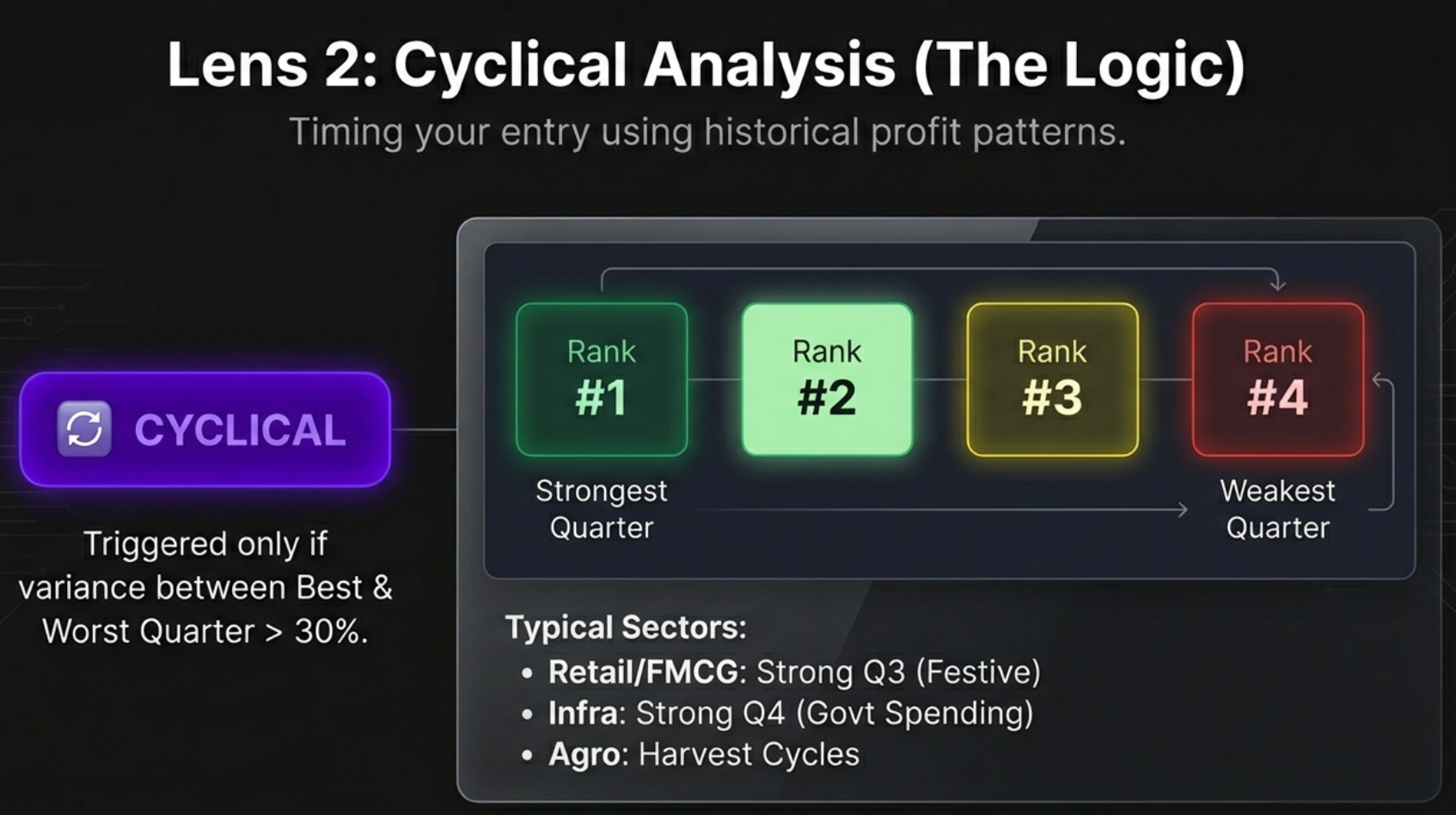
Cyclical Analysis — Timing the Business Cycle (India only)
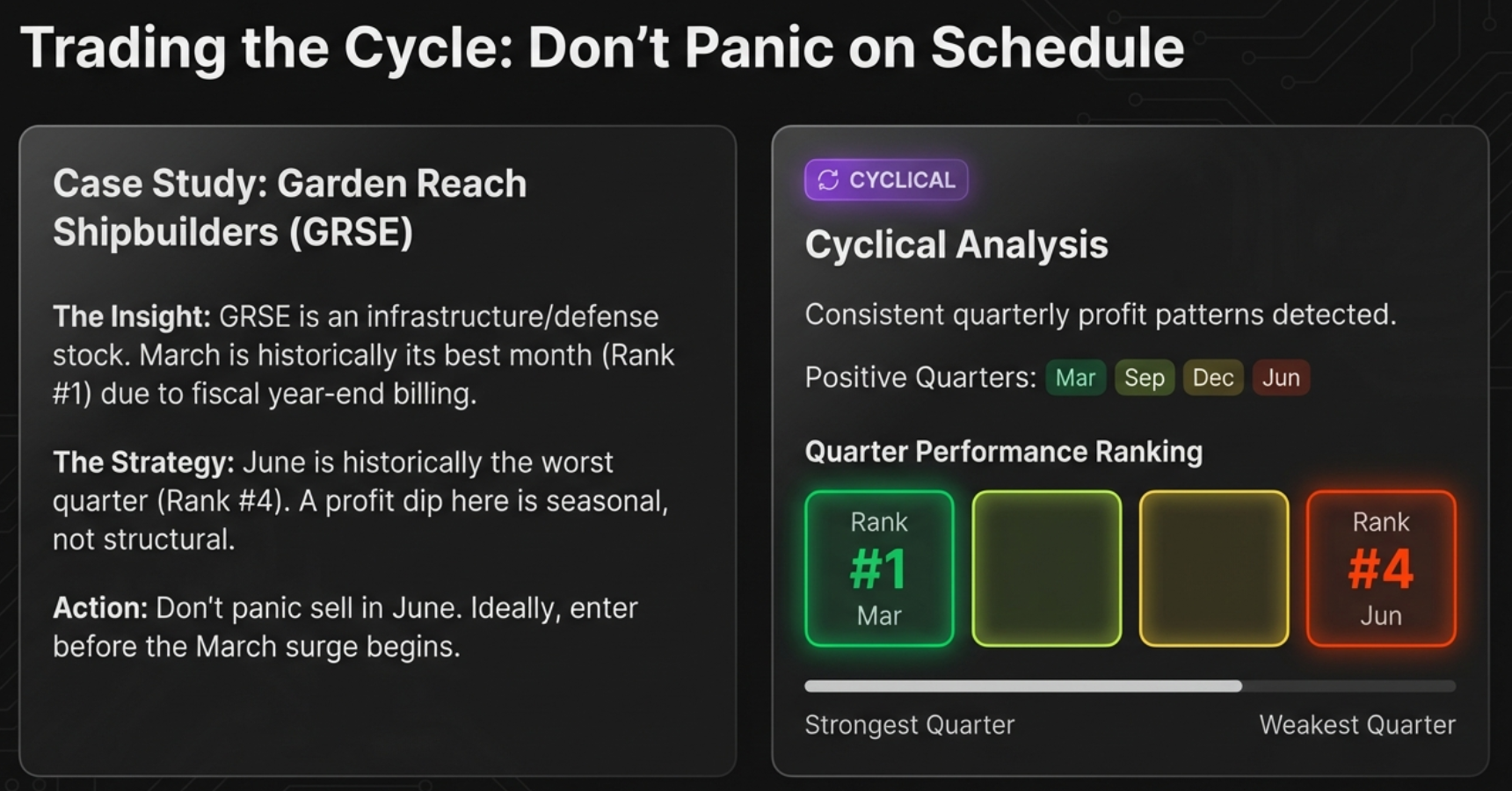
Cyclical Analysis is one of the most underutilised features in the extension. It answers a question that standard fundamental analysis cannot: does this company have predictable seasonal patterns in its quarterly profits? If yes, knowing which quarters are structurally strong or weak helps you time your entry — or at least prevents panic during expected seasonal dips.
Card 3 — Cyclical Analysis Panel
The CYCLICAL Badge
The badge appears when the variance between the best and worst quarter averages exceeds 30% of the mean. A company that consistently earns ₹300 Cr in Q3 (Sep) but only ₹180 Cr in Q1 (Mar) has a 40% swing relative to the mean — flagged as CYCLICAL.
| Badge | Threshold | What It Means | What to Do |
|---|---|---|---|
| CYCLICAL | Variance > 30% of mean quarterly profit | Consistent seasonal patterns exist. Some quarters are structurally stronger than others. | Buy ahead of strong quarters. Don’t panic during weak quarters. |
| No badge | Variance ≤ 30% of mean | No significant seasonal pattern. Profits are broadly consistent across quarters. | Focus on annual trajectory rather than quarter timing. |
Quarter Performance Ranking
The four Indian financial year quarters are ranked #1 to #4 by average historical profit. Colour coding makes the pattern immediately visible:
Highest avg. profit
Second highest
Third highest
Lowest avg. profit
Sector Patterns to Know
| Sector | Typically Strong Quarter | Typically Weak Quarter | Reason |
|---|---|---|---|
| Retail & FMCG | Q3 (Oct–Dec) | Q1 (Apr–Jun) | Diwali festive season, year-end sales lift Q3 |
| Auto | Q3 (Oct–Dec) / Q4 (Jan–Mar) | Q1 (Apr–Jun) | Navratri/Dussehra festival and March year-end incentives |
| Infrastructure | Q4 (Jan–Mar) | Q1 (Apr–Jun) | Government year-end capex spending; monsoon slows Q1 |
| Agriculture | Q2 (Jul–Sep) or Q3 | Q4 (Jan–Mar) | Kharif harvest revenue hits Q2; Rabi harvest Q3 |
| IT Services | Broadly consistent | Q1 (Apr–Jun) mildly | Annual salary hikes and visa costs hit Q1 margins |
| Banking/NBFC | Q4 (Jan–Mar) | Q1 (Apr–Jun) | March-end balance sheet build-up and provisioning cycles |
Real Company Examples
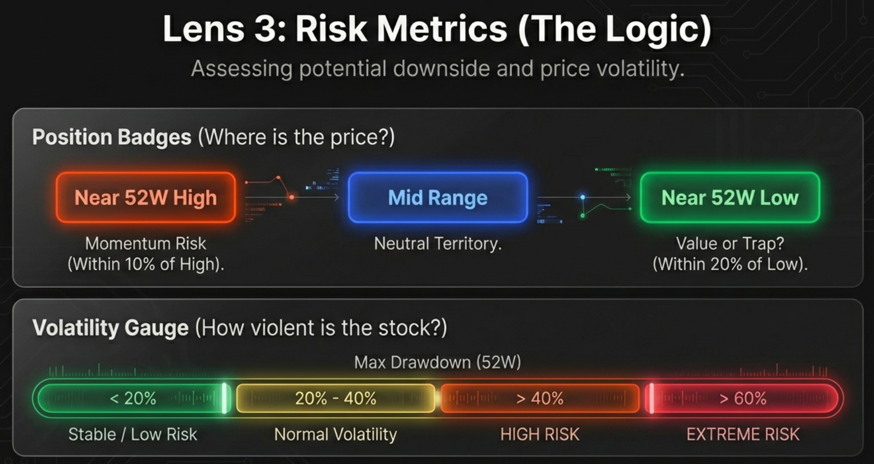
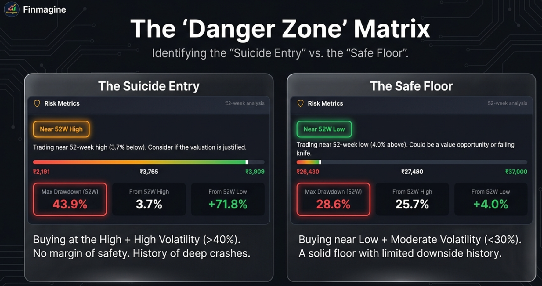
Risk Metrics — Where Are You Entering?
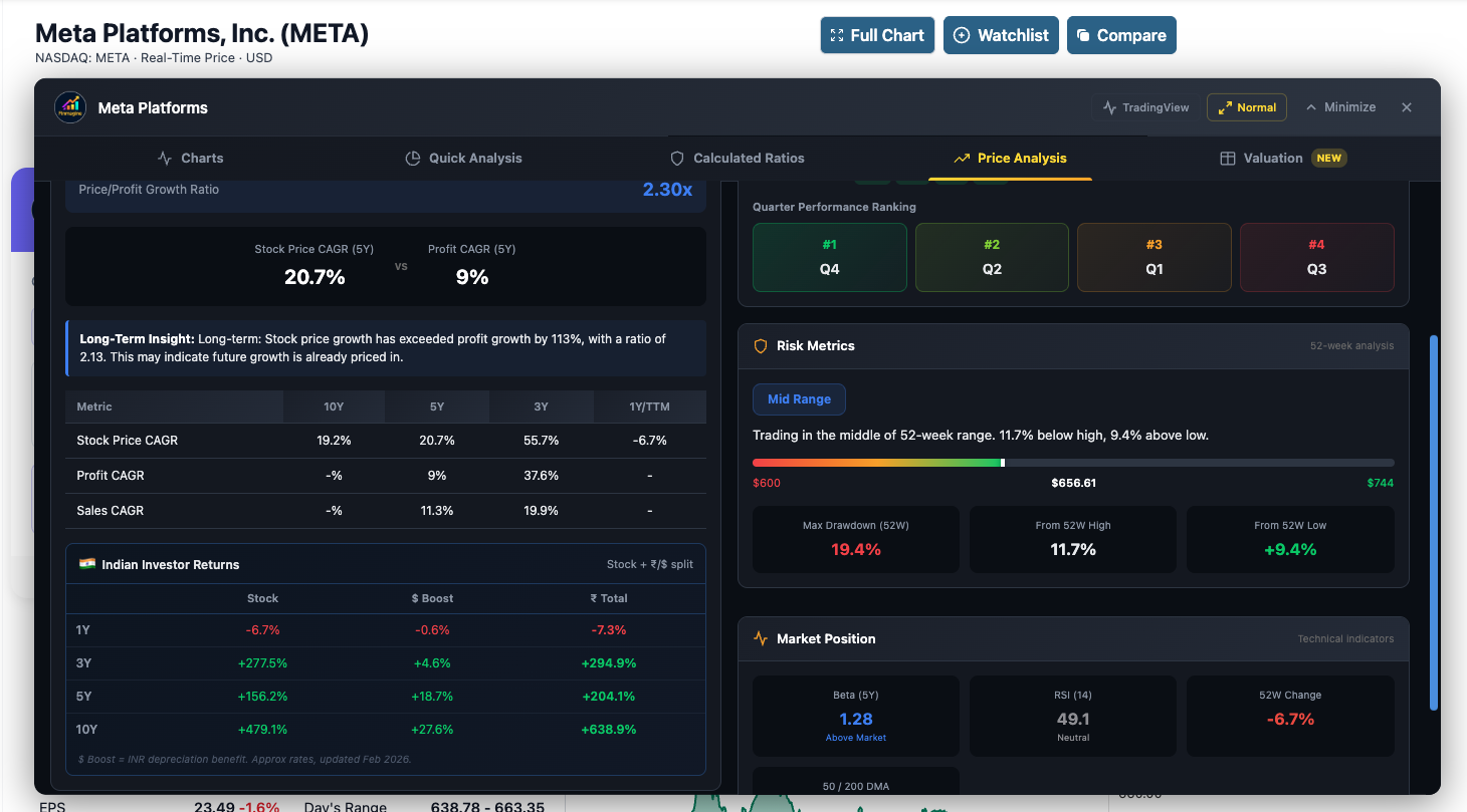
Even a great company can be a poor investment if you buy at the wrong price. The Risk Metrics panel uses the 52-week High/Low range to give you an instant picture of where the current stock price sits relative to its recent history — and how much volatility it has experienced.
Card 4 — 52-Week Range and Position Badge
The Three Risk Metrics
| Metric | Formula | What It Tells You |
|---|---|---|
| Max Drawdown (52W) | (High − Low) / High × 100 | The maximum peak-to-trough loss an investor could have experienced over the last 52 weeks. Higher drawdown = more volatile stock. |
| From 52W High | (High − Current) / High × 100 | How far the stock has fallen from its 52-week high. Useful for identifying stocks that have pulled back significantly from recent peaks. |
| From 52W Low | (Current − Low) / Low × 100 | How much the stock has recovered above its 52-week low. Useful for identifying turnarounds already underway. |
Reading the 52-Week Range Bar
│ │ │
52W Low ₹7,784 (current) 52W High
- The filled (dark) portion of the bar shows how far the stock has risen above its 52-week low
- The empty portion shows the gap between current price and the 52-week high
- The dot (•) marks the current price
Max Drawdown: Risk Calibration Guide
| Drawdown | Risk Level | Interpretation | Typical Stock Type |
|---|---|---|---|
| < 15% | Very Low | Extremely stable. Stock moves in a tight range. | Defensive blue-chips, utilities, stable FMCG |
| 15–30% | Low–Moderate | Normal volatility for most quality stocks | Large-cap quality companies |
| 30–50% | Moderate–High | Significant swings. Something caused this — investigate. | Mid-caps, sector-cyclical stocks |
| > 50% | Very High | Extreme volatility or fundamental distress in the last year | Small-caps, turnarounds, commodity stocks, high-growth tech |
Market Position — Technical Signals for US Stocks (US only)
The Market Position panel is unique to US stocks on stockanalysis.com. It combines three well-established technical indicators — Beta, RSI, and Moving Averages — to give you a sense of where the stock sits in its short- and medium-term trend. These are not replacements for fundamental analysis but powerful complements to it.
Card 5 — Beta (Market Volatility Relative to S&P 500)
| Beta | Behaviour | Typical Sectors | Portfolio Role |
|---|---|---|---|
| < 0.5 | Much less volatile than market | Utilities, Consumer Staples, Water companies | Defensive anchor — shields portfolio in crashes |
| 0.5 – 0.8 | Less volatile than market | Healthcare, REITs, mature industrials | Moderate defensive positioning |
| 0.8 – 1.2 | Market-like volatility | Large-cap diversified tech, financials | Balanced market exposure |
| 1.2 – 1.5 | More volatile than market | Growth tech, consumer discretionary | Amplifies upside and downside |
| > 1.5 | Significantly more volatile | Biotech, AI/GPU chips, small-cap growth | High conviction only — stomach for drawdowns required |
Card 6 — RSI (Relative Strength Index, 14-day)
RSI measures whether a stock has moved too far, too fast in either direction. An RSI above 70 suggests buyers may be exhausted — a pullback could be due. Below 30 suggests sellers may be exhausted — a bounce could be due. These are not signals by themselves. Always pair with fundamental analysis.
Card 7 — 50-Day and 200-Day Moving Averages
| Signal | Condition | Historical Interpretation |
|---|---|---|
| Golden Cross | 50 DMA crosses above 200 DMA | Bullish trend reversal. Often follows an extended downtrend. Historically precedes above-average 12-month returns for quality stocks. |
| Death Cross | 50 DMA crosses below 200 DMA | Bearish trend reversal. Often confirms that a downtrend is gaining momentum. Can produce false signals in volatile sectors. |
| Price > both SMAs | Current price above both 50 and 200 DMA | Strong uptrend. The trend is your friend — no strong technical reason to avoid adding. |
| Price < both SMAs | Current price below both 50 and 200 DMA | Established downtrend. Requires a compelling fundamental thesis to buy against the trend. |
| Price between SMAs | Price between 50 and 200 DMA | Consolidation or early trend change. Direction is undecided — use fundamentals as the primary guide. |
The 5-Minute Price Analysis Workflow
Used in isolation, each card tells a piece of the story. Used together, in the right order, the Price Analysis tab gives you a complete picture of a stock’s current positioning in under five minutes. Here is the exact sequence that extracts maximum insight.
Step 1: Check the Valuation Status Badge (30 seconds)
The badge is your compass. If it shows CATCHING UP, you are looking at a potential value opportunity — the business has been outgrowing the stock price. If it shows RUNNING AHEAD, the burden of proof is on the Valuation tab to justify the premium. Read the badge, note the Price/Profit ratio, then move to the CAGR table.
Step 2: Read the CAGR Table Across All Periods (60 seconds)
Look at three things in the table: (a) Is the 1Y trend diverging from the 5Y trend? A stock can show CATCHING UP over 5 years but be RUNNING AHEAD in the most recent year — a sign the re-rating has already happened. (b) Is Profit CAGR accelerating? If the 1Y Profit CAGR is much higher than the 5Y, the business is inflecting. (c) Does Sales CAGR support Profit CAGR? If profits are growing but sales are flat, the margin expansion has limits.
Step 3 (US Stocks Only): Read the Indian Investor Returns Card (60 seconds)
For US stocks, this step is essential before forming any return expectation. Note the ₹ Total Return column. The 1Y figure is exact — this is what you would have made. The 3Y/5Y figures are approximations (more accurate for low-volatility stocks, less for high-volatility names like NVDA). Add the $ Boost percentage to your mental model — it illustrates how much of your INR return came from FX tailwind vs. actual stock performance.
Step 4: Check the Risk Metrics Panel (30 seconds)
Three questions: (a) Is the stock near its 52-week high? If yes, you are paying a momentum premium — verify that the fundamentals justify it. (b) Is the Max Drawdown above 40%? If yes, this is a volatile stock — size your position accordingly. (c) Is it near the 52-week low with strong fundamentals? That is the combination value investors look for.
Step 5 (Indian Stocks Only): Read the Cyclical Analysis Panel (30 seconds)
If the company is flagged CYCLICAL, note which quarter you are currently in relative to the ranking. Are you entering in a structurally weak quarter? That might actually be advantageous — the stock may have already reacted to an expected weak result. Are you entering after a strong quarter? The next quarter may disappoint purely on seasonality.
Step 6 (US Stocks Only): Read the Market Position Panel (60 seconds)
Check the trend alignment. If fundamentals are strong (Quick Analysis health score > 65) and the technical picture shows Price above both SMAs with a Golden Cross — every dimension agrees. If fundamentals are strong but the stock is below both SMAs in a Death Cross, you are buying against the trend. That requires either a longer holding horizon or a specific catalyst.

Five Mistakes to Avoid
Mistake 1: Treating CATCHING UP as a Buy Signal By Itself
CATCHING UP means the stock price has lagged profit growth. That is a necessary condition for undervaluation, not a sufficient one. A stock can show CATCHING UP for three years and continue to lag because the market is correctly pricing in a quality or governance discount. Always verify with the Valuation tab (are multiples cheap?) and Quick Analysis (is the health score strong?).
Mistake 2: Treating the 3Y/5Y Indian Investor Returns Figures as Precise
For high-volatility US stocks like NVDA, the 3Y INR return can differ from IndMoney’s figure by 60–130 percentage points due to monthly vs daily pricing. Use these figures for directional sizing (“NVDA made roughly 7X in rupees over 3 years”) not for precise reconciliation with your brokerage statement. The 1Y figure is always exact.
Mistake 3: Selling a Quality Stock Because RSI is Overbought
RSI above 70 during a strong uptrend is normal. NVDA stayed above RSI 70 for much of 2023 as the AI wave drove demand beyond all forecasts. Selling a quality compounder because a momentum indicator suggests it has moved too fast is one of the most expensive mistakes in investing. RSI is a tool for context, not a trigger for action.
Mistake 4: Ignoring the Cyclical Badge During Earnings Season
If an Indian company is flagged CYCLICAL and you panic-sell during a structurally weak quarter (e.g., Q1 for an auto company), you may be selling precisely at the wrong time. The Cyclical Analysis panel exists to prevent this. Before reacting to a disappointing quarter, check whether the company’s Q1 has historically always been weak — if yes, the market likely expected it and the stock may already be pricing it in.
Mistake 5: Using Max Drawdown Without Fundamental Context
A 60% Max Drawdown can mean two very different things: (a) the business deteriorated fundamentally and the stock correctly repriced, or (b) a market panic hit a solid business temporarily. The Max Drawdown number alone cannot tell you which scenario you are in. Always check Quick Analysis (health score) and Calculated Ratios (interest coverage, D/E) before concluding that a large drawdown is an opportunity.
Free Chrome Extension
Ready to try this yourself?
Install the Finmagine Financial Chart Builder and transform any Screener.in, Google Finance, or stockanalysis.com page into interactive charts in one click.
Install from Chrome Web Store →No account required • Works on Chrome, Edge, Brave, Opera
Continue Learning: Related Guides
All 11 ratios (Interest Coverage, D/E, DuPont, etc.) with exact thresholds and real Indian company examples.
Altman Z-Score, Piotroski F-Score, ROIC-WACC, Analyst Outlook, and all US-exclusive features explained.
How the health score is calculated, sector weights, bonus points, and banking-specific metrics.
Charts, Quick Analysis, Calculated Ratios, Price Analysis, and Valuation — 74 flashcards and sector benchmarks.